Just got home from some traveling, setting up a new COVID lab. Just a quick update.
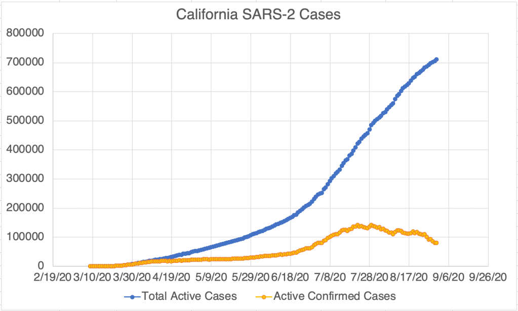
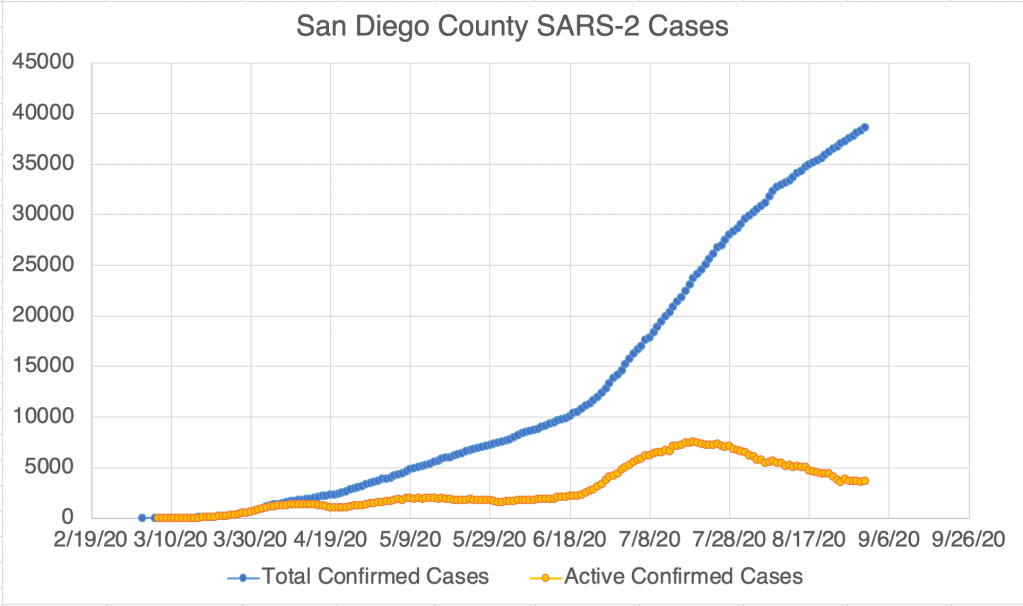
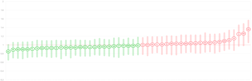
New cases continue to drop in the US, California, and San Diego, as do probable active cases. Endcoronavirus.org counties map shows most of California recovering.
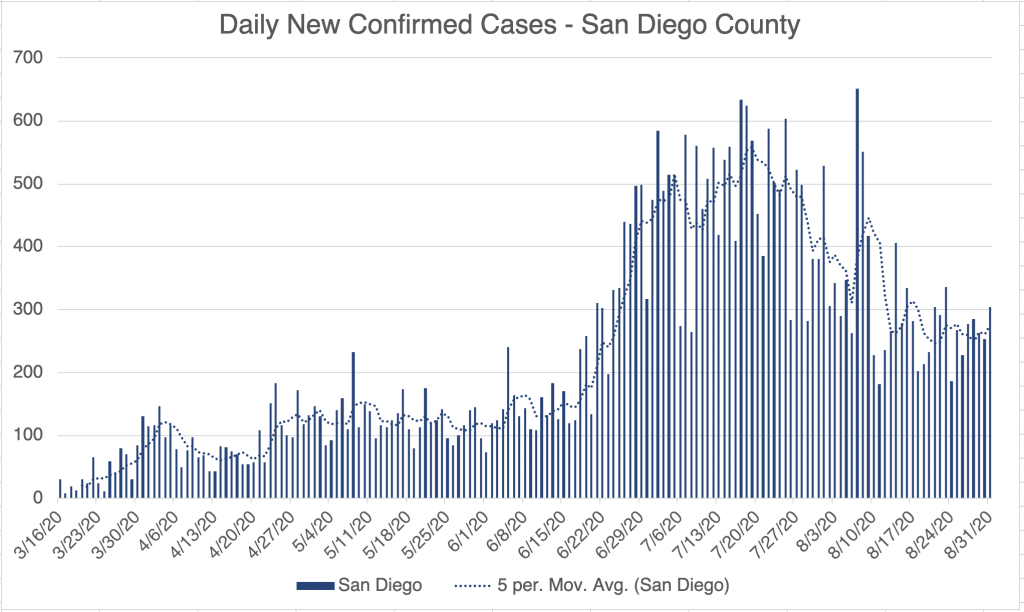
Graph is by me, from data collected from Johns Hopkins University COVID site . Graph is by me, from data collected from Johns Hopkins University COVID site . Graph is by me, from data collected from San Diego County Public Health . See also regularly updated slides from SD County . Graph is by me, from data collected from Johns Hopkins University COVID site . “Active Confirmed Cases” numbers are calculated based on the assumption that patients confirmed to have SARS-2 virus at least 17 days ago have recovered. Graph is by me, from data collected from San Diego County Public Health . See also regularly updated slides from SD County . Some data points of “Active Confirmed Cases” are from SD County, others are calculated. Endcoronavirus’ Counties Map . From Rt Live . Good news! Let’s keep it up!
Don’t fear, but be smart!