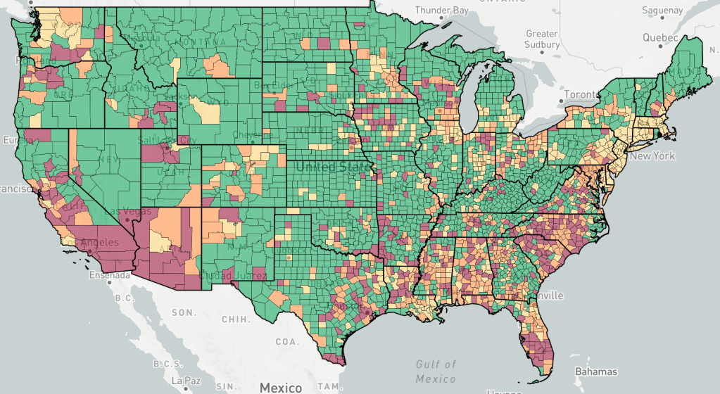
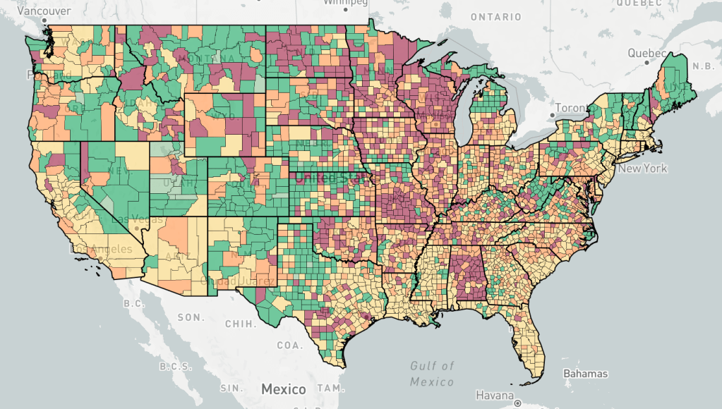
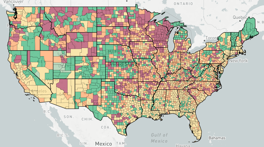
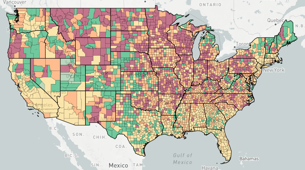
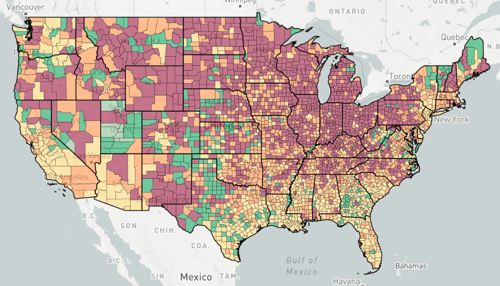
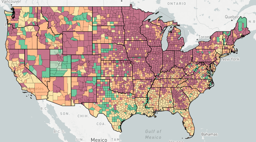
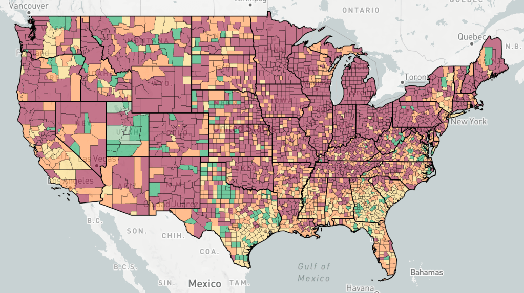
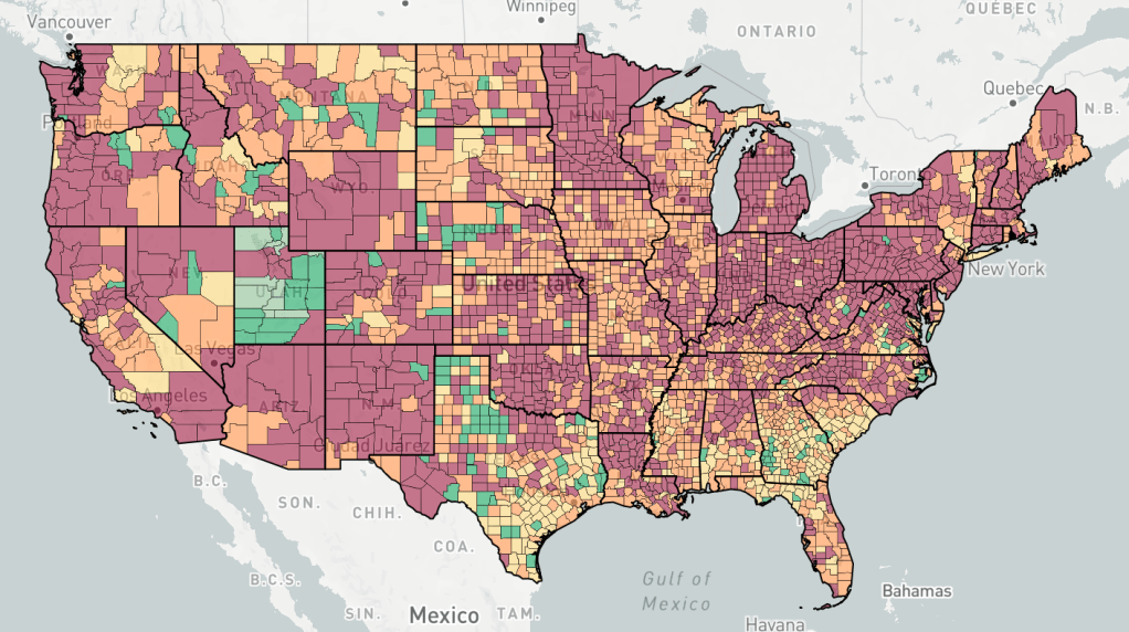
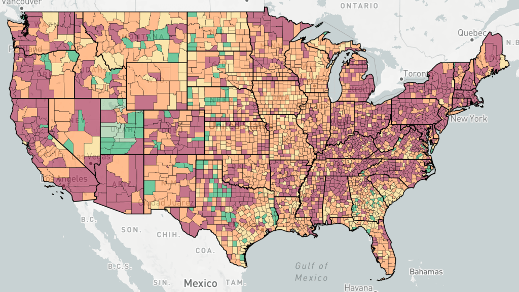
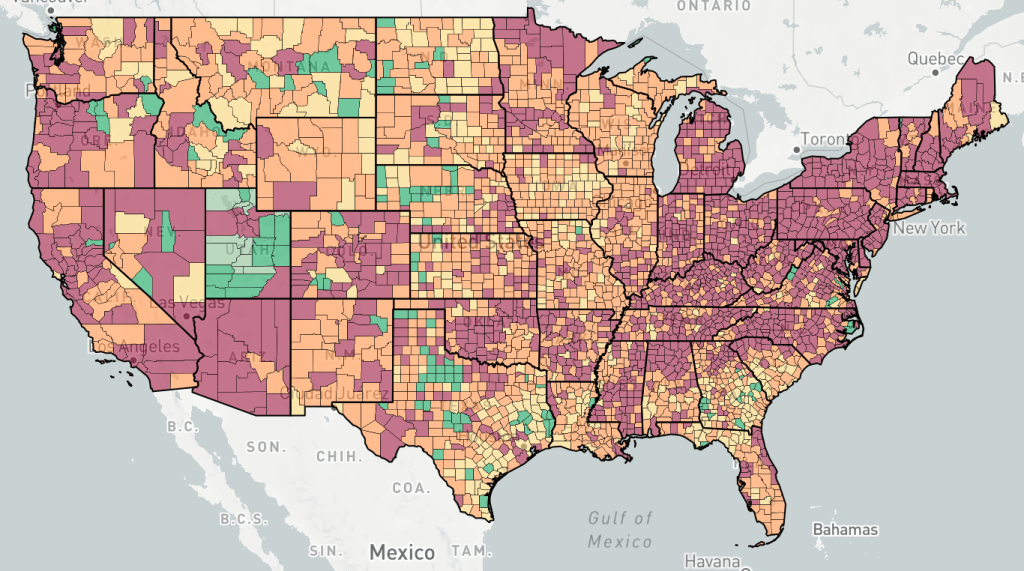
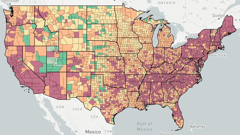
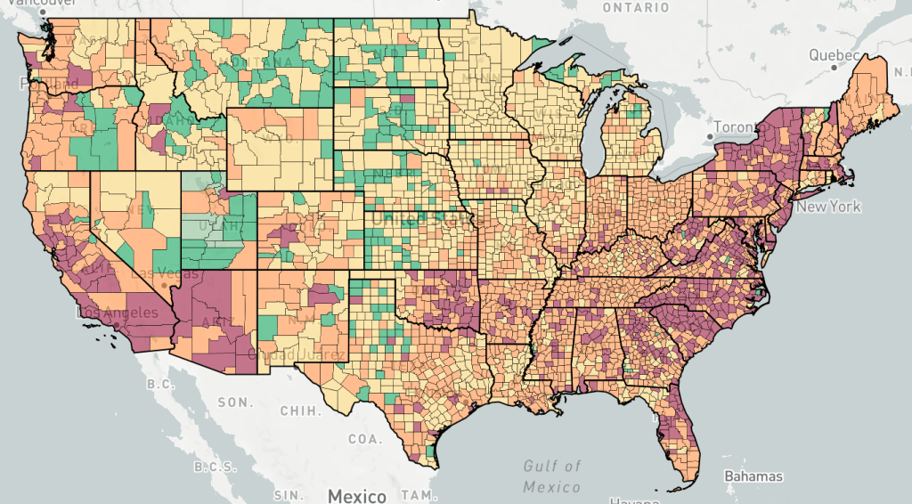
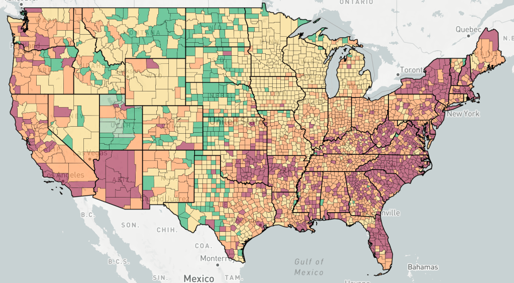
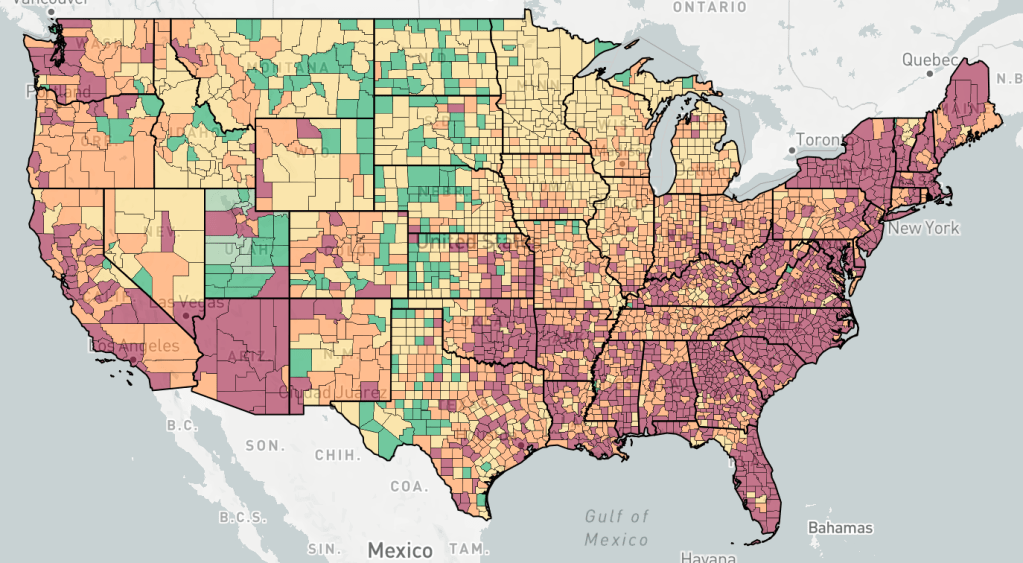
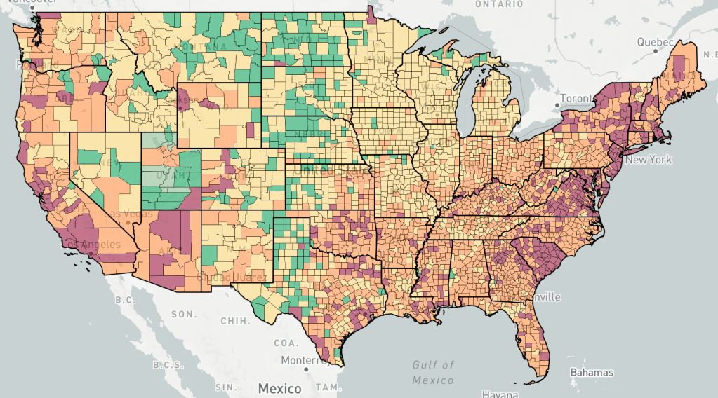
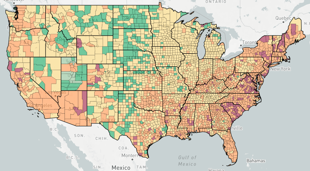
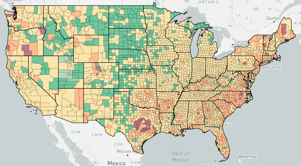
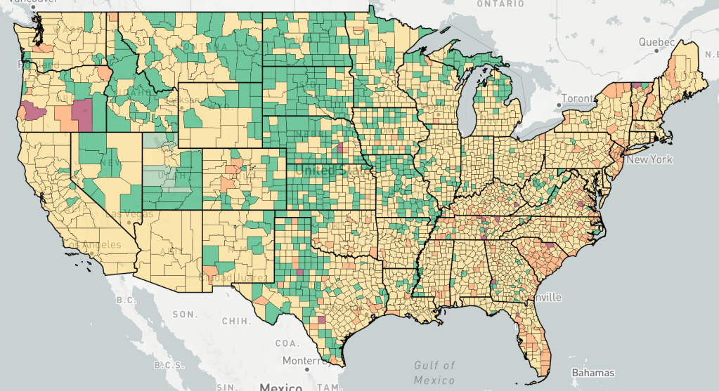
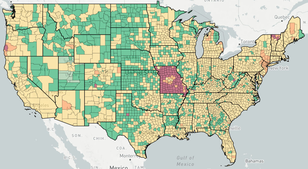
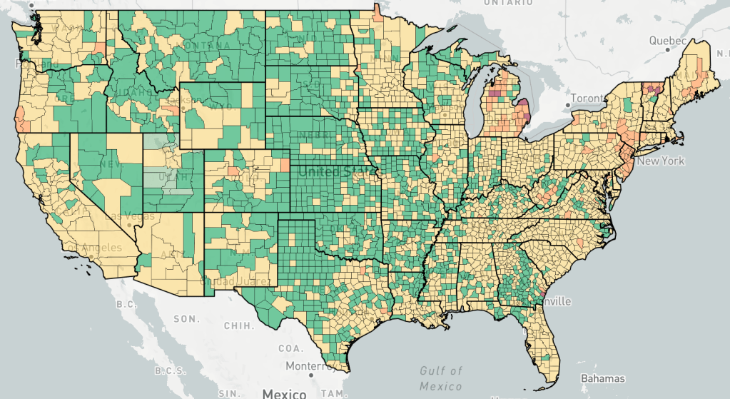
Below is an “animation” of sorts, photos from endcoronavirus, about a week apart, with one photo from June, and then a series starting in September. I’ve said that the Fall wave started in the North and then moved to the South as the wave progressed. I think you can see this in this series of photos. You can also see a flare up in new cases in January, right after Christmas.
Counties are colored based the change in cases, not the number of cases. Red is increasing cases, orange is falling or constant cases, yellow is cases almost under control, dark green is cases under control, light green is no cases.
Erik


1 thought on “Fall Wave “Animation””