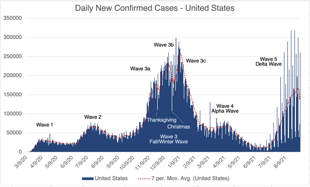
This is a brief case update. Last week may represent a lowering of cases in the US, and we may finally have reached the peak of the Delta Wave in the US. Deaths continue to increase but they are proportionally lower than for previous waves. Endcoronavirus shows many counties and states in the country finally recovering from Wave 5.
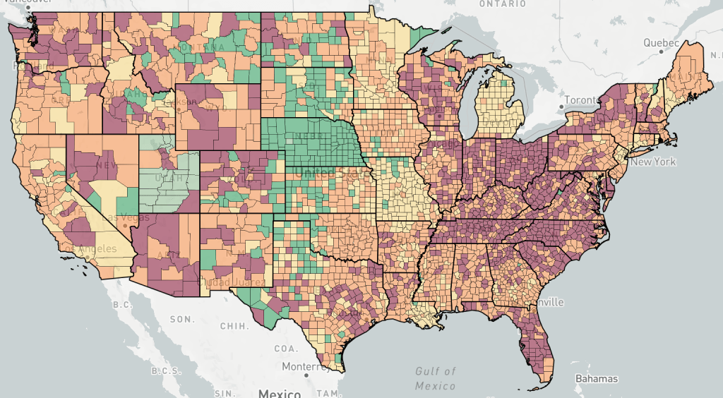
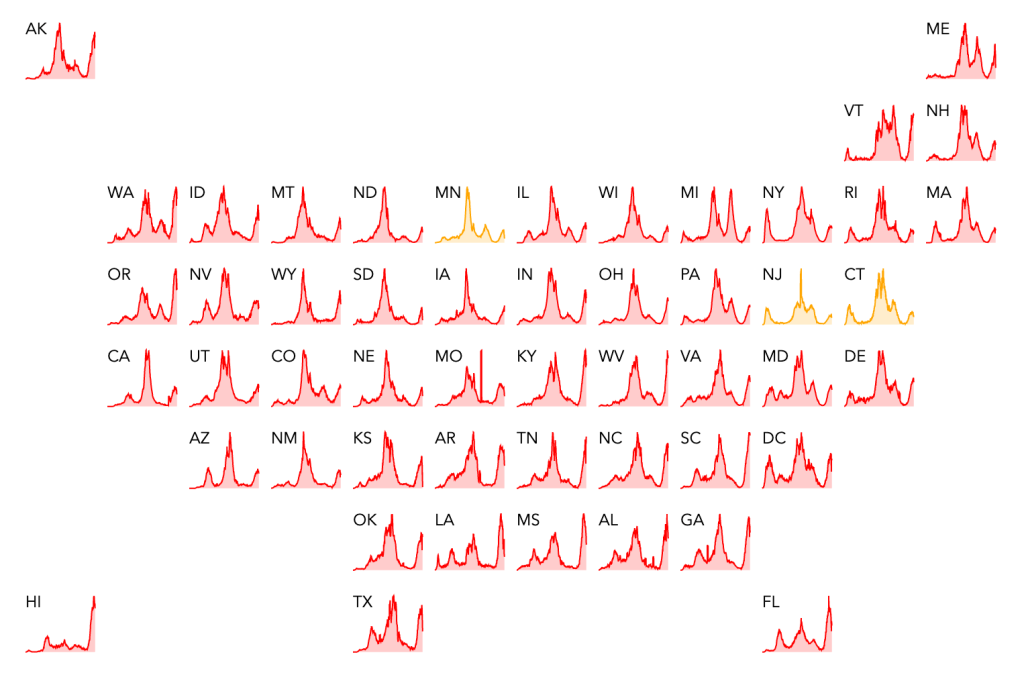
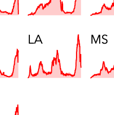
A word of caution on interpreting some case graphs that you may see. As you can see on my graphs, there is usually a disproportionately higher number of cases reported on Friday and Monday, and a lower number reported on Sunday. Some maps will report very high cases for an area (see Endcoronavirus state map for Louisiana) but zooming in on the map shows that the very high peak just shows cases for Fridays. So look for this when interpreting some data you might see.
Endcoronavirus State Level Map, September 8th, 2021. Delta wave in this view appears to be higher than the Fall/Winter wave.Endcoronavirus State Level Map, September 8th, 2021. Clicking on the Louisiana graph on the Endcoronavirus state map gives you this graph. Note that the average case number is not nearly as high as is suggested by the higher days. This is not true for every state, so check your own state’s information.
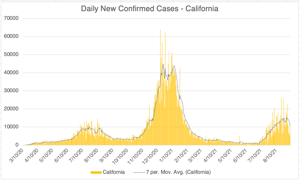
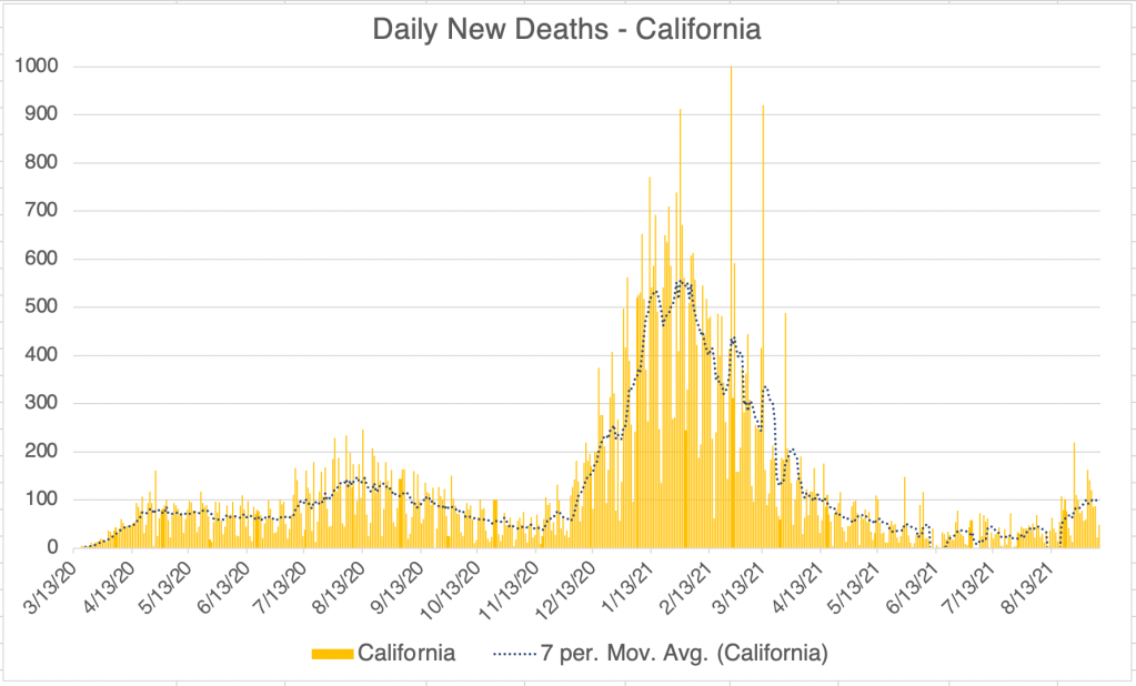
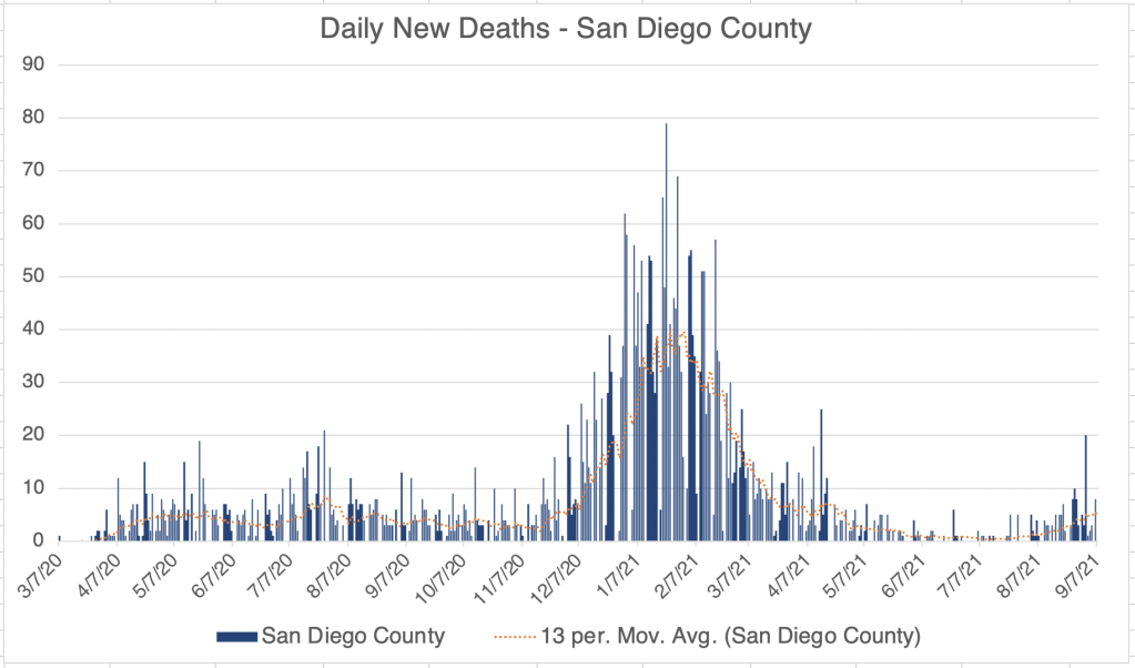
California and San Diego County both continue their downward trend in new confirmed cases. It’s still to early to say, but deaths in San Diego County may have already peaked for the Delta peak. If this is the case, then deaths due to Delta have been very low. Hospitalizations have been proportionally as high as the Winter peak during the Delta Wave, however, at least in San Diego County.
Many have been interested in the Israel data on vaccination. The paper associated with that data has finally been pre-printed. I haven’t had a chance to read it myself yet, but I’m providing the link in case you’re interested in it.