I have a variety of resources to share with you today.
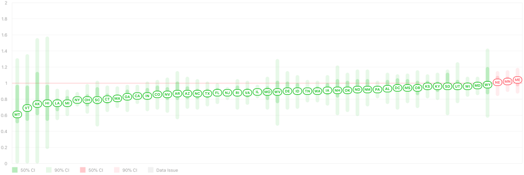
Re-opening: First, after many states have started to re-open, Rt Live is showing that all but 3 states have an Rt value below 1. This means that for most states, each infected person is passing the virus to less than 1 other person, and the virus is slowly disappearing in that state. The states with an Rt above 1 are Minnesota, Maine, and Nebraska. After a poor initial response, I’m happy to say that New York State is doing very well now, and daily new cases are low in New York. In California, my home state, the number of new cases is flat, approximately 1700 cases per day since the middle of April.


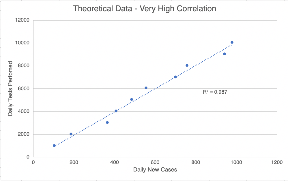
How many real new cases? This is going to be a little mathy! I told you I was going to start tracking the number of tests, and I have been doing that since April 27th. This will help us know how many of the new cases are just because of more testing, and how many are actual new cases. I’ve plotted the new cases against the new tests. For each day, a point comparing the new cases and new tests is shown. If new testing matters, then a day with a high number of tests will also have a high number of new cases. To find out if this pairing exists, we can do a statistical test called the R2 test (pronounced “R squared”, also called the correlation coefficient). This test creates a best fit line with the data and that creates an R2 value. This value is a measure of how well the 2 parameters (new tests and new cases) are correlated. I show a hypothetical graph in which the 2 sets of data are well correlated. A perfect correlation will have a score of 1.0, while a set of data with no correlation at all will get a score of 0.0. For scientists (at least the ones in diagnostics, like me) a correlation is considered “true” if the R2 value is above 0.95. You could also say that the correlation is 95% likely to be true.
Now on to our data. I started plotting on April 27th. 5 days later, the graph for the United States got an R2 value of 0.6559. This suggests that new cases and new tests are 66% likely to be correlated for this time period. In real world terms, this probably means that some new cases are because of new testing, but some aren’t.

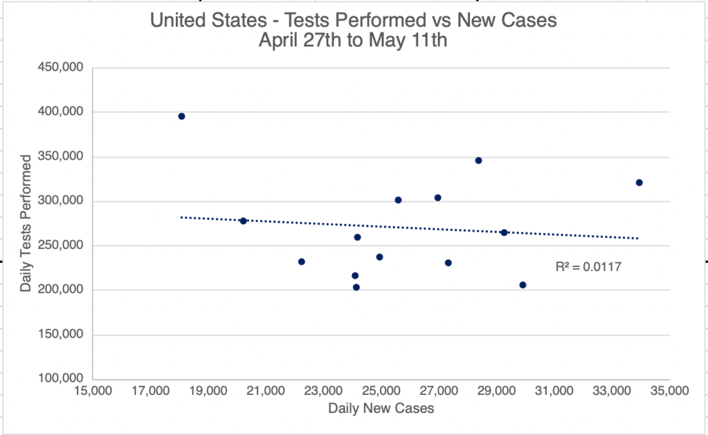
Interestingly, as of yesterday, a graph like this for the US gets an R2 value of just 0.0117. This is very low and suggests that there is now no correlation between new testing, and new cases. This means that new cases we see now are probably “real” new cases, and not just pre-existing ones that are just being found because of new testing. For California, the correlation between new cases and new testing was never very high. Right now, the R2 value is only 0.0039 for California, suggesting that most new cases discovered are “real” new cases. What this means going forward is that we probably have enough testing now to locate new cases. As we go forward, I expect we will start to see a steeper decline is new cases.

Good news! This good news comes with a warning, however! Those living in the West will easily understand a comparison to a brush fire. Right now, we are in the “containment” stage. We have the fire surrounded, and were at the beginning of the end, but if we walk away now, the fire will start to spread again. We need to stay on task and keep fighting the fire! I am all for re-opening, but we need to remain diligent. Wear a mask when you go out into public, and continue to keep your distance from others! If your workplace re-opens, you will probably want to wear a mask, wash your hands frequently, and sterilize your workspace often. I am probably going to start traveling for work again soon, and I’m very glad that everyone will be wearing a mask on the plane!

Endcorona.org compares responses: I discovered a new website the other day, endcorona.org, from the New England Complex Systems Institute. The group compares the responses and results from different countries. First, “green” countries responded very well, and were able to get the virus under control quickly. Aside from the good response, I also notice that most of these countries have relatively small populations. You may notice that China also appears on this list. Most experts agree that the data coming from China is not reliable, and they probably have many more cases than they are reporting. After intermediate cases in yellow are countries in red that need more action. This includes the US. If you’ve been reading my posts, you’ll recognize the “flat” curve of the US. Yes, we’ve flattened the curve, but we haven’t been able to knock down our case load yet. Other countries with similar flat curves include Canada, Finland, Indonesia, Panama, Poland, Sweden, and the UK. Other countries had low cases at first, but are now experiencing explosive growth in new cases, including Brazil, Mexico, and Russia.
After analyzing the responses of these countries, endcorona.org recommendations include the following, many of which you’ll recognize:
- Lots of testing to identify new cases.
- Isolating infected individuals, even from family members!
- Strict lockdowns. The stricter the lockdown, the shorter it will be.
- Travel restrictions, even within the same country.
- Adequate health care capacity.
- Safe practices for essential services.
- Masks in public for everyone.
Viral spread: Erin Bromage, an Associate Professor of Biology at U Mass Dartmouth, has a very nice article on his blog describing how the virus spreads. It is well written for non-scientists and has lots of links to original research. The take home lesson is that the virus spreads particularly well in-doors. In addition, cough, sneezing, and to a lesser degree shouting, singing, and even talking are all risk factors in spreading virus.
That’s all for now!
Don’t fear, but be smart!
Erik

4 thoughts on “Re-opening, How Many New Cases?, endcorona.org Compares Responses, Viral Spread”