Case Update: March 24th, 2021

This is a COVID case update. New confirmed case numbers continue to decrease, although slowly. The endcoronavirus county level trend map shows a few small outbreaks in Michigan, but improvement everywhere else.

Graph is by me, from data collected from Johns Hopkins University COVID site.
Endcoronavirus County Level Map, March 23rd, 2021
Graph is by me, from data collected from Johns Hopkins University COVID site.
Graph is by me, from data collected from Johns Hopkins University COVID site. “Active Confirmed Cases” numbers have been calculated based on the assumption that patients confirmed to have SARS-2 virus at least 17 days ago have recovered. Recently, however, this would produce an active case number that is too low to make sense in comparison to San Diego. This graph estimates 17 to days to recover in January, but gradually moves to 22 days for mid-March. Is this still useful information?
Graph is by me, from data collected from San Diego County Public Health. See also regularly updated slides from SD County.
Graph is by me, from data collected from San Diego County Public Health. See also regularly updated slides from SD County. “Active Confirmed Cases” numbers are reported by San Diego County. Because our new active case numbers are getting low, I’ve switched to a logarithmic view. This emphasizes small values and makes them easier to see. Notice that the case number on the left now go up 10 fold with each higher line on the graph.

I’m going to get into the statistical weeds a little bit right now. Read on if you’re interested in that. I often post a graph of new cases along with active cases for California and San Diego County. San Diego actually publishes numbers of recovered patients, but California does not. My estimates for California have been based on the San Diego recovered numbers. San Diego’s recovered numbers have generally matched the new case numbers for 17 days previous, so I’ve been doing the same for California. Now, for whatever reason, San Diego’s recovered numbers have been matching new numbers for 22 days previous, which makes a big difference in “Active Confirmed Cases”. So now I’ve been making a bunch of modifications to my estimates for California numbers, and I’m not sure I feel comfortable showing you such adjusted numbers. So if you have an opinion, let me know in the comments if you want to continue seeing “Active Cases” for California, despite all the guesswork.

Don’t fear, but be smart,
Erik

What is Science?

This is a long post about the philosophy of science. I probably should have written this one a long time ago, but here it is. 

During the pandemic, we’ve often heard scientists and commentators say “I’m just following the science.”  Confusingly, we’ve heard people on all sides of the issues say this, pro-maskers, anti-maskers, vaccine fans, vaccine detractors, people who love Hydroxychloroquine, and those who think it kills people.  Very often, when people have used the word “science” in the last year, they’ve used it in a way that you DIDN’T learn in high school biology class (thanks, Mr. Walker!).  So what do people mean when they say this, and how can you evaluate what they are saying?

When you hear the word “science” on the news or in discussions on the pandemic, other definitions are often smuggled in. I’ll give you a few different ways people use the word “science”, and then I’ll talk about how you can evaluate science related discussions.

1) In actuality, science is a method for measuring things in the natural world, and using reasoning and the scientific method to make, falsify, and confirm hypotheses about natural things.  Science has been phenomenally successful at describing aspects of the natural world, as well as producing useful applications for communication, travel, health, manufacturing, the arts, and nearly every conceivable human endeavor.  The incredible success of science has given it enormous cultural power as well, and many ascribe to it powers that it does not have. By definition, science measures and describes the natural world, but cannot describe many common aspects of reality, questions like “what is justice?” or “what is the meaning of life?”. 

While many contributed to the Scientific Method, the steps were formalized by Francis Bacon.  The steps include 1) the formulation of a question, 2) the development of a hypothesis, or a guess about what actually happening, 3) a prediction about what impact the hypothesis may have on a system, 4) doing experiments to test the hypothesis, and last 5) analyzing results, to include falsifying or confirming the hypothesis and forming a new question.

The scientific process is not a slow gradual accumulation of truth.  It’s often ugly, with long searches down the wrong path before finding the right one. Fields can experience sudden, jerky changes in direction.

2) The collection of facts currently believed by the majority of scientists.  When many in our current culture use the word “science”, this is what they mean. The phrase “settled science” often refers to this.  But scientific truth is not decided by a vote.  Yes, if a “fact” is believed by most scientists, it’s more likely to be true, but science history is full of people who had “weird” ideas that later turned out to be right.  By definition, topics under current study are not well understood, and there can be widely varying opinions about what’s going on. 

It’s always OK for a scientist to question current thought.  Trust me when I say that having a PhD does not mean that other scientists have to believe you.  I’ve heard shouting matches at conferences over what to believe about seemingly simple things.  

Real “Truth” transcends opinion.  Things are true whether you believe them or not. Science is the search for the truth about the natural world, not the search for ways to force your view on others.

Which leads to…

3) The collection of facts currently believed by scientists who agree with me.  When things are murky and not well understood, which is quite often in active fields, there can be 2 or more models of how a system is working. Sometimes the evidence that is out in the world can appear to be contradictory. This may be because some of the evidence is wrong, or because conclusions based on the evidence is wrong, or because a crucial piece of evidence is still missing, or because the system is just more complicated than anyone is aware of. At this point, a good scientist will try and rethink the available evidence or perhaps design a new experiment to try and get at something still unknown.  Instead, some people, even good scientists in a moment of weakness, will simply declare that their view is correct prematurely.  Scientists must always seek to be more persuasive, and not just shout louder.

4) The collection of facts currently believed by me, right now.  This definition is common for those who believe an outlier view.  It’s not bad to have a view that is outside the current orthodoxy, this is how scientific breakthroughs happen, but a person in this position must seek even more to persuade with evidence, not just be dogmatic.  Do more internet work, read more literature, or design another experiment.

5) An atheistic worldview, as in “I believe science”. Science is great at discovering information about the natural world, but it can’t answer the big questions. What some call “science” in this way is really “naturalism”, the belief that only matter and energy exists. It rejects any worldview that includes a transcendent or supernatural component. Science alone does not support this worldview, because by definition, science can’t “prove” the non-existence of things outside the known universe. Other philosophical structures are necessary to support this view.

So how do you figure out what’s really true about a scientific opinion being presented.  This can be difficult, but it can be a little easier to figure out if someone is abusing “science.” Here are some clues that science might be being misused.  You’ll have to dig deeper to be sure:

  1. A real scientific argument includes a conclusion supported by evidence.  Does the person talking give any evidence for their position? Often, people just make an assertion, a claim without evidence.  This is OK if they can back it up, but very often they can’t.  Ask “can you clarify that?” or “how did you come to that conclusion?”
  2. When questioned, a person should have evidence for their claim. If instead they call you anti-science, or *phobic or *ist, then they are abusing science.
  3. If a story or comment starts with “X person is brilliant and has been in the business for years”, this is often a red flag for me.  While a person’s qualifications are important, they must still present evidence.  A title or degree is not enough for them to be automatically believed.  The more glowing the terms used to describe a source, the more I’m suspicious that they are about to spout nonsense.
    Yes, this even applies to me.  If you tell someone “This Facebook friend of mine is a real scientist and he says <something really smart>”, you should rightfully expect your friend to ask what evidence I had for my claim. If you don’t know, then re-read my post, or just message me!  I’m happy to work through it with you, and I’ll tell you outright if I’m just speculating.
  4. News articles are OK, but they are only a starting place.  If a person references a news article, they still have homework. What news outlet? What evidence did the author use? Journalists often misunderstand or misrepresent information from scientific sources.
  5. Real evidence can be a scientific paper, a study learned about on the radio (who presented it?), or a comment by an authoritative source (who is the source?).  Each of these can in principle still be wrong, but they have more weight than other sources.
  6. Often, we gain knowledge about the world from someone we trust, an authority on the matter.  This is a fine way to learn things. Your parents were the first authority that you used for learning much of what you needed to know.  But authorities, even good ones, are not always right.  You learned this about your parents when you were a teenager. It’s OK to pick someone you trust as an authority on scientific matters, but still don’t believe everything you hear.  The CDC, the WHO, Dr. Fauci, the President (either one), yes even me, have been right about some things and wrong about some things during COVID. During an evolving situation, expect opinions and “facts” to change as more information is gathered.  Your favorite authority doesn’t know everything.

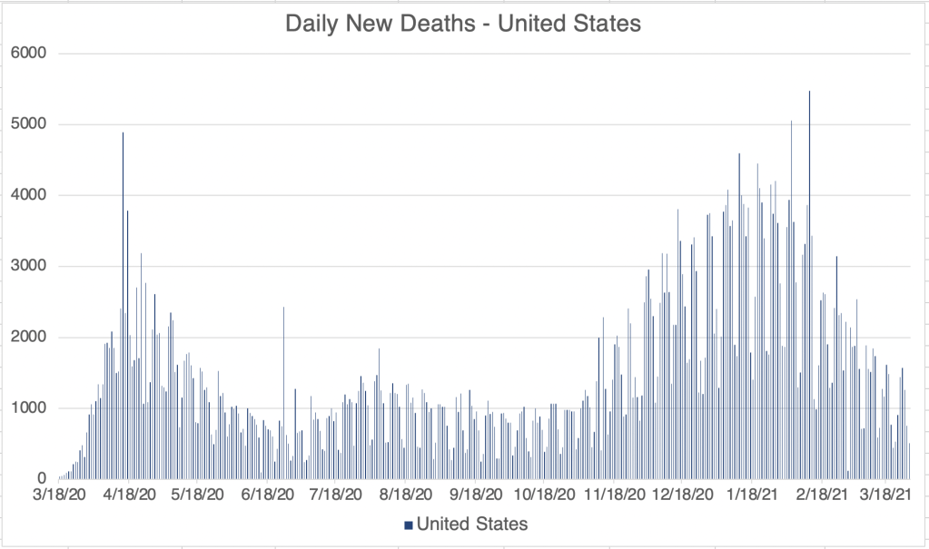
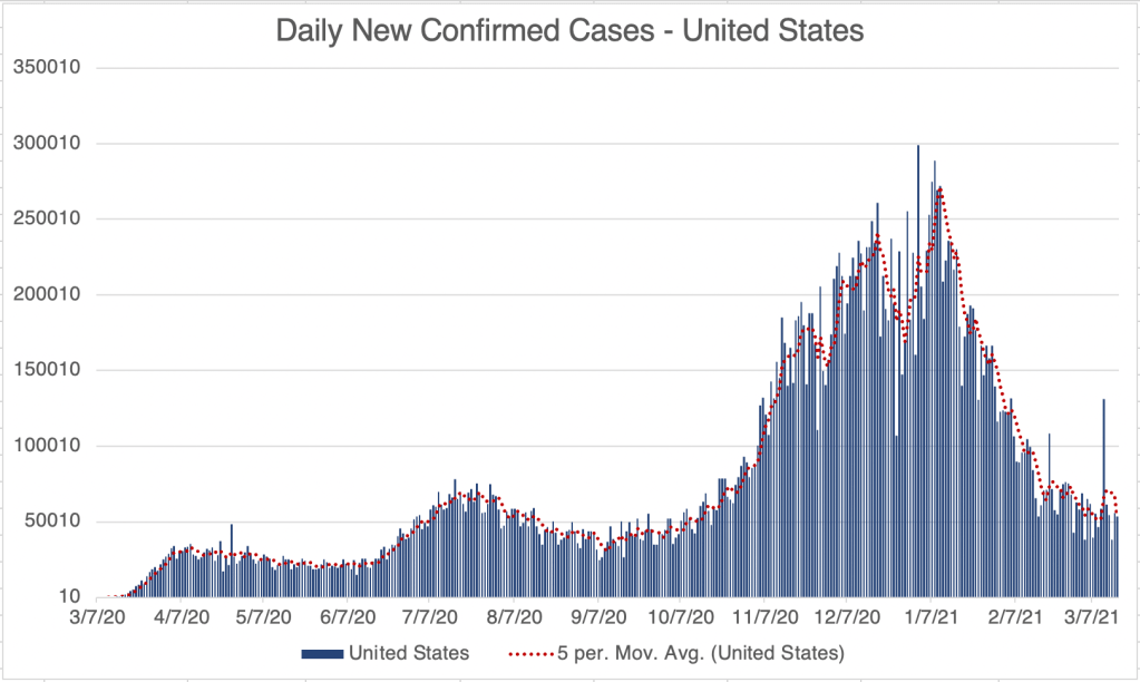
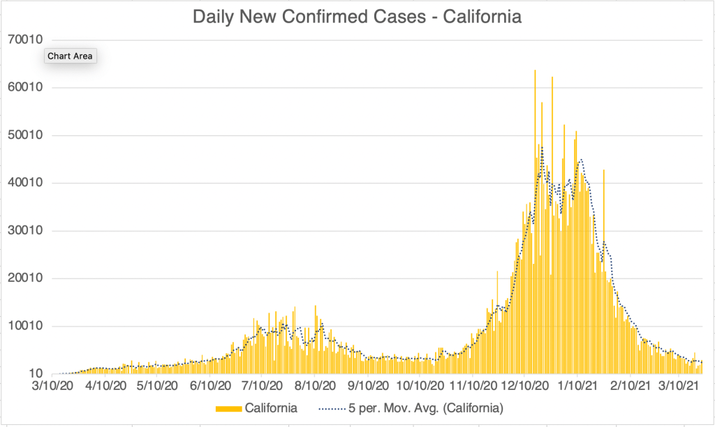
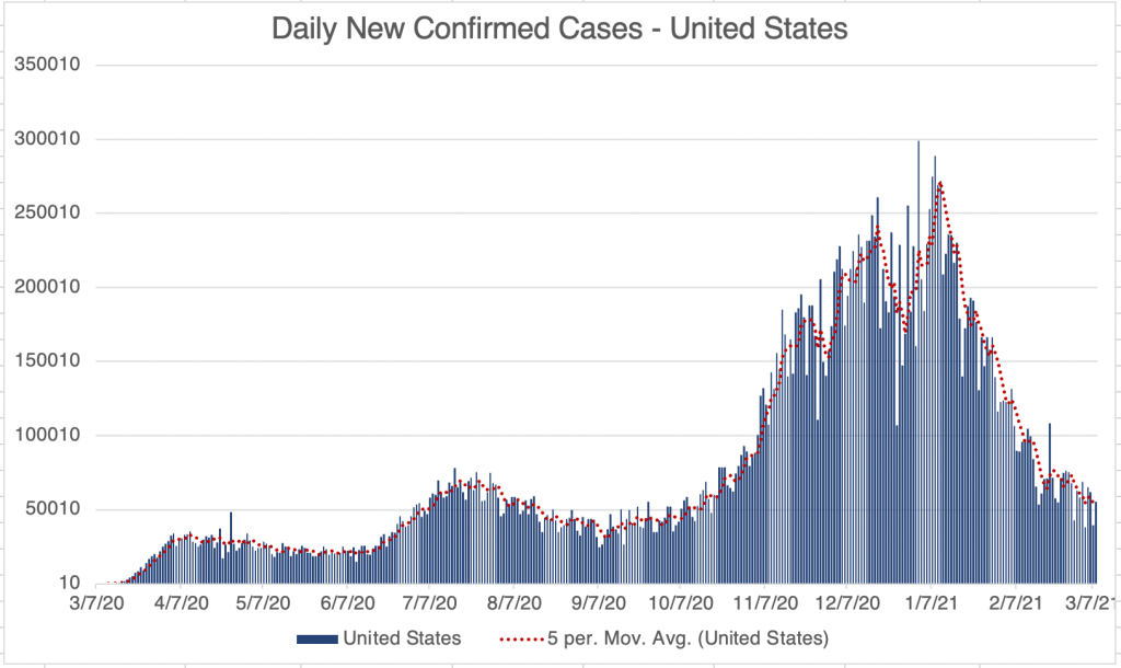
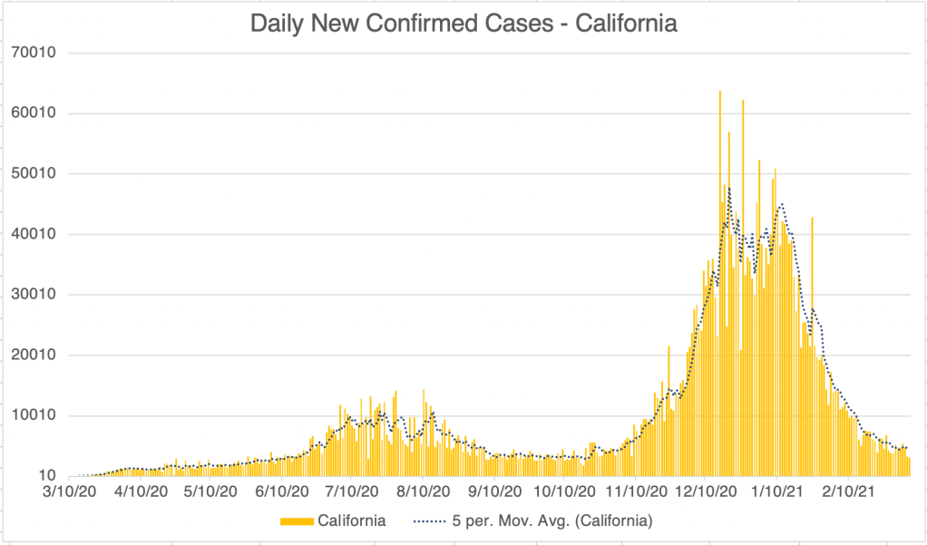
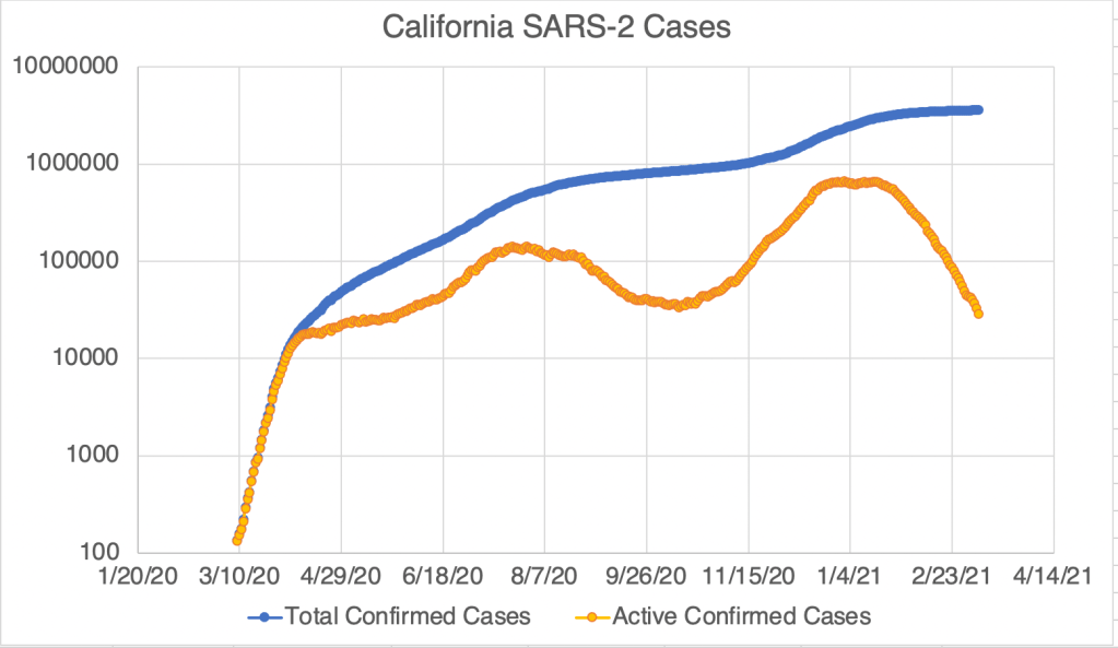
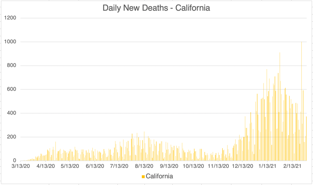
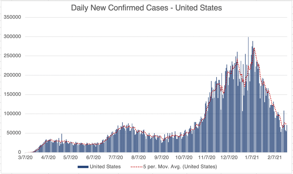
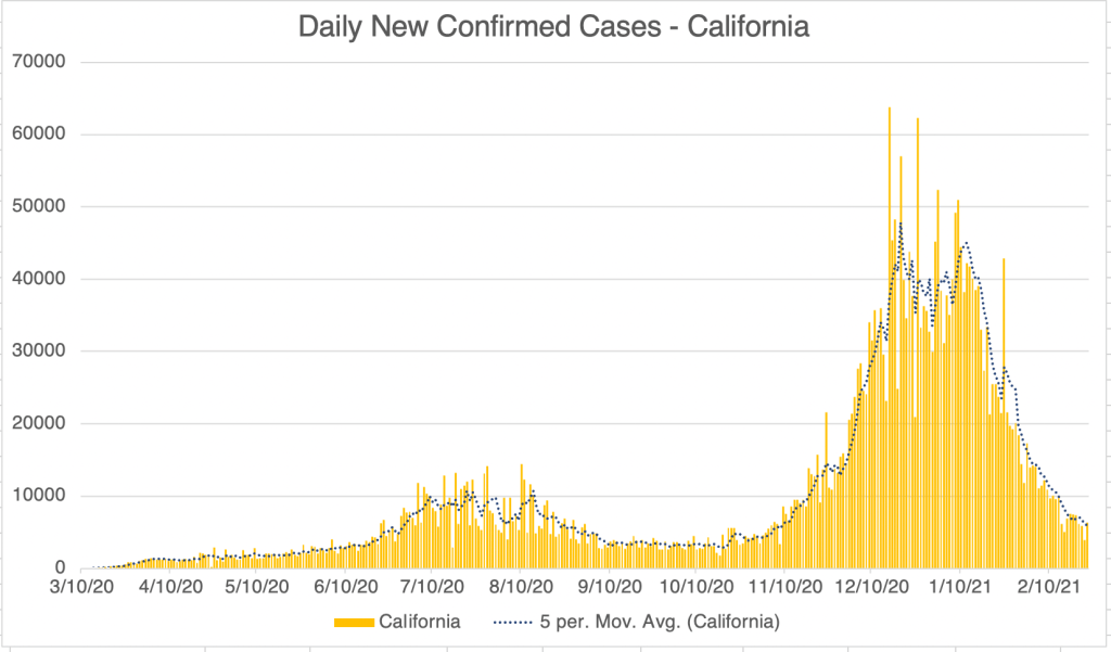
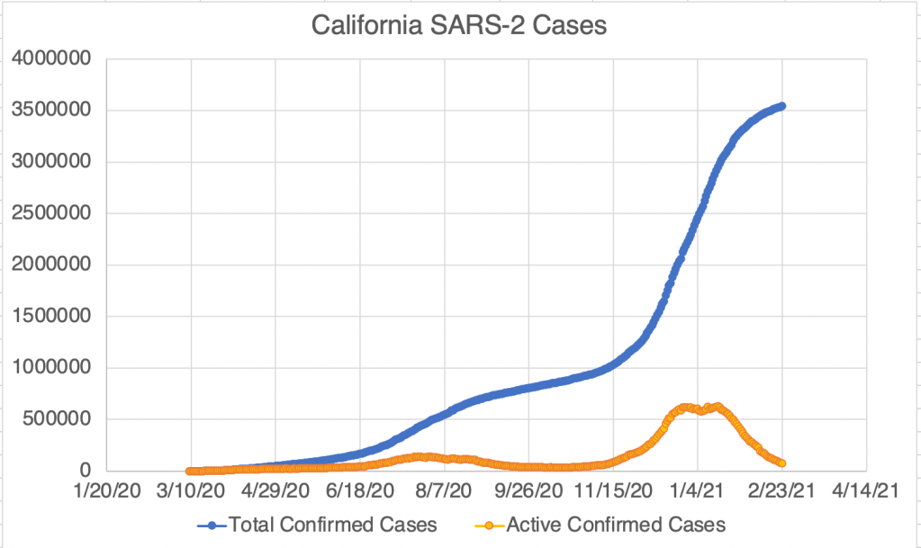
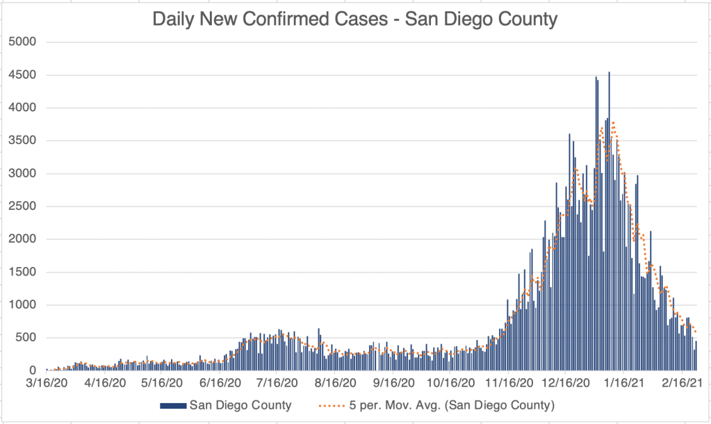
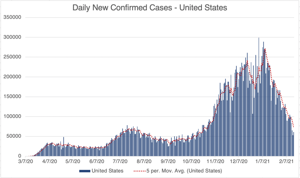
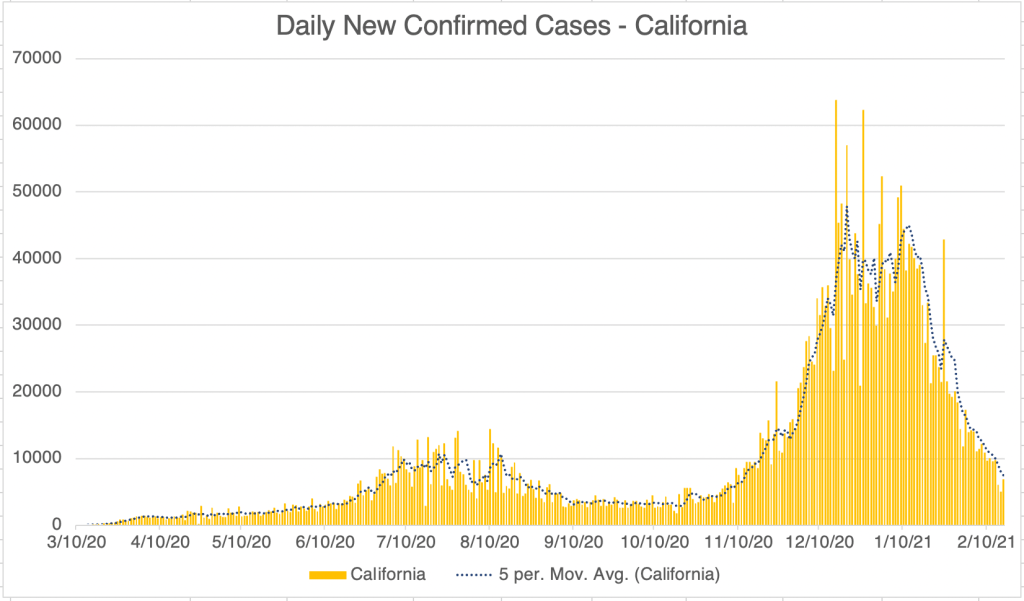
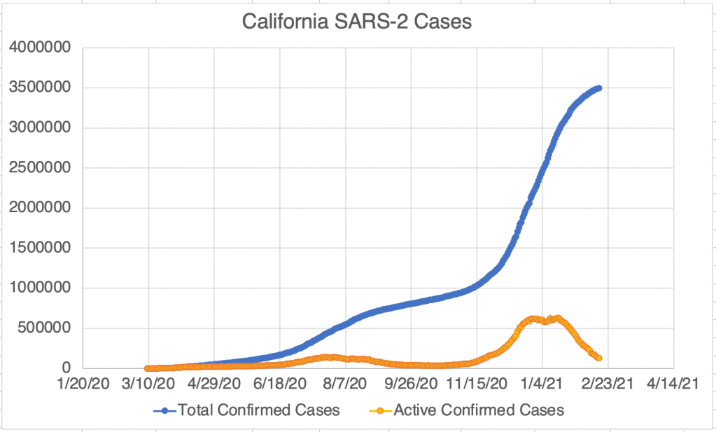
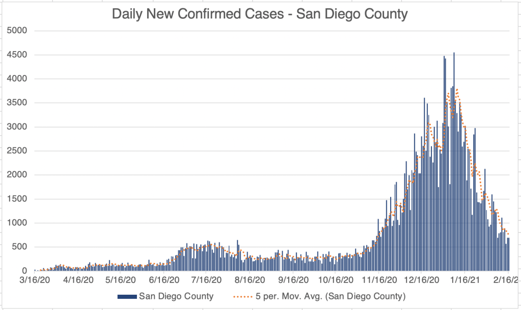
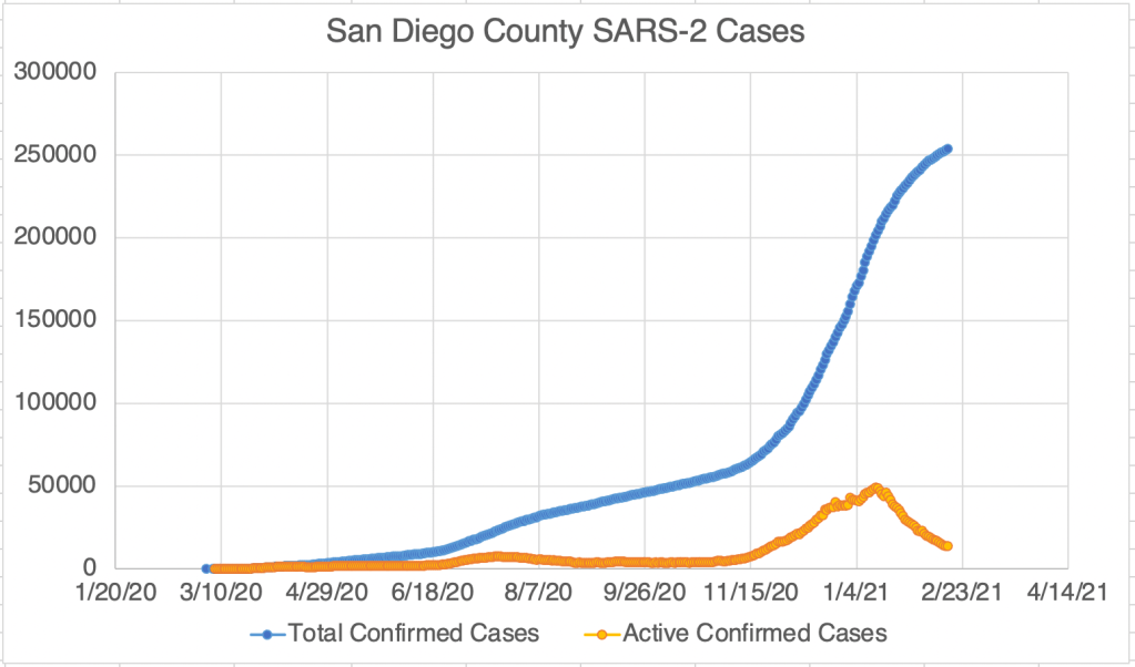
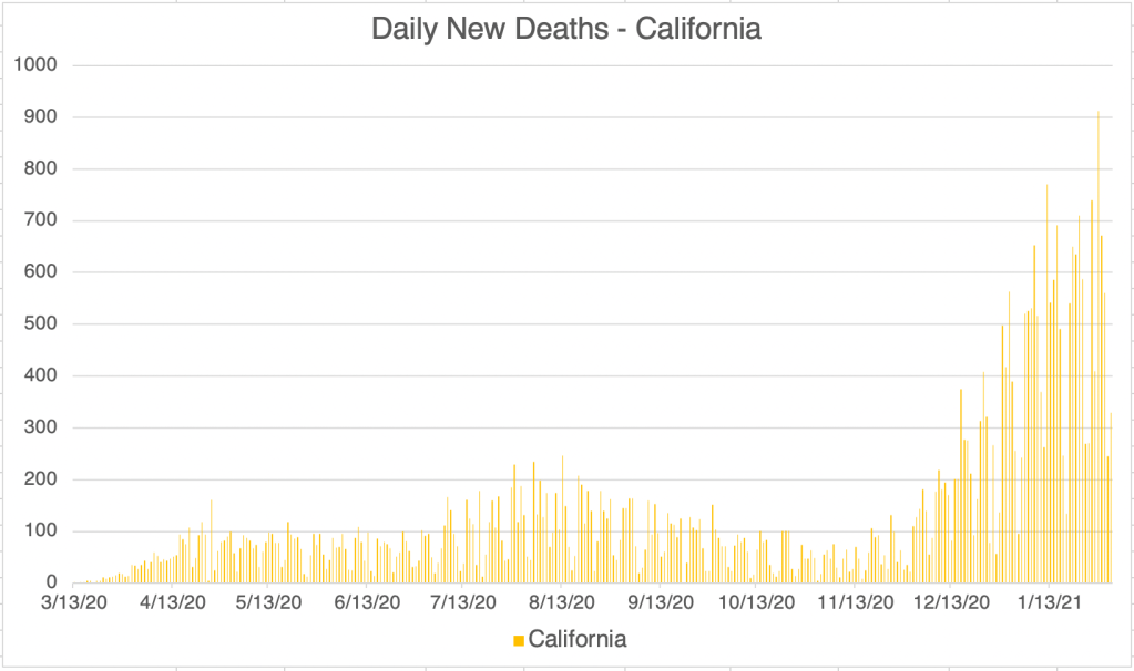
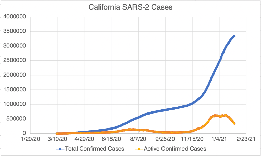
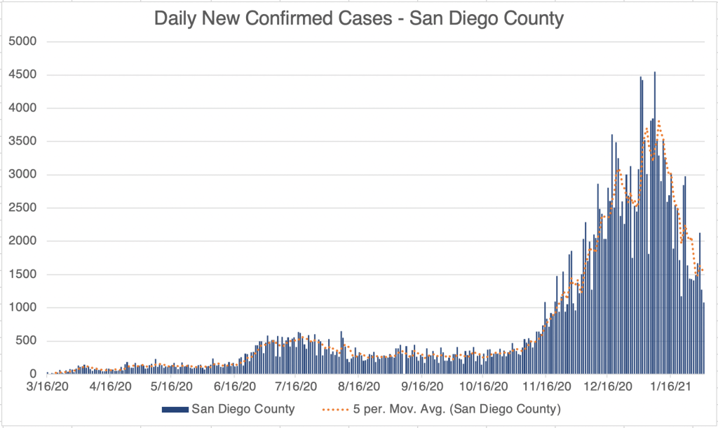
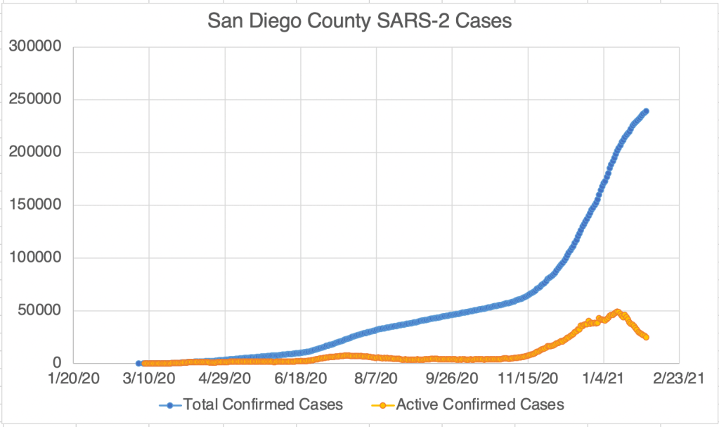
Of course, the debate on several COVID related topics have become politicized, which can make it difficult for scientists to do good work, and often VERY difficult for lay people to know the truth. I feel for you. It can be really difficult for folks to figure out what’s true about something that’s not in their field.  I feel the same way about climate change, an important topic of frequent debate that’s not in my field.  Don’t feel dumb if you have trouble figuring out what’s going on.  Lots of folks are abusing science, trying to make you agree with them.  Hopefully I’ve given you a few tips on how to discover the truth.  Here’s an article on how to communicate scientific things!

Don’t fear, but be smart,
Erik

Case Update, March 17th, 2021; Still higher new case numbers than Wave 1?

This is a case update. New cases continue to fall for the US, California, and San Diego. There was a spike in cases for the US on March 8th. At the same time, there is a spike in cases in most counties in Missouri. The spike was so consistent across the state, and stops on every nearby state line, that my suspicion is that this represents a reporting problem rather than actual new cases in every county in the state. Sometimes labs or public health departments don’t report on time and allow new case reports to stack up. When they finally report the results, it looks like a big outbreak. I can’t prove that this happened in Missouri, but it’s my suspicion. I couldn’t find any news about this phenomena, and the Missouri state health department shows no spike in cases during this time.

Graph is by me, from data collected from Johns Hopkins University COVID site.
Endcoronavirus County Level Map, March 16th, 2021
Endcoronavirus State Level Data, March 17th, 2021.

My total case number graph for California assumes that patients recover after 17 days. But today’s number gives a unbelievably low 6500 active cases in California. California doesn’t report recovered cases, so I’ve been using San Diego Counties numbers and extrapolating an estimate for California. Right now, San Diego’s reported recovered numbers suggests a 22 day recovery time instead of 17. If you use 22 days for California, current active cases for California is 28,000. This is why I tell you exactly how I get my information, so if it’s wrong or suspicious, you can decide for yourself if you believe my source.

Graph is by me, from data collected from Johns Hopkins University COVID site.
Graph is by me, from data collected from Johns Hopkins University COVID site. “Active Confirmed Cases” numbers are calculated based on the assumption that patients confirmed to have SARS-2 virus at least 17 days ago have recovered. Given this criteria, the active cases are crazy low right now, probably too low to be real.
Graph is by me, from data collected from Johns Hopkins University COVID site. “Active Confirmed Cases” numbers are calculated based on the assumption that patients confirmed to have SARS-2 virus at least 17 days ago have recovered. If I change this assumption to 22 days for the last few weeks, matching the estimate from San Diego County, active cases in California is 28,000.
Graph is by me, from data collected from San Diego County Public Health. See also regularly updated slides from SD County.
Graph is by me, from data collected from San Diego County Public Health. See also regularly updated slides from SD County. “Active Confirmed Cases” numbers are reported by San Diego County. Because our new active case numbers are getting low, I’ve switched to a logarithmic view. This emphasizes small values and makes them easier to see. Notice that the case number on the left now go up 10 fold with each higher line on the graph.

Still more than in Wave 1? For the last few weeks, I’ve been saying that while our numbers are getting really low, the numbers are still higher than in Wave 1 from last April. A friend pointed out that last Spring we weren’t really testing much, so maybe the cases were higher. That’s an excellent point and absolutely true. In fact I have several friends that were really sick during the Winter of 19/20, some after spending time with friends or family from Asia. So yes, there may have been far more cases last Spring than we know.

Don’t fear, but be smart,
Erik

Case Update: March 10th, 2021

This is a brief case update. New confirmed case numbers are continuing to drop for the US, California, and San Diego County. After a pause, numbers for the US are improving again. For all three regions, numbers are at or near the pre-wave 3 levels, but these are still higher than wave 1, so we still need significant improvement. Notice that the active cases for California are now below the trough between waves 2 and 3.

Graph is by me, from data collected from Johns Hopkins University COVID site.
Endcoronavirus County Level Map, March 10th, 2021
Graph is by me, from data collected from Johns Hopkins University COVID site.
Graph is by me, from data collected from Johns Hopkins University COVID site. “Active Confirmed Cases” numbers are calculated based on the assumption that patients confirmed to have SARS-2 virus at least 17 days ago have recovered. Because our new active case numbers are getting low, I’ve switched to a logarithmic view. This emphasizes small values and makes them easier to see. Notice that the case number on the left now go up 10 fold with each higher line on the graph.
Graph is by me, from data collected from San Diego County Public Health. See also regularly updated slides from SD County.
Graph is by me, from data collected from San Diego County Public Health. See also regularly updated slides from SD County. “Active Confirmed Cases” numbers are calculated based on the assumption that patients confirmed to have SARS-2 virus at least 17 days ago have recovered. Because our new active case numbers are getting low, I’ve switched to a logarithmic view. This emphasizes small values and makes them easier to see. Notice that the case number on the left now go up 10 fold with each higher line on the graph.

Don’t fear, but be smart!
Erik

Case Update, March 3rd, 2021; When will the Pandemic be Over, New Variants and Vaccines

This is a case update.  I’ll also talk about when the pandemic may be considered “over”, and briefly discuss the new SARS-2 variants.

For the US, the downward trend in new cases has paused.  New cases have been steady for the past 2 weeks.  The daily new cases continue to be higher than the first wave, and almost as high as for the second wave this summer.  The new case map from endcoronavirus shows recovery, but this particular map only shows changing trends.  The small number of counties in red may be misleading, because many of these counties are rural, so represent very few actual cases.  If you look at the top 10 counties for new cases in the country, there is still a significant number of new cases in several counties.

Graph is by me, from data collected from Johns Hopkins University COVID site.
Endcoronavirus County Level Map, March 3rd, 2021

We continue to see a downward trend in California and San Diego County. However, the new case numbers remain higher than they were during the 1st wave.  

Graph is by me, from data collected from Johns Hopkins University COVID site.
Graph is by me, from data collected from Johns Hopkins University COVID site. “Active Confirmed Cases” numbers are calculated based on the assumption that patients confirmed to have SARS-2 virus at least 17 days ago have recovered.
Graph is by me, from data collected from San Diego County Public Health. See also regularly updated slides from SD County.
Graph is by me, from data collected from San Diego County Public Health. See also regularly updated slides from SD County. “Active Confirmed Cases” numbers are calculated based on the assumption that patients confirmed to have SARS-2 virus at least 17 days ago have recovered.

When will this be over?  The 3rd wave this Fall and Winter is winding to a close, which makes many speculate on when the pandemic will be over.  I’m going to speculate on this, and what criteria we may use to determine this, but remember that I am not a physician or epidemiologist.  This is my informed but not expert opinion.  I am a molecular biologist specializing in infectious disease testing.

The most significant event happening right now that will impact the progress of the pandemic is the ongoing vaccination program going on in the US. We are currently into Phase 1B, vaccination of all individuals over 65. If you are over 65, I encourage you to consider vaccination.  Check in with your local health department to find out how you can be vaccinated.  You know I have some concerns about the ADE issue, but on balance, those over 65 will almost certainly benefit from the vaccination despite these concerns. As more vulnerable people are vaccinated, we will continue to see a drop in new cases, as well as a further drop in severe symptoms and mortality. Soon, we will enter Phase 1C, in which anyone over 16 with COVID risk factors will be able to receive the vaccine. 

Once everyone who is vulnerable has been vaccinated, this may rightfully be considered the “end” of the pandemic in the minds of many.  We should also pay attention to the number of COVID deaths. In order for the pandemic to be considered truly over, the number of deaths must be very low as well. I’m not willing to speculate yet on exactly what “very low” means.  Keep in mind also that many other countries do not yet have the vaccine, so vaccination in the US alone will not end a global pandemic!  Even after the epidemic in the US is over, travel to and from other countries may still be restricted.

Graph is by me, from data collected from Johns Hopkins University COVID site.

Variants: We have seen several SARS-2 variants arise over the last few months.  Most of these variants have made the virus more infectious but not more pathogenic.  This is because they alter the Spike protein, the viral protein that is used to infect our cells.  This is also the protein that the immune system, and the vaccines, target to neutralize the virus.  However, the vaccines currently in use appear to still work on most variants.  The exception to this is the South African variant (501.V2) which some suggest may evade the current vaccines.  Concerns about this are strong enough that Moderna is currently working on a vaccine against 501.V2.  This variant is already present in many countries, including the US.

The Second Shot: I haven’t been vaccinated yet, but I’ve heard several accounts of people feeling significant flu like symptoms after their second COVID vaccination. It’s actually not unusual to have flu like symptoms after a vaccination. Flu like symptoms are your body’s normal response to an invasion and many of the symptoms we experience are designed to help you fight an infection. That’s why so many infectious diseases produce “flu-like symptoms”. So unless your symptoms are severe, or your fever is over 102°, you don’t need to get medical attention. If you are prone to allergic reactions after a vaccine, inform your healthcare provider before you get one.

So we have lots of good news, but we need to continue to be diligent!

Don’t fear, but be smart!
Erik

Case Update, February 24th, 2021

This is a brief case update. Case numbers continue to drop in the US, California, and San Diego County. There was a small outbreak in Iowa this week. Numbers are low enough generally right now that we can see outbreaks in particular places!

Graph is by me, from data collected from Johns Hopkins University COVID site.
Endcoronavirus County Level Map, February 24th, 2021
Graph is by me, from data collected from Johns Hopkins University COVID site.
Graph is by me, from data collected from Johns Hopkins University COVID site. “Active Confirmed Cases” numbers are calculated based on the assumption that patients confirmed to have SARS-2 virus at least 17 days ago have recovered.
Graph is by me, from data collected from San Diego County Public Health. See also regularly updated slides from SD County.
Graph is by me, from data collected from San Diego County Public Health. See also regularly updated slides from SD County. “Active Confirmed Cases” numbers are calculated based on the assumption that patients confirmed to have SARS-2 virus at least 17 days ago have recovered.

For those of you in the testing field, reported SARS-2 tests dropped below 1 million tests yesterday.

Graph is by me, from data collected from Johns Hopkins University COVID site. This graph shows reported tests. Laboratories are currently required to report both to the ordering physicians and also report positives (without identifying information) to the CDC as well as county and state public health. Some labs have been late reporting to public health, which is why you see some days which have either a very high or very low number of tests.

Don’t fear, but be smart,
Erik

Case Update: February 18, 2021

Here’s a short COVID update. New confirmed cases numbers continue to drop for the US, California, and San Diego County. Endcoronavirus show the central part of the country mostly under control, with just a few counties with increasing case numbers. And as a bonus, we didn’t have a Superbowl related bump in cases! Wave 3 is almost over! But we still have significant cases, so continue to be diligent!

Graph is by me, from data collected from Johns Hopkins University COVID site.
Endcoronavirus County Level Map, February 18th, 2021
Graph is by me, from data collected from Johns Hopkins University COVID site.
Graph is by me, from data collected from Johns Hopkins University COVID site. “Active Confirmed Cases” numbers are calculated based on the assumption that patients confirmed to have SARS-2 virus at least 17 days ago have recovered.
Graph is by me, from data collected from San Diego County Public Health. See also regularly updated slides from SD County.
Graph is by me, from data collected from San Diego County Public Health. See also regularly updated slides from SD County. “Active Confirmed Cases” numbers are calculated based on the assumption that patients confirmed to have SARS-2 virus at least 17 days ago have recovered.

On a short non-scientific note, support local businesses whenever possible! Lots of people, including me, have been shopping at the big boxes instead of small businesses which are really hurting, so shop at small businesses as your local regulations allow!

Don’t fear, but be smart!
Erik

Case Update: February 10th, 2021

This is a case update. New case numbers continue to plummet for the US, California, and San Diego County. New case numbers are now similar to those in early November. Obviously, the number are still not zero, so we still have work to do, but we have good news. As an interesting side note, the endcoronavirus map of new cases reveals a little pocket of new cases spreading out from Austin, Texas! Other parts of the country are generally improving, and the central part of the country is doing particularly well.

Graph is by me, from data collected from Johns Hopkins University COVID site.
Endcoronavirus County Level Map, February 10th, 2021
Graph is by me, from data collected from Johns Hopkins University COVID site.
Graph is by me, from data collected from Johns Hopkins University COVID site. “Active Confirmed Cases” numbers are calculated based on the assumption that patients confirmed to have SARS-2 virus at least 17 days ago have recovered.
Graph is by me, from data collected from San Diego County Public Health. See also regularly updated slides from SD County.
Graph is by me, from data collected from San Diego County Public Health. See also regularly updated slides from SD County. “Active Confirmed Cases” numbers are calculated based on the assumption that patients confirmed to have SARS-2 virus at least 17 days ago have recovered.
Graph is by me, from data collected from Johns Hopkins University COVID site. This graph shows reported tests. Laboratories are currently required to report both to the ordering physicians and also report positives (without identifying information) to the CDC as well as county and state public health. Some labs have been late reporting to public health, which is why you see some days which have either a very high or very low number of tests.

Of course, we just had the Superbowl, which I count as an American cultural holiday. We may have had some new infections associated with gathering in peoples homes. If so, we may start to see numbers coming up starting on Friday or Saturday. After Thanksgiving and Christmas, new cases started to increase a little less than a week afterward.

During the year, we’ve seen testing capacity come up slowly but steadily from just a few hundred a day when the CDC was trying to do all the testing themselves in March, to around 1.5 to 2 million per day in December ’20 and January ’21. Now that new cases are starting to come down, testing is just starting to head down as well. If you are a medical professional, especially in testing, you may begin to find it easier to buy pipette tips in the next month! We can only hope!

Don’t fear, but be smart!
Erik

Case Update: February 2nd, 2021; New Variant CAL.20C

This is a case update, and I’ll also talk about a new SARS-2 Variant, CAL.20C. New confirmed cases continue to drop in the US, California, and San Diego County. New cases are now at about the same level as they were in late November or early December. This is great news of course, but there are still lots of actively infected people around, especially in Southern California. So continue to be diligent!

Graph is by me, from data collected from Johns Hopkins University COVID site.
Endcoronavirus County Level Map, February 2nd, 2021
Graph is by me, from data collected from Johns Hopkins University COVID site.
Graph is by me, from data collected from Johns Hopkins University COVID site. “Active Confirmed Cases” numbers are calculated based on the assumption that patients confirmed to have SARS-2 virus at least 17 days ago have recovered.
Graph is by me, from data collected from San Diego County Public Health. See also regularly updated slides from SD County.
Graph is by me, from data collected from San Diego County Public Health. See also regularly updated slides from SD County. “Active Confirmed Cases” numbers are calculated based on the assumption that patients confirmed to have SARS-2 virus at least 17 days ago have recovered.

CAL.20C: You may have heard of a new strain of SARS-2 circulating in the LA area. CAL.20C was first discovered in July, but then was undetected for many months until October. By December, it represented 25% of new cases in the LA area, and was spreading to other locations. Like most of the new variants, CAL.20C is more infectious than previous versions, but does not appear to be more pathogenic. All viruses have a tendency, over the course of years or decades, to become more infectious and less pathogenic, and SARS-2 seems to be following this pattern as well.

Don’t fear, but be smart!
Erik

Case Update, January 27th, 2021, Anaphylactic Shock in 0.0011% of Vaccine Recipients

This is a case update. I’ll also briefly discuss some cases of anaphylactic shock in some vaccine recipients. The US, California, and San Diego County are all experiencing a continuing decrease in new confirmed cases! The center of the country seems to mostly have recovered from the 3rd wave according to endcoronavirus, and the coasts are improving as well.

Graph is by me, from data collected from Johns Hopkins University COVID site.
Endcoronavirus County Level Map, January 25th, 2021
Graph is by me, from data collected from Johns Hopkins University COVID site.
Graph is by me, from data collected from Johns Hopkins University COVID site. “Active Confirmed Cases” numbers are calculated based on the assumption that patients confirmed to have SARS-2 virus at least 17 days ago have recovered.
Graph is by me, from data collected from San Diego County Public Health. See also regularly updated slides from SD County.
Graph is by me, from data collected from San Diego County Public Health. See also regularly updated slides from SD County. “Active Confirmed Cases” numbers are calculated based on the assumption that patients confirmed to have SARS-2 virus at least 17 days ago have recovered.

Anaphylactic shock in some patients: According to Paul Offit, in a YouTube interview (at 2:30 in the linked video), a number of vaccine recipients have experienced anaphylactic shock after being vaccinated. All vaccines carry some risk of this phenomena, but the COVID vaccines appear to produce this at about 11x the rate of the flu vaccines. This is about 11 patients per 1 million vaccinations, about 0.0011%. Dr. Offit thinks this allergic reaction is likely caused by Poly Ethylene Glycol (PEG), a component of many vaccines, also used in many other products, including Dr. Pepper!

The good news is that anaphylaxis is easily treatable using an epi-pen. If you are prone to allergic reactions, let your provider know before getting the vaccine.

Don’t fear, but be smart!
Erik