This is a weekly update, but I’ll also talk about apparent existing immunity in some people, reinfection, and the 2nd wave of cases and what this all may mean about Coronavirus strains.
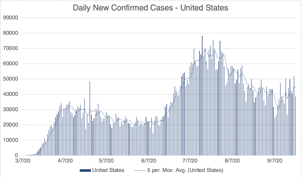
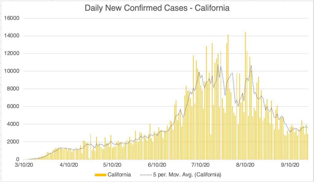
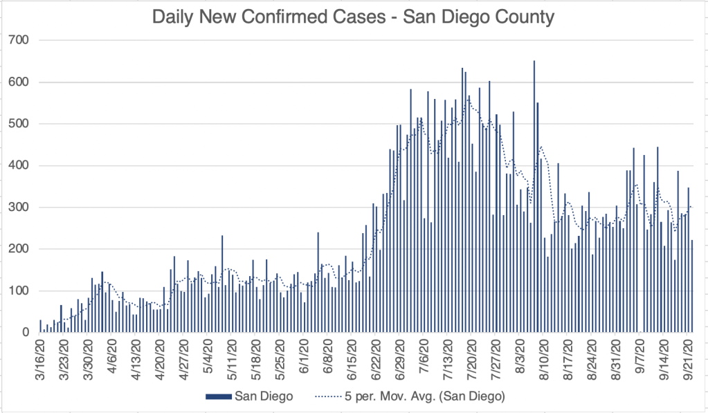
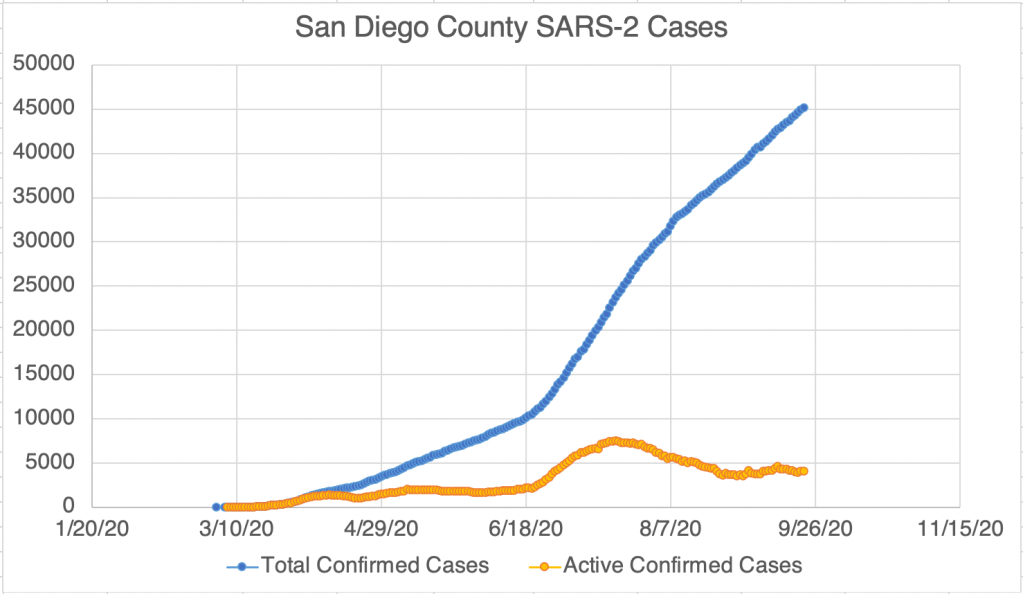
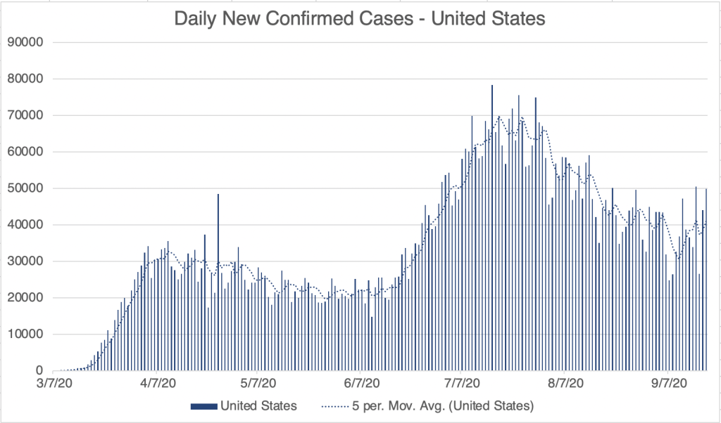
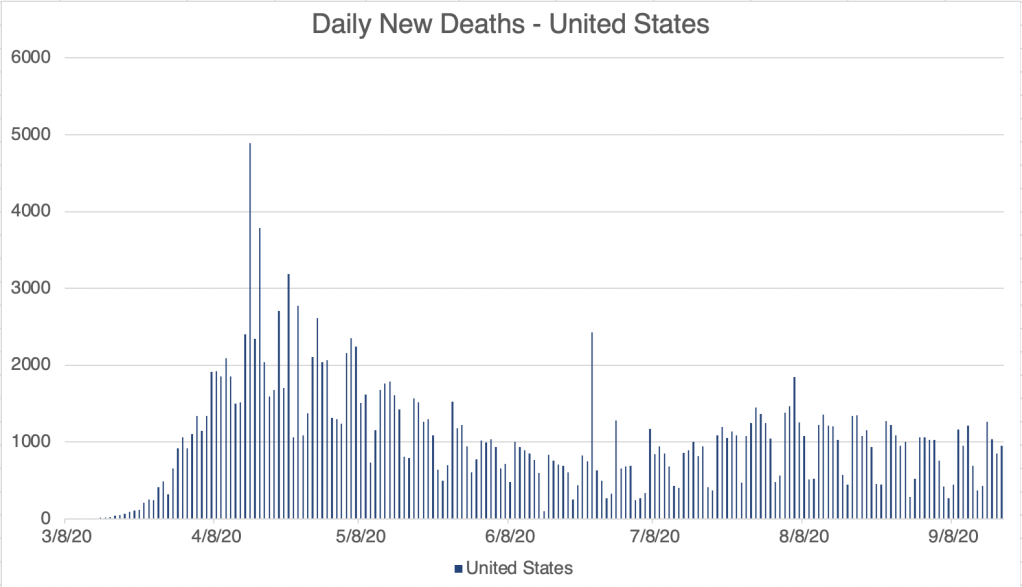
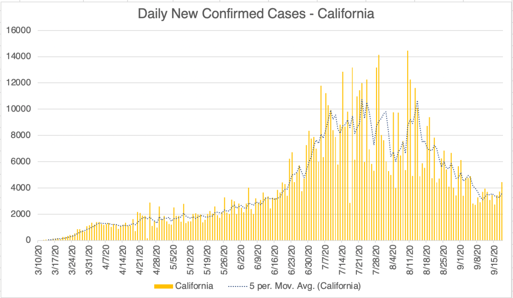
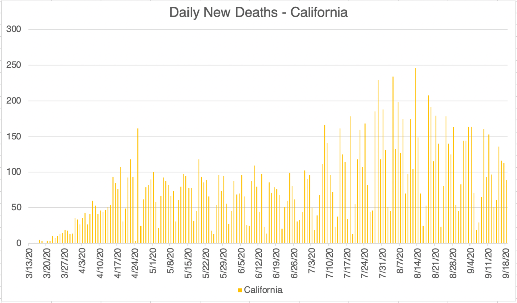
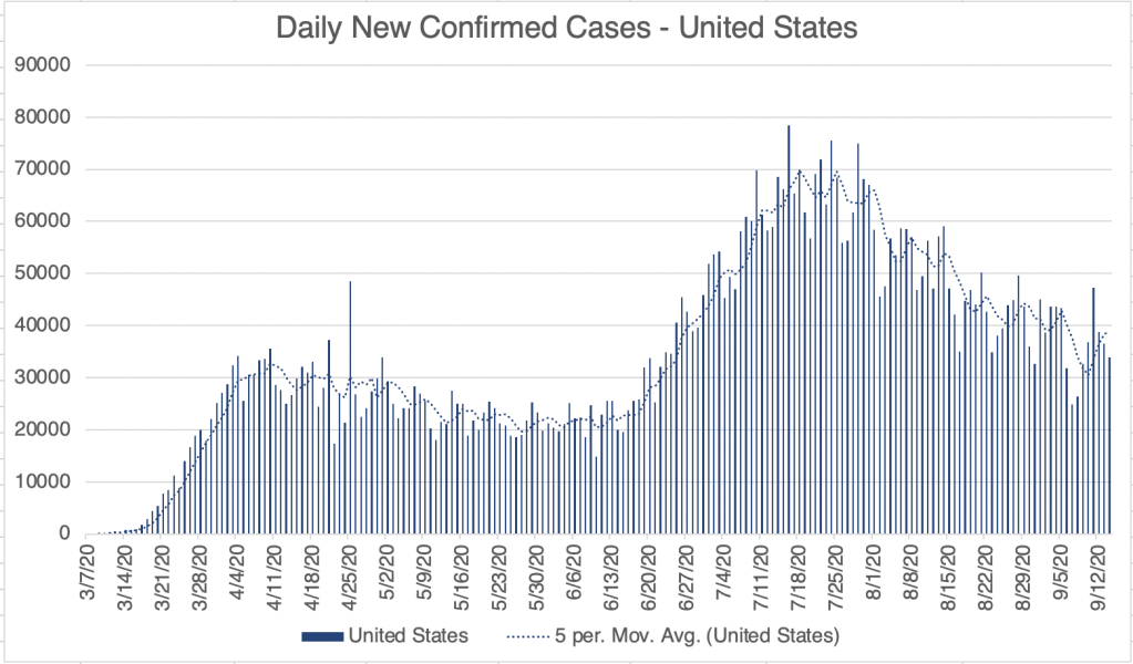
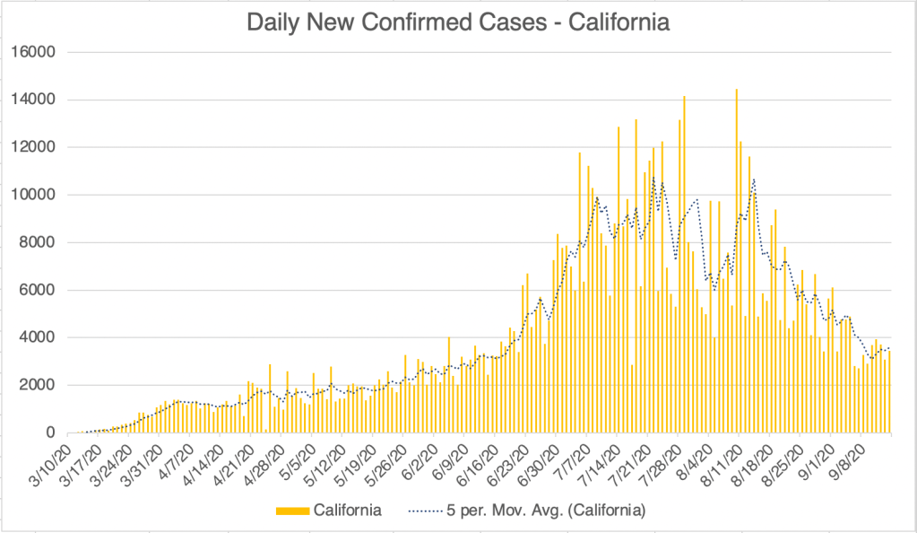
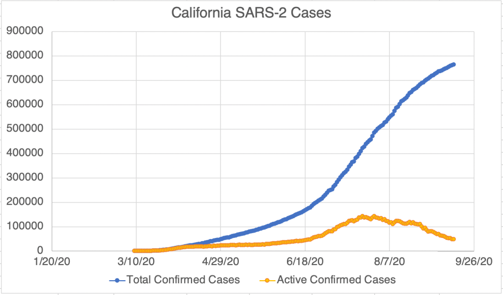
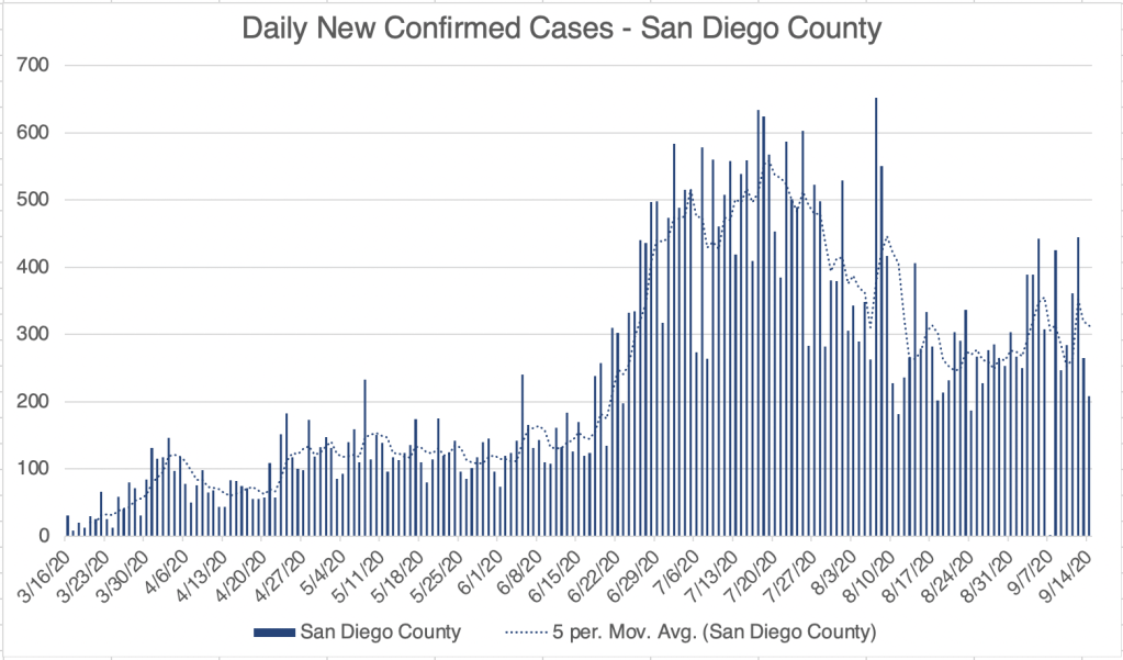
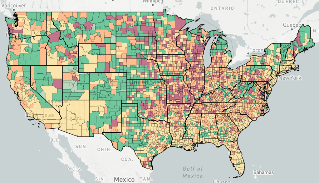
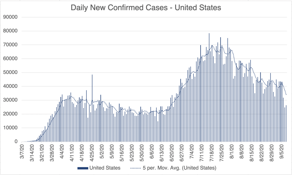
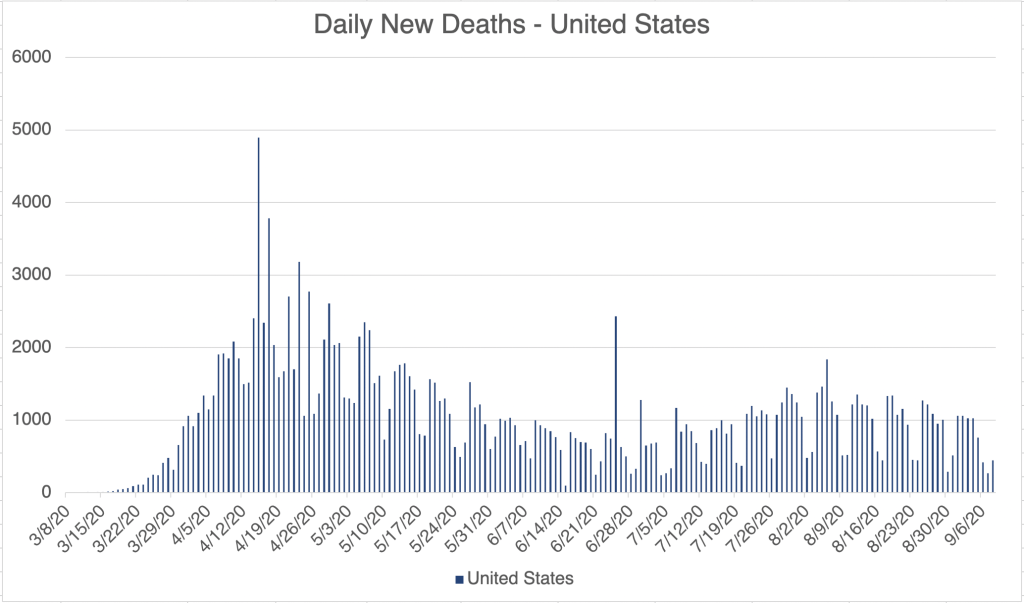
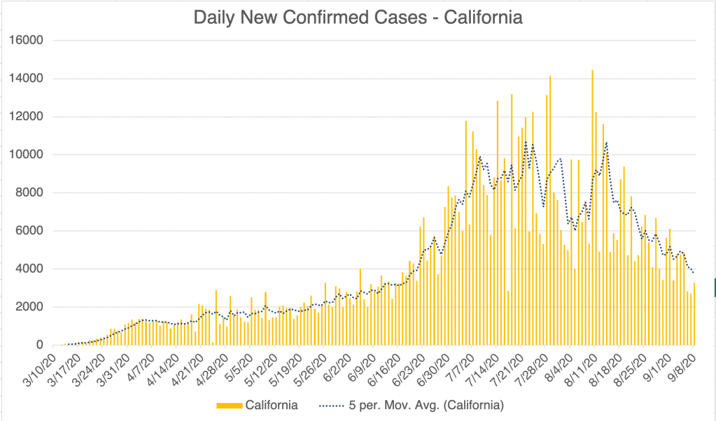
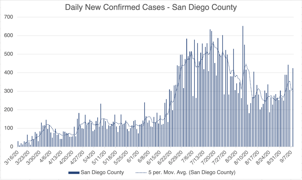
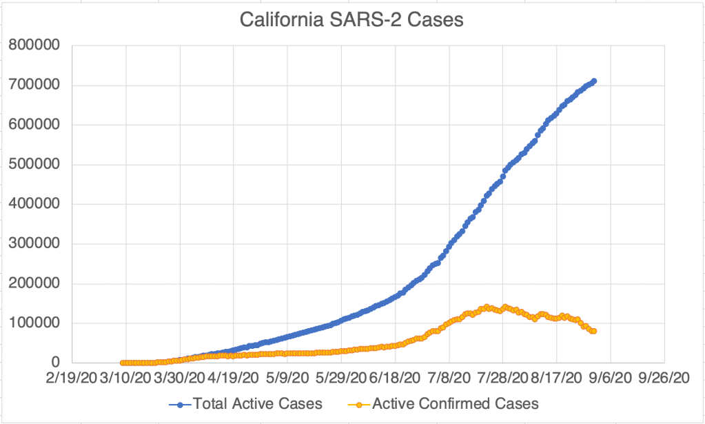
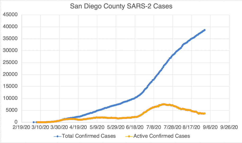
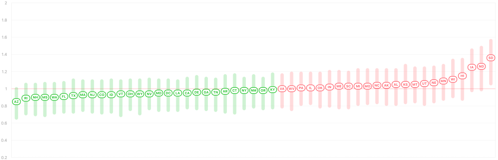
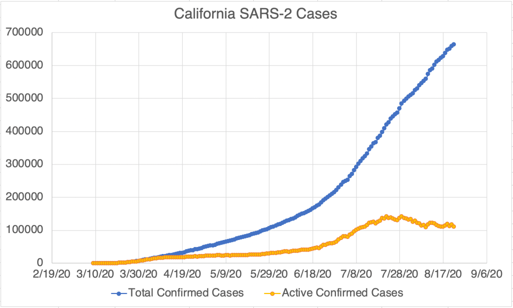
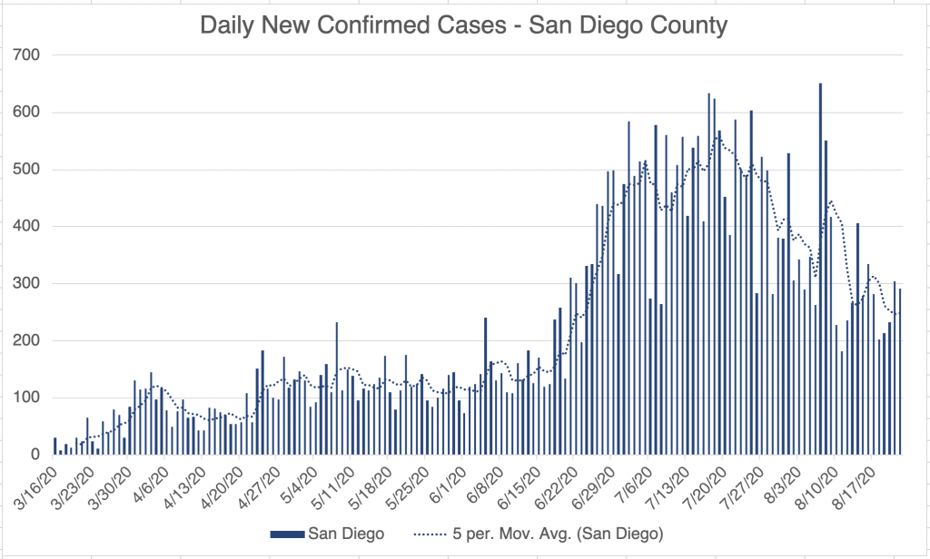
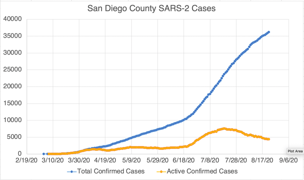
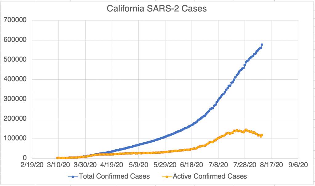
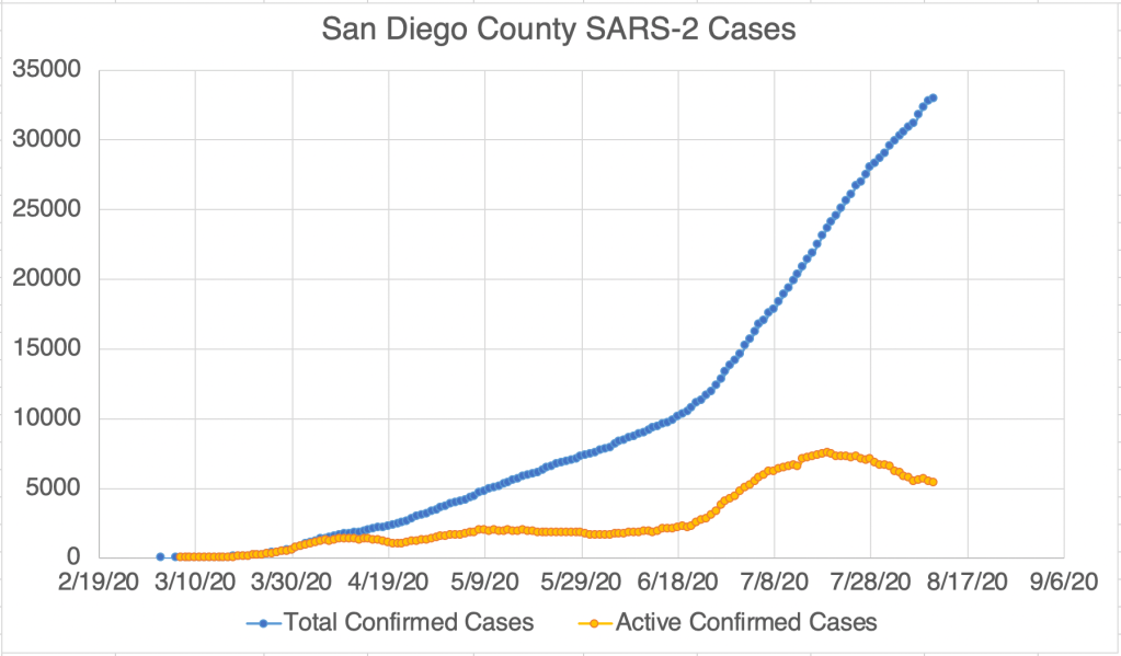
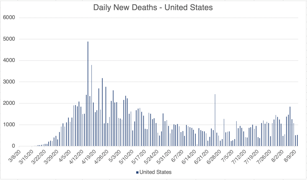
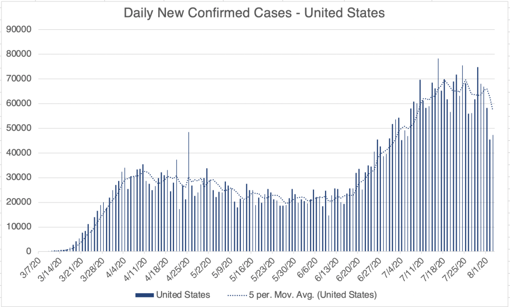
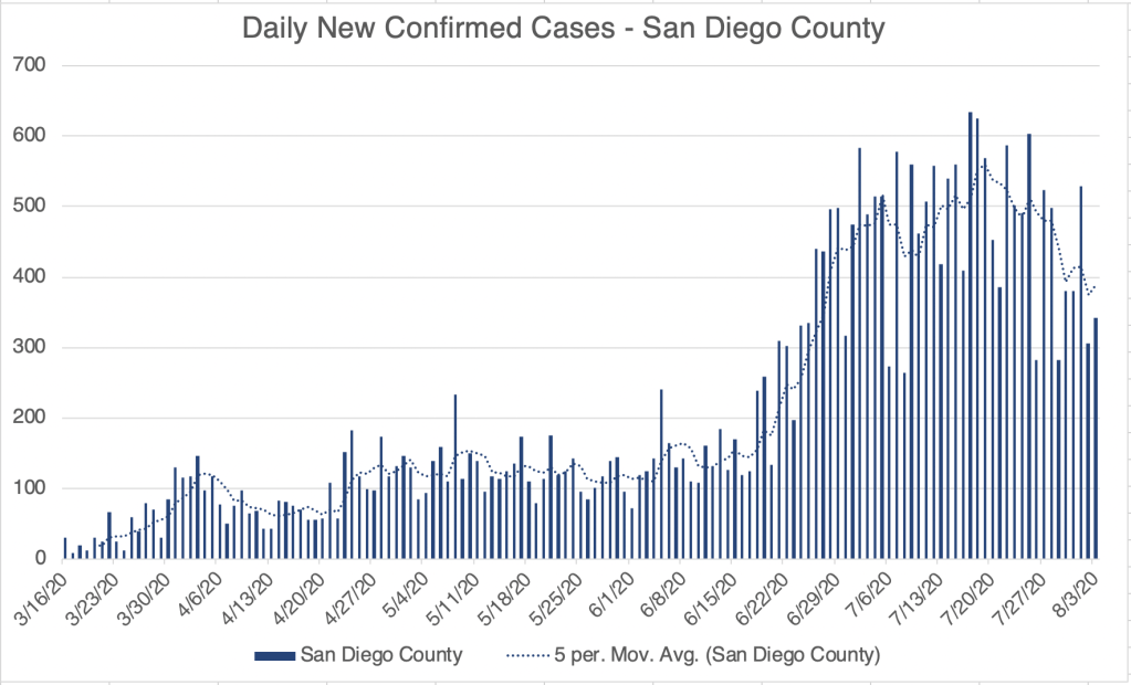
The 2nd wave of cases is apparently over in many places in the US, although not all. The US new confirmed case numbers have risen slightly in the past week. While the southern part of the country, California all the way for Florida, was the epicenter of cases for several weeks, new cases are primarily arising in the North Central part of the country. I might speculate that this might be related to the coming Fall weather, but of course it’s too early to say for now. The US also crossed a threshold of 200,000 total COVID deaths, outpacing a prediction I made several weeks ago that we would have 100 – 200 thousand deaths. California is back down to pre-2nd wave new case numbers, but is not sinking below that. In San Diego County, we had a small wave of cases related to a series of outbreaks at SDSU, but we’re back to a lower persistent new case rate.
Internationally, India now has the second most cases in the world, with 5.6 million cases as of this posting. Of course India’s very high population and densely packed cities are likely a contributing factor. Brazil and Mexico have managed to slow the rate of new confirmed cases, having peaked in late July. While things are improving in the US, many countries are experiencing first or second waves right now, including France, the UK, Israel, and Austria.
Existing Immunity: I’ve resisted talking a lot about existing immunity because the information is complicated and may have phenomena with overlapping and opposing impacts. Also, I’m not an immunologist! Be aware that what I say next may change. There is data suggesting that the reason many, especially children, are asymptomatic is that there may be some existing immunity to Coronavirus in those individuals. Coronaviruses is a large family of viruses which includes the SARS and MERS viruses, but also several viruses that cause the common cold. As such, many may already have some kind of immunity to Coronaviruses as a group. This is good news of course.
Reinfection: On the other hand, I listened to a story on the September 2nd episode of the Nature Podcast about several cases of SARS-2 reinfection. These cases appear to be rare, and most are not well studied. In one case in Hong Kong, however, both the 1st and 2nd strains which infected a patient were sequenced and were found to be different strains. This has several implications. It suggests that immunity to a single strain may persist at least for a few months, but also that several strains are circulating, and immunity may not apply to other stains.
If you’ve followed my page for long, you know that I’m concerned about Antibody Dependent Enhancement (ADE). In some cases of reinfection, symptoms were worse the second time, but in others, they were less severe. So unfortunately, these don’t necessarily provide clarity on whether ADE will be an issue, although if this is ambiguous now, it may be the issue will at least not be as serious as I feared. We’ll have to see more of these cases to know for sure.
Strains and Vaccines: I’ve written about the D614G strain that arose in April and May. When I first heard about it, scientists were saying it may be several times more infectious than the already very infectious SARS-2. I suspect that the 2nd wave we saw in the US may have been so large partially because of this strain. All of this, as well as the reinfection story above, highlights that we have several strains moving around at once, and will likely have more. Like HIV and Flu, Coronaviruses are RNA viruses. RNA viruses use a RNA dependent polymerases to copy their genomes, and these enzyme tend to be VERY error prone as compared to DNA dependent polymerases. Because of this, RNA viruses mutate quickly, and are resistant to the use of vaccines. This is why we need a few Flu vaccine every year, and part of why we still don’t have a vaccine against HIV. This of course also complicates the prospect of a vaccine against SARS, along with concerns about ADE. I’ll keep you posted as I learn more.
Avast! This be Talk Like a Pirate Day! So if you be havin’ a question below, use your favorite dialect of the high seas!
The New England Journal of Medicine foisted a flag regardin’ mask wearin’. It appears masks reduce scurvy and COVID symptoms even in infected seafarers. This may be explainin’ why even with the large number of cases during the second wave, fatalities were low.
Friends, This is a virus update. I’ll also have a few comments regarding the recent Bob Woodward book. New confirmed cases continue to drop for the US, California, and San Diego. California new case numbers are back down to what they were before the 2nd Wave hit in mid June.
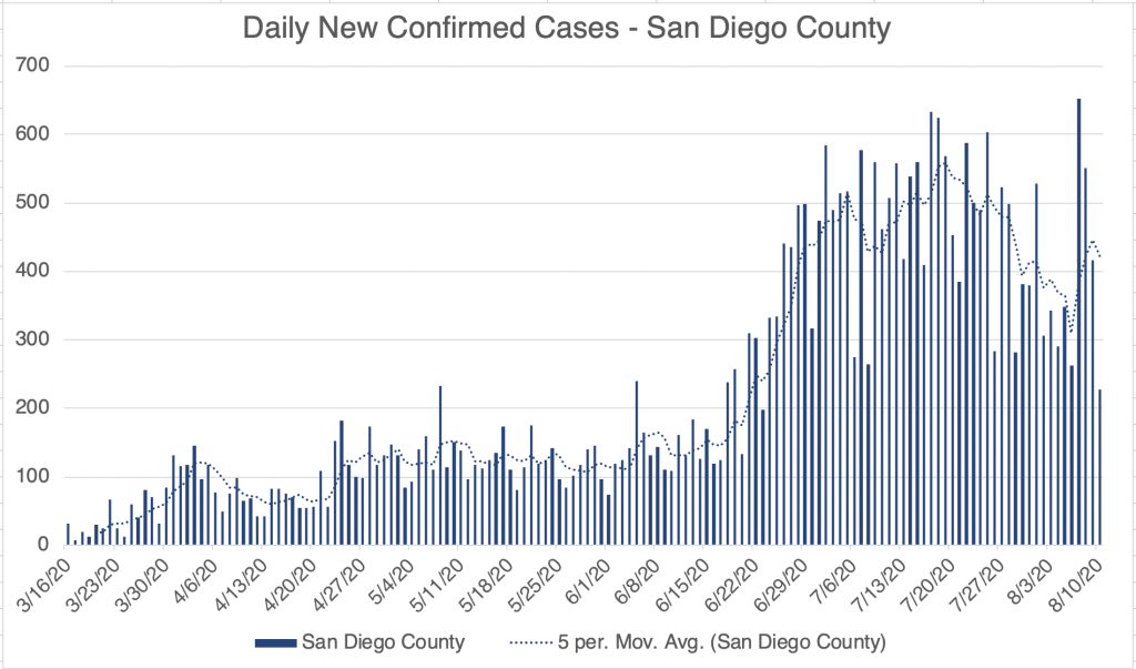
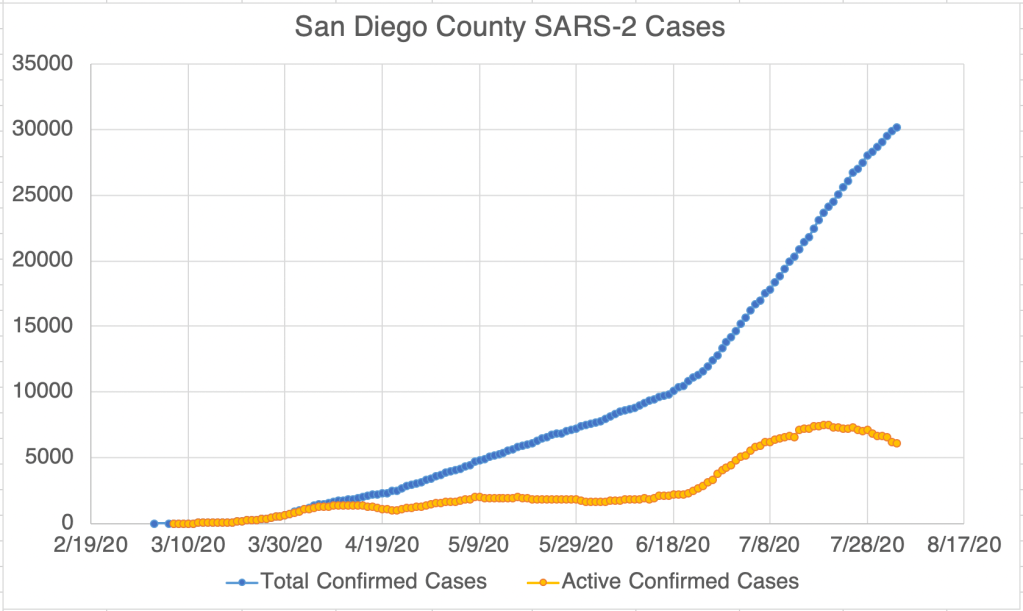
San Diego had a moderate sized outbreak at SDSU in the last few weeks which created a spike in new confirmed cases for the County, but those numbers are coming down as well.
Endcoronavirus.org’s county view map now shows mostly yellow across much of the South, including California, Arizona, Texas, Louisiana, and Florida, which was perhaps hardest hit by the 2nd Wave. It looks like that region is now recovering, and the Mid-West is now the region of greatest concern, with increasing numbers in many Mid-Western states.
Bob Woodward comments: If you’ve been reading my posts for long, you know that I try to keep these posts as politics free as possible, referring to policies, but not to people. You also know that my recommendations sometimes support those commonly from the “left” and sometimes from the “right”. I do my best to pass along the science as I see it, since I believe politics and science are terrible together.
If you’ve read my July 7th post, you know that a major concern of mine is Antibody Dependent Enhancement. This phenomena is still not discussed openly in the media, and the only other commentator I hear discussing it is Chris Martenson of the Peak Prosperity YouTube channel. Tony Fauci has mentioned it only in passing. I have been concerned about this phenomena since February when I started studying the SARS-2 virus.
Why did I wait until July to post about it? In any crisis, there are people who are anxious about it, they are the first to react, and some overreact. There are others who are unconcerned, and react slowly if at all. Many are somewhere in between. Anyone who communicates to the public has to aim somewhere in the middle of these perspectives. My goal from the beginning has been to communicate adequate concern while being as positive as possible and not cause the anxious to over-react. As I’m sure you’ve heard, there have been many mental health issues attached to recent events, and I have friends in the mental health field for whom this is a great concern. I struggled for a long time before my July 7th post. I wanted people to be adequately concerned, but I didn’t want to cause needless anxiety. The ADE phenomena is still poorly understood, and it’s not certain if it will play a roll in this crisis. I finally decided to discuss it because I had a lot of friends who I felt were not taking the virus seriously enough, and I began to feel it was wrong of me to not inform them. To this day, I wonder if I waited too long, or maybe shouldn’t have mentioned it when I did.
All this to say, Bob Woodward’s discussion with the President was in February, if my understanding is correct. In February, the virus had still not come to the US, except for a few small clusters. Little was still known about how it would behave in the US, and the opinion of medical professionals regarding how to deal with it has changed many times since then. If President Trump was wrong to downplay the virus in February, then I was wrong too. I hope you will have some understanding for the difficult decisions to be made.
The CDC continued to treat the virus like it has always treated epidemics somewhere else, deep into March. Only in Mid-March did they allow other entities to do SARS-2 testing in the US, responding to the President’s request. Large scale testing did not start until early April. In my opinion, the CDC is most responsible for reacting too slowly to the virus.
Friends, This is a case update from the last week. For the US and California, confirmed case numbers continue to improve. In San Diego, we seem to be having a small bump in cases right now, after a consistent fall since late July. My friend Brit Colanter who works at San Diego County Public Health tells me that there was an outbreak at SDSU in the last few weeks. 444 cases so far and 1 hospitalization.
I just got back from a trip to a hospital lab in Rochester, New York, helping them expand their COVID testing. As much as we can grumble about conditions here in California, they are even more strict in New York. New York has a quarantine program going for residents of some states, including California! I was required to check in with Contact Tracing every day, and stay in my hotel room when I wasn’t at the lab. So I was kind of under house arrest!
I have a new appreciation for Door Dash and other delivery people working out there today. So thanks to all of you who are working hard to bring needed items to those who can’t leave their house! You have important work right now!
Don’t fear, but be smart! Erik
PS. I’ve heard a rumor that many African nations are having official events to pray for the US. Many thanks to my African readers for your prayers. We certainly need them!
People have been asking me about a story that came out in the last few days about 94% of deaths having co-morbidities. The implication many have made is that most don’t really die from COVID, they die from something else, and they also happen to have COVID.It’s certainly true that contributing factors can make symptoms worse, and many of those with symptoms have another underlying issue. But I think it would be a mistake to think that this means COVID can be dismissed as no big deal. The fact is, the list of contributing factors is long, and includes the following:
age asthma or COPD heart conditions kidney conditions liver disease high blood pressure diabetes obesity auto-immune disease use of NSAID anti-inflammatory medications being immunocompromised (HIV infected, undergoing cancer treatment, under medication for a transplant) vitamin-D deficiency type A blood (Type O appears to be protective)
A lot of people are on this list, including me, since I have Celiac Disease, an auto-immune disease. Think of it this way. If someone dies because they got pushed in front of a train, did they die because of the train, or because someone pushed them? Well, both. Getting shoved generally doesn’t kill you, but it does if you get shoved into a train.COVID on it’s own may not be very deadly on it’s own, but it is in combination with a lot of other conditions.
The good news is, COVID is getting more survivable as treatment gets better, and also perhaps since people are getting exposed to lower viral loads because of mask wearing. We should be concerned, but not fearful, and we can also be optimistic that things are getting better!
I’ve also been asked by several people recently about a vaccine. You may remember my post about ADE, Antibody Dependent Enchancement. It’s a rare phenomena in which a virus can use an antibody against a previous infection to infect the immune system (link to my original post below). This can make a second infection much worse than the first. This only occurs with a small handful of viruses, but SARS, MERS, and likely SARS-2 are some of them. Because of this phenomena, I am suspicious of vaccines against SARS-2, and will wait to see what happens before I get one for myself, or recommend others do. I am not an anti-vaccine person in general! I have gotten the annual flu shot many times! But SARS-2 is different. If someone involved with the vaccine creation process can convince me it’s safe, I will certainly let you know.
Just got home from some traveling, setting up a new COVID lab. Just a quick update.
New cases continue to drop in the US, California, and San Diego, as do probable active cases. Endcoronavirus.org counties map shows most of California recovering.
Friends, Sorry for the long wait for a new update, I’ve been helping put together a new COVID lab, and I’ve been working long days for the past week. Today, I’ll give the update, then talk about a new study concerning masks.
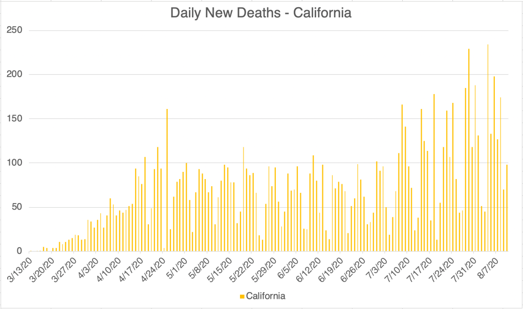
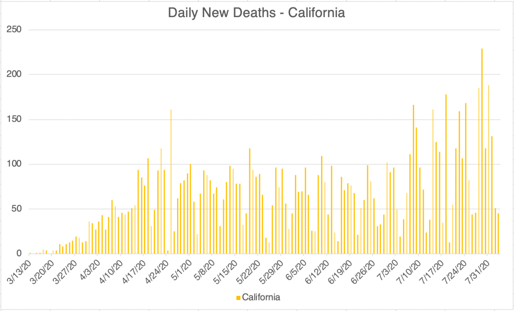
Update: New confirmed cases continue to go down for the US, California and San Diego County. For California, the numbers are kind of flat. The reporting system in California was broken for much of last week, but the state says it’s working again. Death rates are coming down from their second peak. Comparing the new daily case numbers and the new death numbers make it clear that the virus has become much more survivable than it was in March and April.
New study on droplet transmission from various masks: A study was pre-published a few weeks ago that studied droplet transmission from various popular masks (Fischer EP, et al., Low-cost measurement of facemask efficacy for filtering expelled droplets during speech, Science Advances, pre-released August 7, 2020). The study used a system in which a speaker wearing a mask would say a prescribed phrase several times into a box through which a laser was shining. A camera would then capture droplets that were illuminated by the laser. The study used a relative scale for mapping mask benefit, with the N95 getting a relative score of 0, and no mask at all getting a score of 1. See the results in the photos.
Surgical masks did the second best after the N-95, and a 2 ply cotton mask with a sheet of polypropylene (like blue Shop Towel) fabric did third. I’m particularly happy to see the cotton and poly mask do so well, because that’s what I use! Performing poorly are knitted masks, bandanas, and especially the neck gaiter, which actually did worse than nothing! The authors speculate that this is because the fleece material may break up larger droplets into smaller ones instead of stopping them.
Shout out to my sister-law Penny who has made hundreds of masks in her home. The 2 ply cotton masks she makes have a pocket for inserting a filter or piece of poly like I use, and these masks did very well in this study! For extra credit, say the phrase “masks she makes” ten times fast.
I have never been a fan of the surgical mask because of the large side spaces that allow air to pass easily into and out of the mask from the side. I was surprised to see these masks do so well in this study. The answer may be in the experimental design, which captured droplets coming from the front of the mask, but excluded ones from the side. I would like to see a study that captures that too! This just shows that experimental design matters, and just because a study shows something, doesn’t mean the study was designed to detect all relevant things!
Mask wearing has become controversial, but the data supports the idea that masks reduce viral transmission, and that lower viral load on exposure leads to better medical outcomes!
Here’s the weekly update. The US, California, and San Diego County continue to improve. New confirmed cases continue to drop. I have to qualify this however, since California had a problem with their cases reporting system for much of last week. It’s back working normally, but cases may still be erratic in number for the next few days. This may impact the San Diego numbers as well.
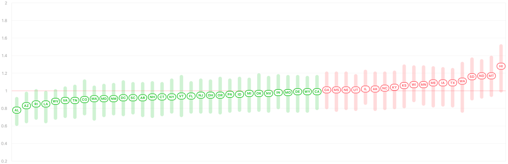
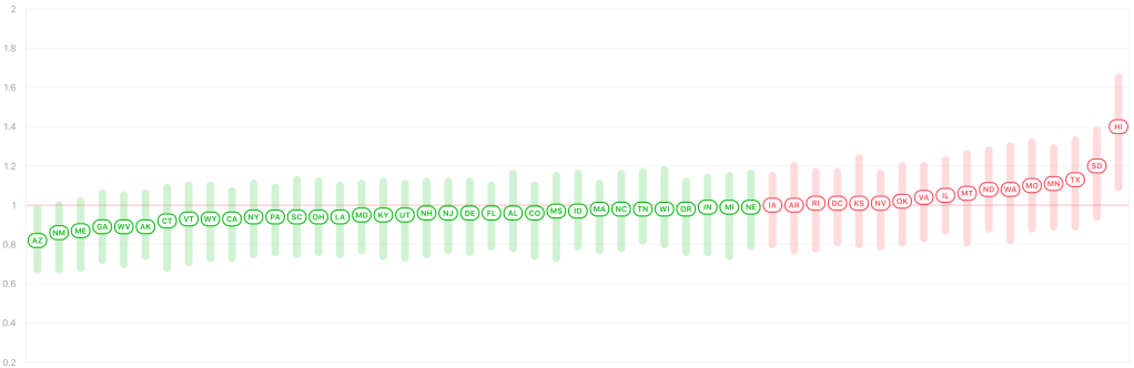
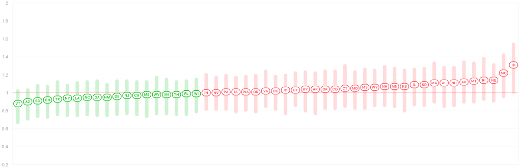
According to Rt Live, more than half the states in the US now have an Rt of below 1.0 again. This suggests that those states are on the downslope of the last peak, and virus is slowly going away in those states. This is great news.
I spoke to testing professional this week who said that viral load, the number of viruses in a patient’s test sample, started coming down in April, when mask wearing became common place. This supports my claim that even if a person gets exposed to the virus, they receive less virus if they’re wearing a mask. This may also be why the virus has been more survivable in the past few months.
I have a grab bag of things to discuss today, starting with the weekly update, a note about the new KN95s, a new version of the Coronavirus (D614G), and where outbreaks are located, at least in San Diego County.
The positive trend continues! Cases are dropping in the US and San Diego, and are flat in California, which is actually better than it sounds, since the state has been steadily increasing in cases since mid-April. Active cases continue to decline in San Diego. Even in Los Angeles County, the epicenter of new cases in the entire country for the last few months, new daily confirmed cases are finally coming down.
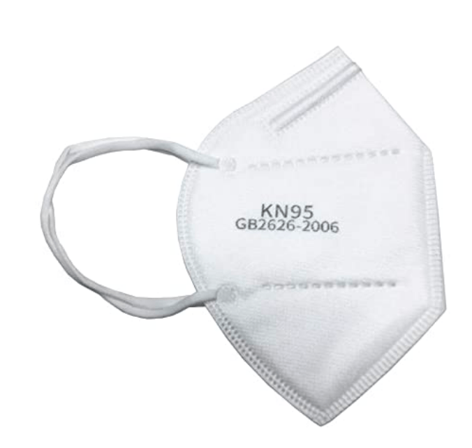
KN95 masks: I’ve started to see a new kind of mask being worn, the KN95. They are rated to filter out 95% of virus particles, but are made and certified in China and carry the European CE mark. The FDA has allowed their use in the US as an emergency measure. They fit a little less snugly than an N95. Perhaps their greatest benefit is that they’re available. If you’re still using a surgical mask consider upgrading to the KN95, which will be an improvement!
A KN95 mask.
New strain D614G: A new strain appeared in the US and worldwide probably in May or June. Called D614G, it carries a mutation at the 614th position of the Spike protein. This mutation makes the virus more infectious by 4-5 times, and may have contributed to wave Ib of the virus that we saw in June and July. Dr. Deborah Birx, White House Coronavirus Response Coordinator, has speculated that this mutation may be why we saw more widespread virus outside urban areas during the last jump in cases.
Coronaviruses are RNA viruses. Enzymes that replicate RNA tend to be very error prone which is why RNA viruses change so rapidly. This is true for Coronaviruses as well as for the flu and for HIV. We can continue to expect more naturally occurring mutations in the future. The good news is, over the course of years, viruses generally become less virulent and more mild.
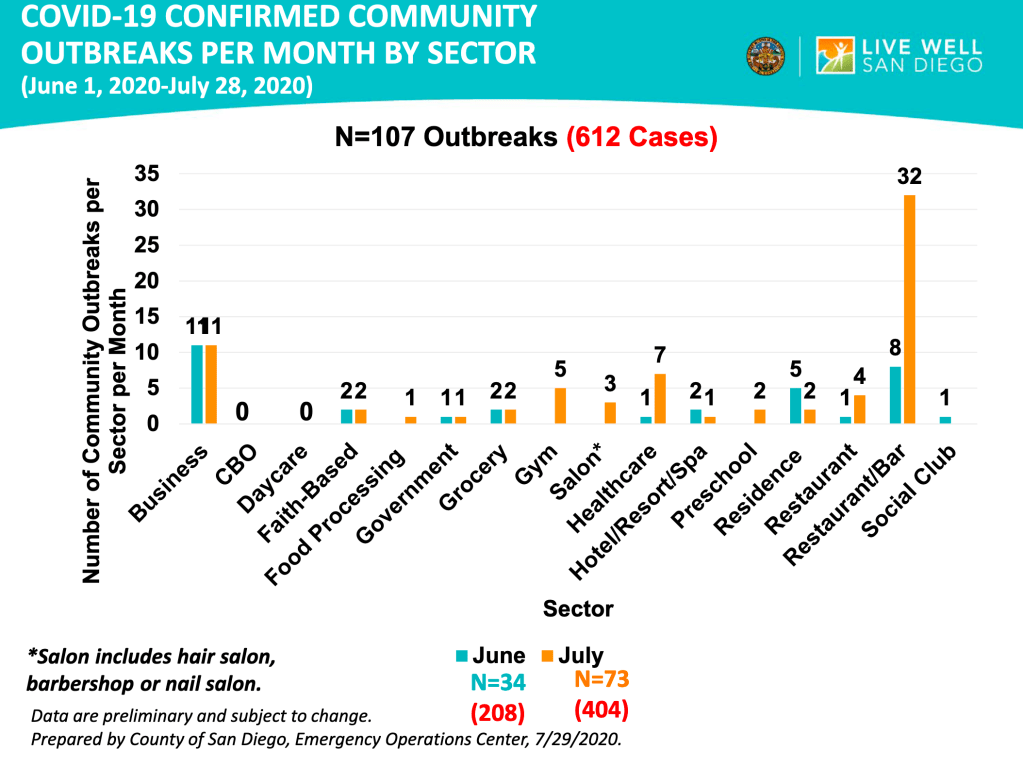
The location of outbreaks in San Diego County: San Diego Public Health has published a graph on the locations of outbreaks as part of their regular slide package. Out of 134 the top most common places for outbreaks are restaurants with a bar (40), businesses (27), the healthcare environment (15), and residences (9), further down the list, faith based organizations and government offices are tied at 5. As a business traveler myself, I’m happy to see that hotels are only at 3. Restaurants without a bar only had 5 events.
Things are starting to get better! But remember that an epidemic is like a wildfire, getting containment doesn’t mean it’s over! We need to remain diligent in order to put it down for good. Keep up your efforts!
A quick note, I posted an update yesterday, but I accidentally only sent it to one person, so for the weekly update, check your feed for yesterday morning, or check my timeline.
Many people have asked me about a video that was posted yesterday by a group called “America’s Frontline Doctors”. The original video has since been removed from Facebook, YouTube and the group’s website has even been dropped by the host, Squarespace. All this to say, you may have a hard time watching it if you want to. I found a different version.
As I’ve said before, politics and science should never go together. Whenever a scientific issue becomes political, it becomes very difficult for free scientific inquiry to move forward, and nearly impossible for non-scientists to figure out what the truth is. So I’m sorry to those of you who are confused and are trying to pursue the truth. The video was put together by the Tea Party Patriots and Breitbart News, 2 right leaning organizations. This is a red flag for me because I know that the message will have a political angle, and that I’ll need to watch with extra care. As I said in my July 14th post, however, just because you disagree with someone in general doesn’t mean they have nothing good to contribute to the discussion. Especially with politically charged issues, we need to get information from a variety of sources in order to be as informed as we can. I know for many of us, it’s nearly impossible to have time for that, so we often just pick someone we trust to get our information from. I definitely have political opinions, but whenever a scientific issue comes up, I do my best to set those aside and look at the evidence. I hope this has been valuable to you. You may have noticed that some of my thoughts about the Coronavirus have been “left-wing” and others have been “right-wing.” I’m doing my best to be objective. And yes, I consider it a tragedy that opinions on scientific issues can be categorized as either left or right.
I want to discuss some of the main points of the video and offer my informed but not expert opinion. I am a Ph.D. molecular biologist specializing in infectious disease testing. I am not a physician or an epidemiologist. I will give my opinion and also why I think that way.
Hydroxychloroquine (HCQ): The video focuses to a great degree on HCQ as a potential “cure” for the Coronavirus. As soon as President Trump mentioned it as being potentially helpful for treating Coronavirus, it became a subject of immediate and hot controversy. Democrats seemed to reflexively dismiss HCQ, and Republicans seemed to reflexively support it. President Trump dug in his heels and seemed to support its use before all the evidence was in. Obviously, this is not how science should be done. Careful and well-reasoned studies should be done, and conclusions made based on evidence. Early studies seemed to support both conclusions. Opponents claim that HCQ doesn’t work and is even harmful to patients, causing heart problems in some. Supporters claim that HCQ works when given early in the disease, and with Zinc and perhaps azithromycin.
Dr. Immanuel made an impassioned case for the use of HCQ, having successfully used it to treat over 300 patients. This kind of evidence is what scientists call “anecdotal”. Anecdotal evidence, basically stories, is often not considered scientific because in a large pool of people, you can find stories supporting all kinds of claims. Anecdotal evidence also usually does not carefully consider other factors that may contribute to a conclusion. An example would be “I ate ice cream and then I got attacked by a shark, so eating ice cream leads to shark attacks.” This is obviously a silly example, but many pieces of anecdotal evidence you hear suffer from the same lack of critical thinking. However, this is not at all to say that anecdotal evidence is not useful! These kinds of stories may not be scientific per se, but can often trigger more rigorous studies that prove the claims of a story.
Several scientists I’ve heard from will point out that HCQ is useful when given early and given in combination with Zinc, and also in appropriate dosages. I actually agree that some of the studies arguing against HCQ use have given it too late or in inappropriately high dosages. I would like more rigorous studies to be done, however at the moment, I think HCQ is well worth consideration by the medical community. Other treatments also exist and may actually be better, such as the MATH+ protocol I described in my summary post on June 22nd, Dexamethasone, Remdesivir, and perhaps Budesonide. For the HCQ protocol, it appears that Zinc is actually most responsible for anti-viral activity, with HCQ mostly helping Zinc enter cells to interact with the virus.
Some have pointed out that Dr. Immanuel has some beliefs that are well outside accepted scientific views. As I pointed out before, even folks who you generally disagree with can bring helpful information to the table. Her HCQ experience may be true despite her unorthodox beliefs. So even if you justifiably don’t consider a person reliable, you should resist the urge to dismiss them outright.
Lastly on the issue of HCQ, physicians have the right to use drugs “off-label” meaning they are granted by their medical degree the right to try medications in ways that are not necessarily supported by the literature or guidelines. This right is granted in the interest of patients, because careful studies can take a prohibitively long time to be published, and to encourage the development of helpful new protocols. In my opinion, government agencies should not be restricting the use of HCQ by doctors at this time.
School reopening: In some ways, there is reason to re-open schools in the Fall. It appears to be true that children under 10 do not get infected at high rates, do not carry a high viral load when infected, do not get severe disease, and do not seem to spread virus to others. So there is a case to be made for reopening schools for young children. However, because of the ADE issue I’ve written about before, I am not currently in support of re-opening schools in the Fall. Just to recap, ADE (Antibody Dependent Enhancement) is the phenomena in which some viruses can use antibodies presented on immune cells to infect those cells and cause more severe disease. So a second infection with a similar strain can lead to much worse symptoms. SARS-1 and MERS, cousins of SARS-2, can both use this pathway, so with current evidence, it seems likely that SARS-2 will as well. But we won’t know for sure until another SARS strain develops and we see how people respond to it. I will point out in full disclosure, that almost no-one is talking publicly about ADE. Dr. Fauci has mentioned it, but just in passing. So I could be out to lunch about this, but it is a major concern of mine. I have had a few epidemiologists mention in private conversations that they think ADE is a real issue, but they aren’t comfortable talking publicly about it either.
Sweden and Herd Immunity: Dr. Dan Erickson, who made a video back in April, also spoke. I was critical of his original video because his analysis of the death rate used the wrong number for total cases. This time he spoke mostly about the lock-downs, and most of his comments were more measured. He argued against lock-downs and suggested Sweden as a model.
I am also critical of lock-downs as they were done in much of the US, with people asked to stay home at all times. However, I am not supportive of the Swedish model either, in which few precautions are taken. While I am not for people staying at home, and I think people should find ways to get back to work, I also think people should wear masks while indoors in public. Small outdoor meetings are fine, even without masks, but large outdoor gatherings with closely packed people are dangerous in my opinion. Again because of the ADE issue, I am not in support of the idea of obtaining herd immunity as a way out of the crisis.
Masks: Some have taken away from the video the idea that we should not wear masks. I didn’t get this from the video. Dr. Gold explicitly said she thinks masks should be worn indoors, but not necessarily outside. I agree with this approach.
As you can see, I agree with some aspects of the video, and disagree with others. When possible, study all sides of the issues, and make the best most reasoned choices for you and your family.
My basic rules are as follows:
1) Wear a mask or face covering in public. Avoid places with unmasked people. 2) Keep 6 ft away from others. 3) Avoid indoor gatherings, especially ones in which singing or shouting is likely. 4) Small outdoor gatherings are fine, even without masks, if everyone maintains a distance. Have guests bring their own food. 5) While many restaurants are open for limited indoor seating, I personally am still not comfortable eating indoors at a restaurant. I enjoy eating outdoors at restaurants, however.
Don’t fear, but be smart!
Erik
A version of the America’s Frontline Doctors video: NOTE: The below video was removed by YouTube a day after this blog posted.