Category Archives: Case Update

Case Update, September 1st, 2021; FDA approval for Pfizer vaccine, 2 shots of vaccine, or 1 after COVID infection improve protection from Delta.

This is a case update. I’ll also discuss the potential for a Fall peak, new branding for the approved Pfizer vaccine, and whether you should get a vaccine shot if you’ve had COVID.

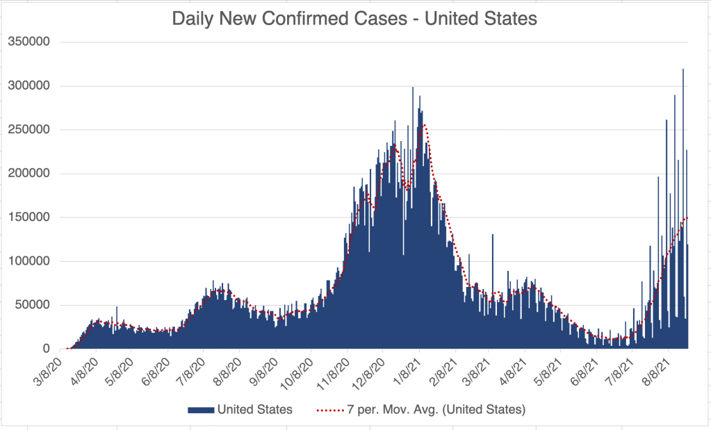
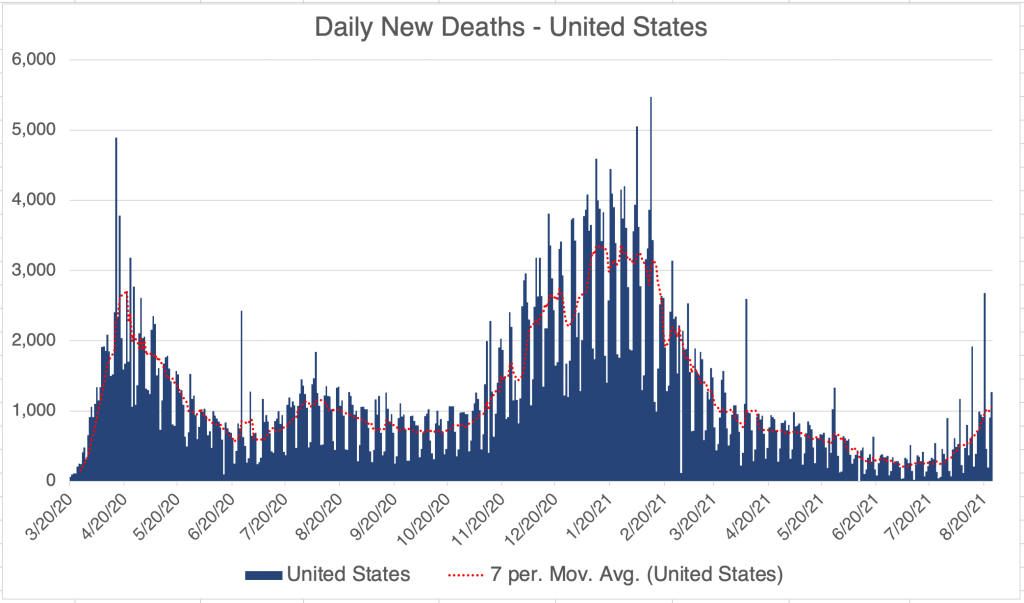
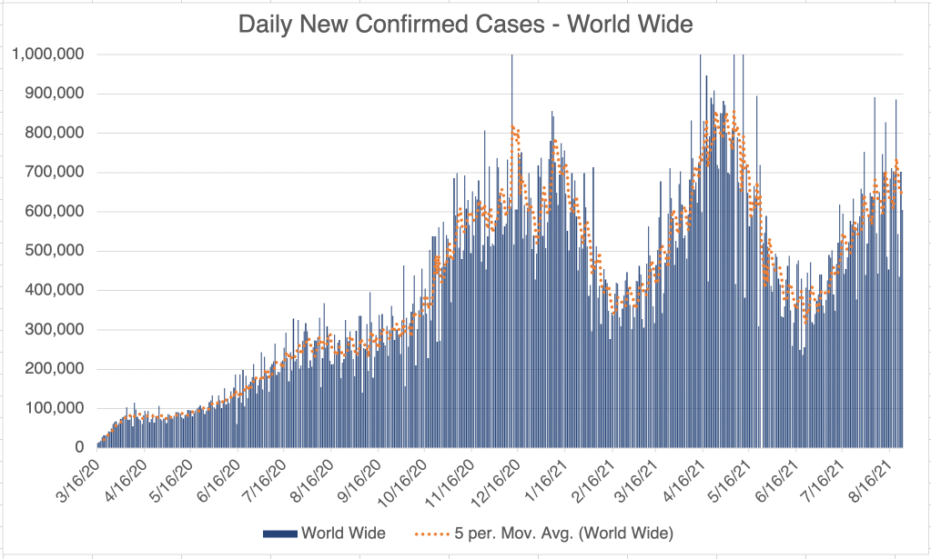
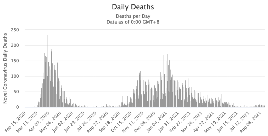
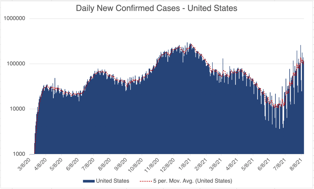
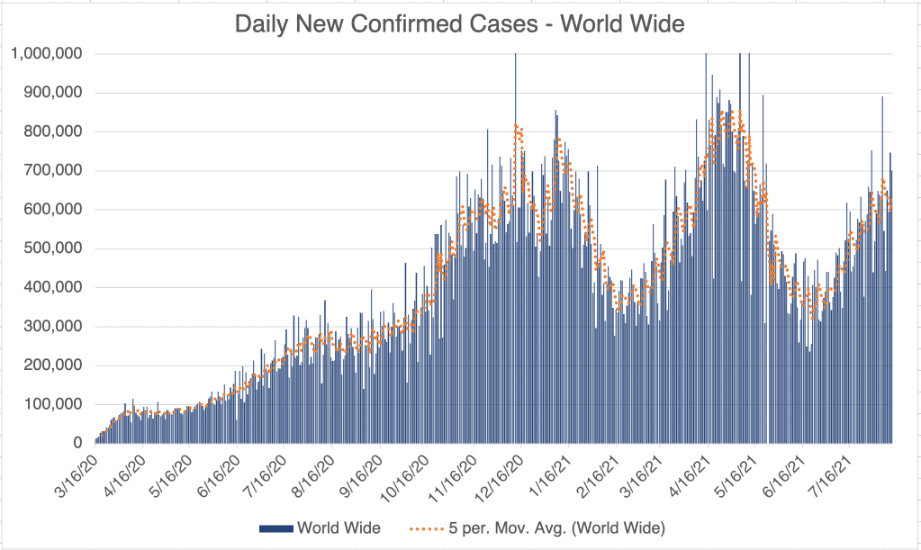
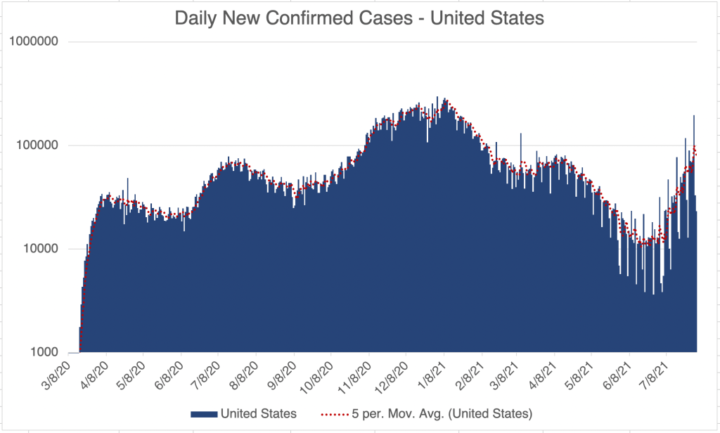
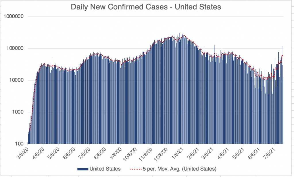
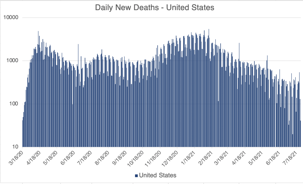
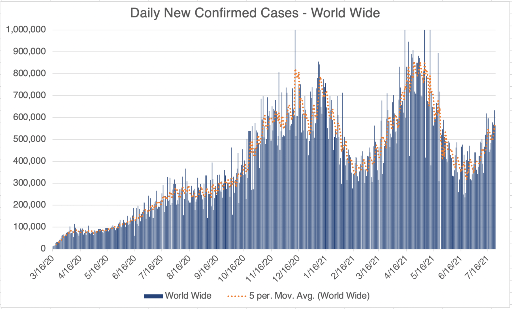
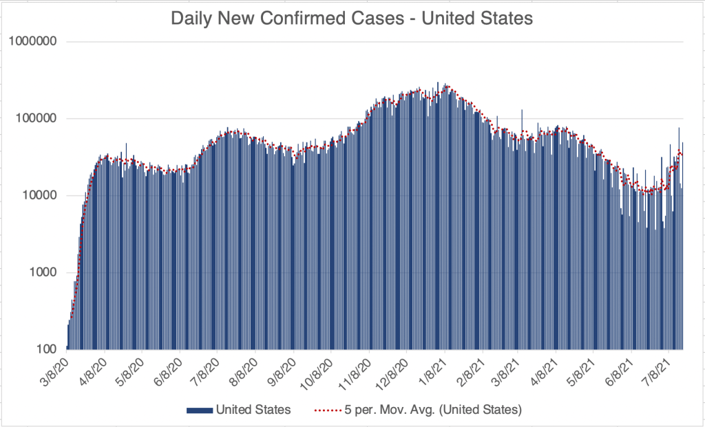
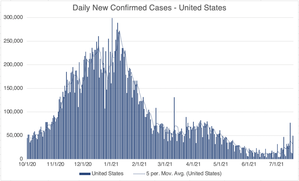
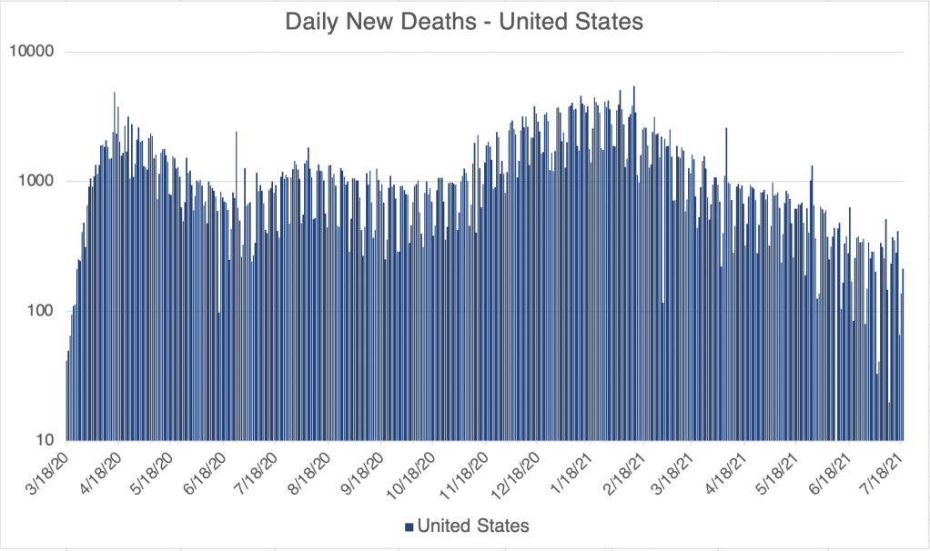
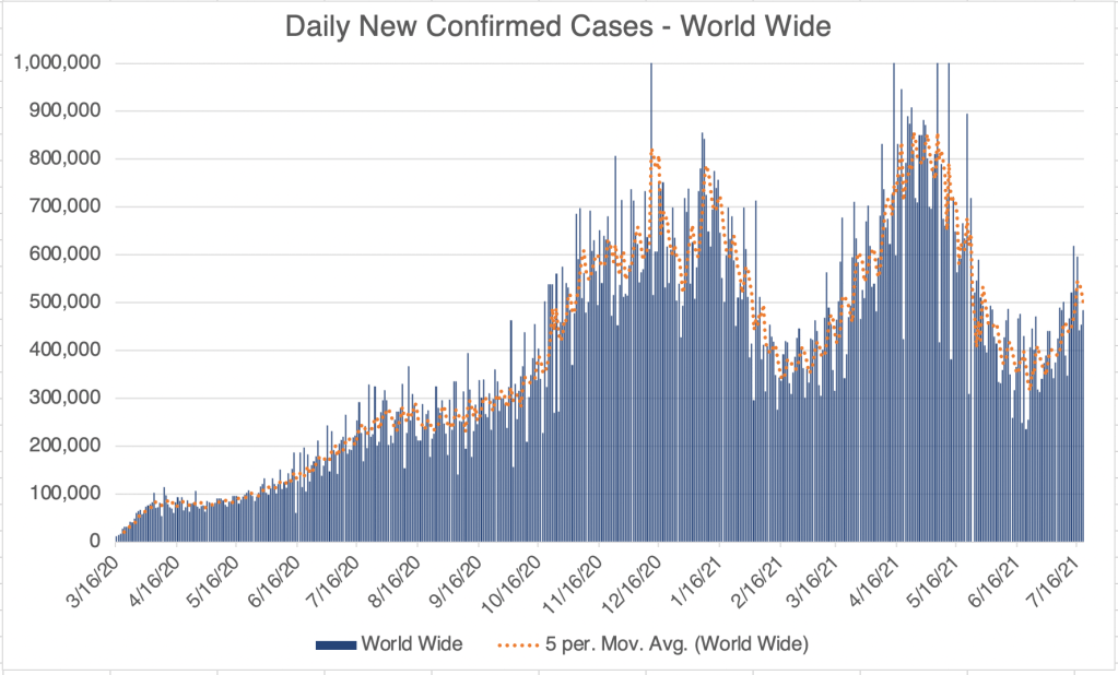
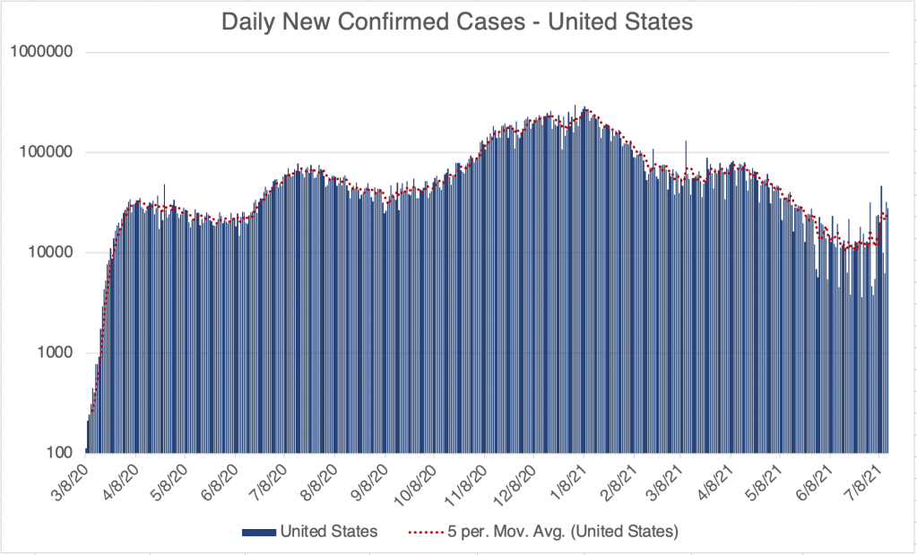
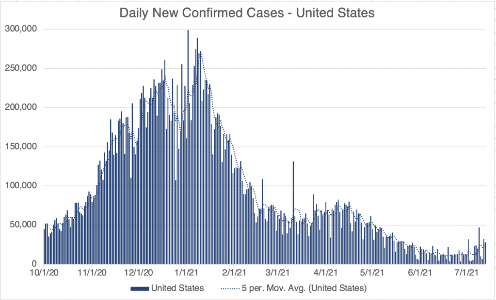
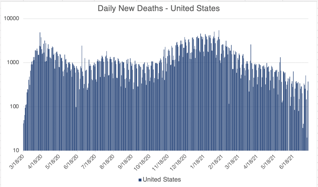
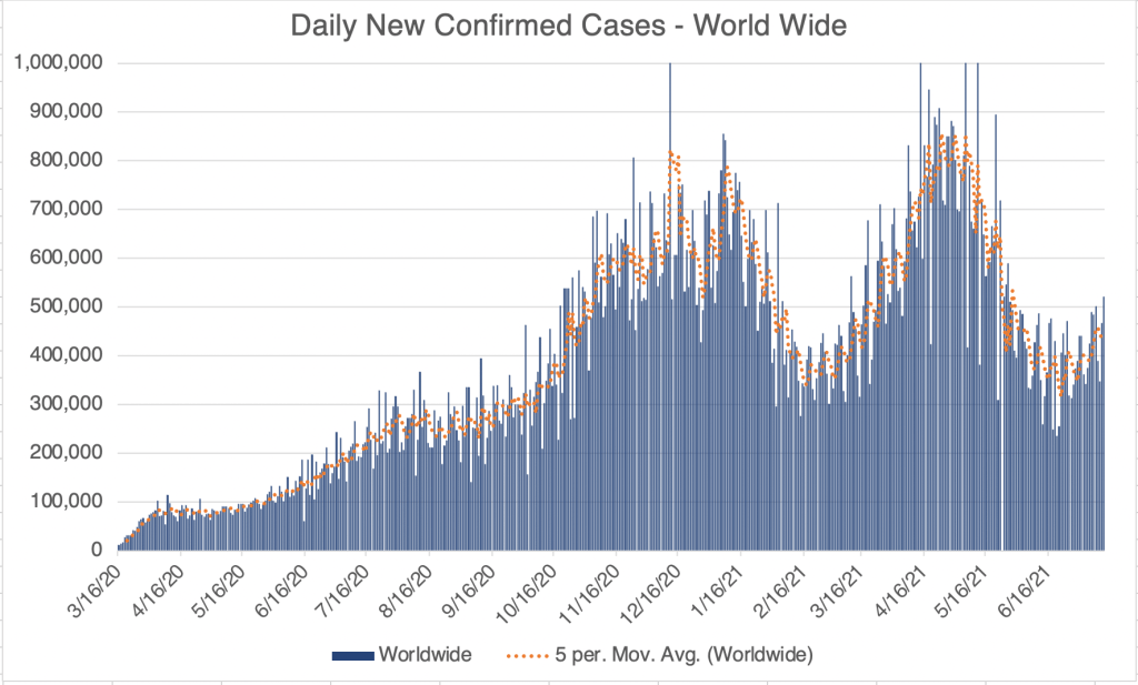
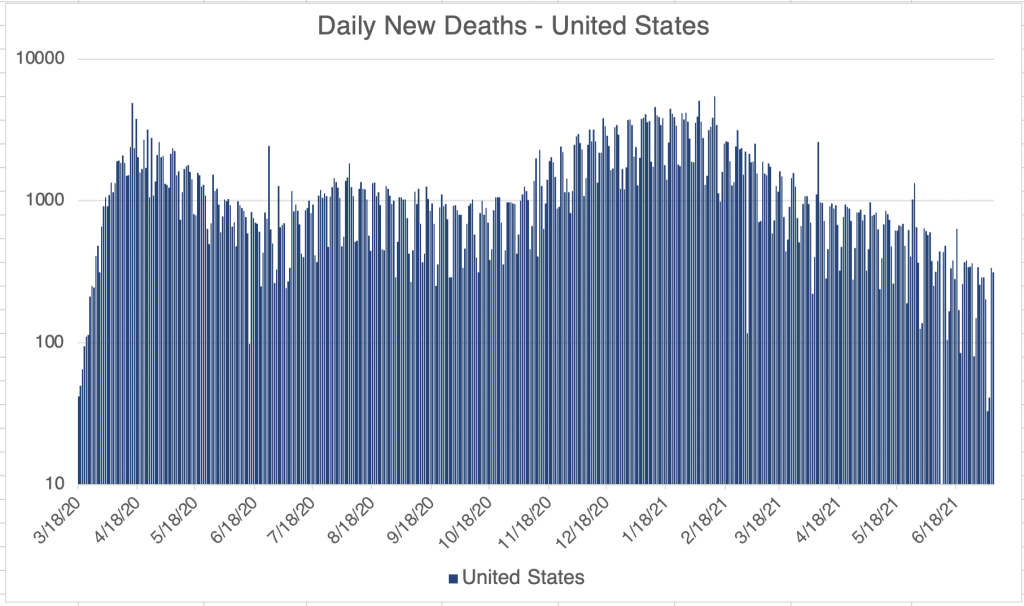
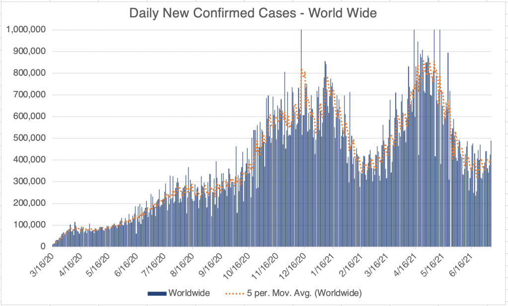
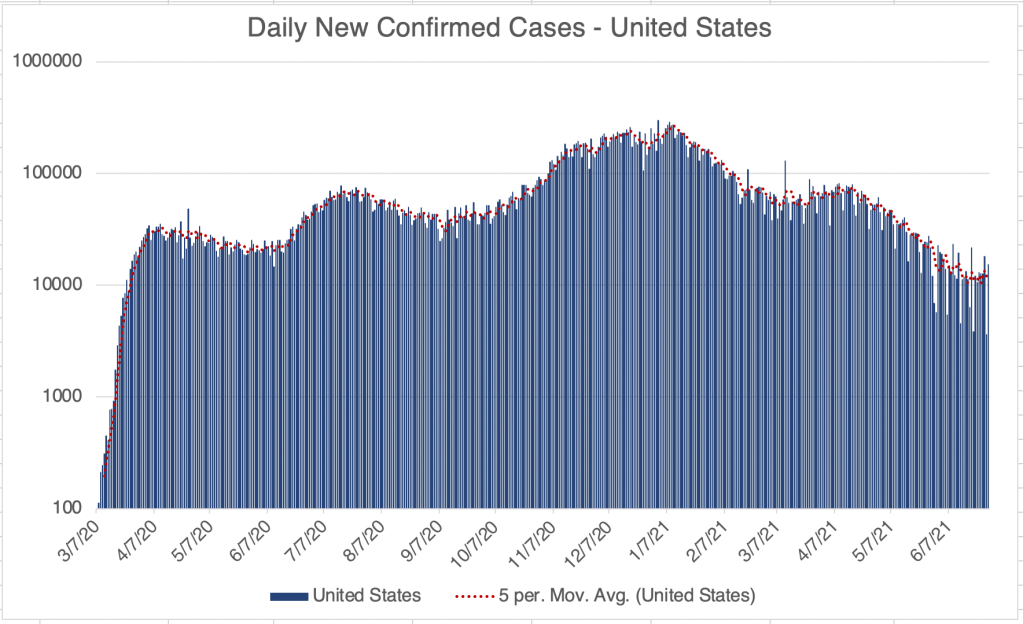
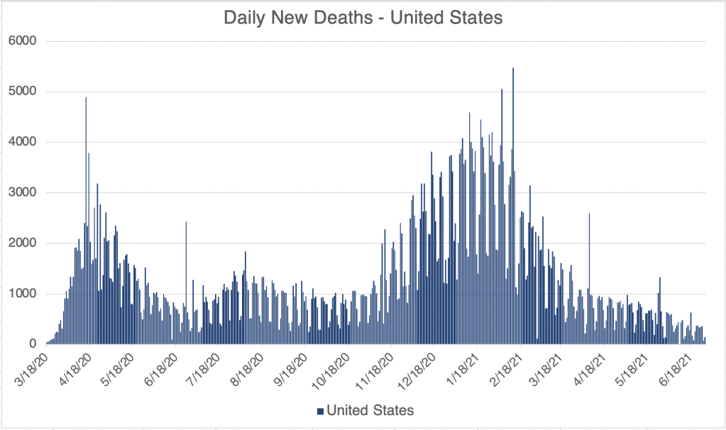
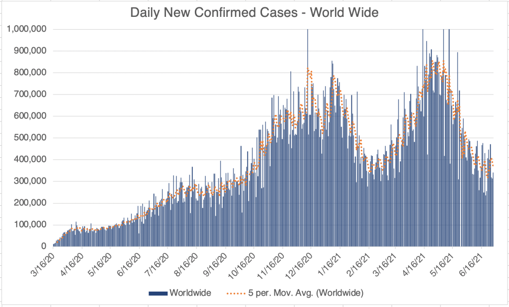
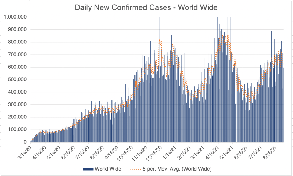
In the US, cases continue to rise, but the rise is slowing. Numbers from this last weekend suggest we may be seeing a peak in cases, but it’s too early to say. Deaths from the Delta peak are increasing also, but are proportionately less than for previous peaks.

Graph is by me, from data collected from Johns Hopkins University COVID site. Graph is presented in a linear format.

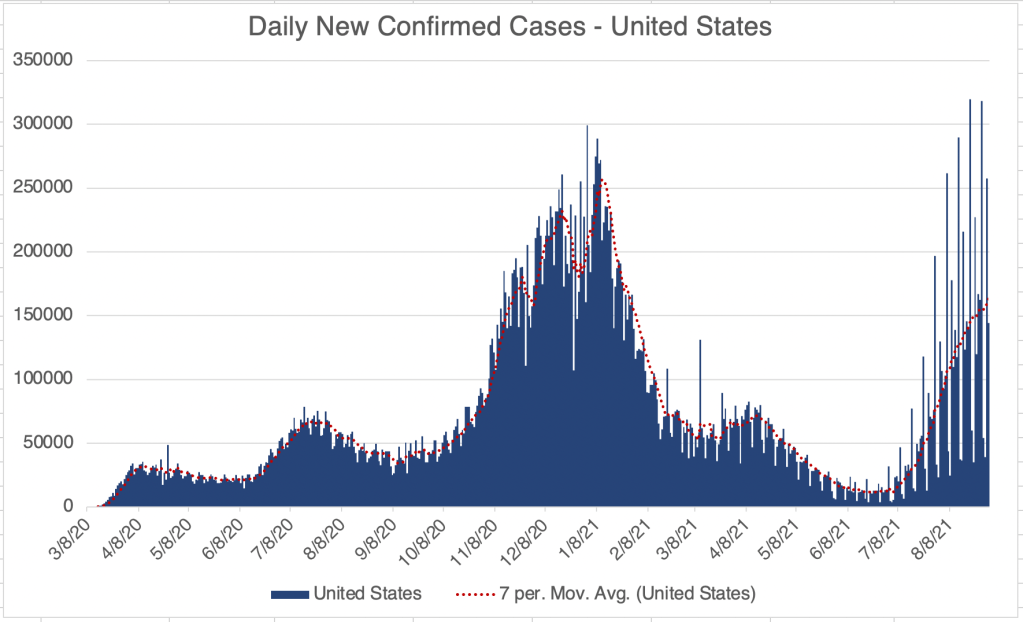
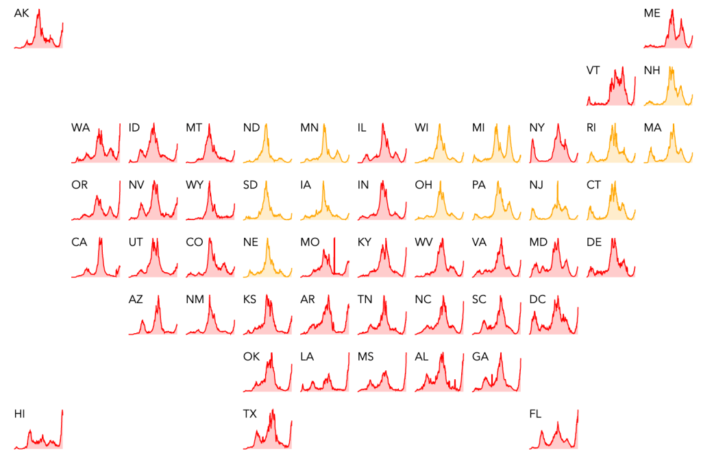
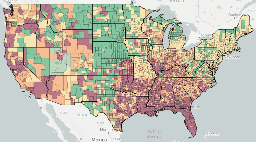
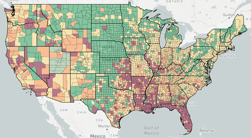
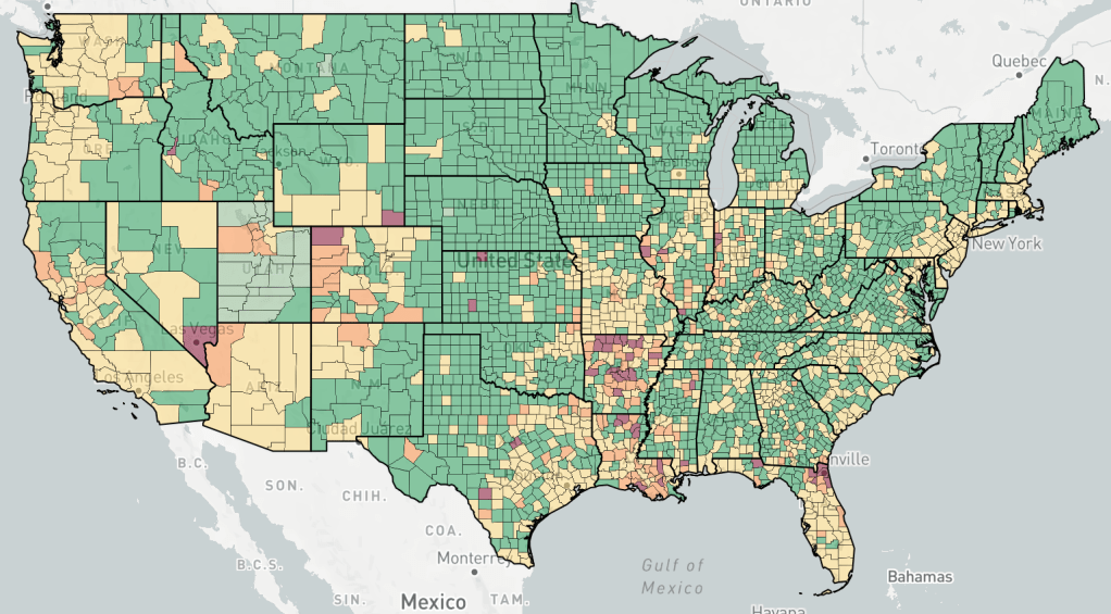
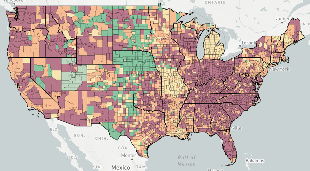
We are starting to see fewer cases in the South. Last year, the Summer peak was centered in the warmer states, California to Florida, and then we had a very large wave starting in the North starting in October. With cases still high at the start of September, we may see another large surge of cases in the North as we head into Fall.

Endcoronavirus County Level Map, August 31st, 2021. New cases slowly receding in the South and growing in the North. Michigan, Missouri, Nebraska still appear to not have strong outbreaks as of now, likely because of large case numbers during the UK variant wave in the Spring of 2021.
Endcoronavirus State Level Map, August 31st, 2021

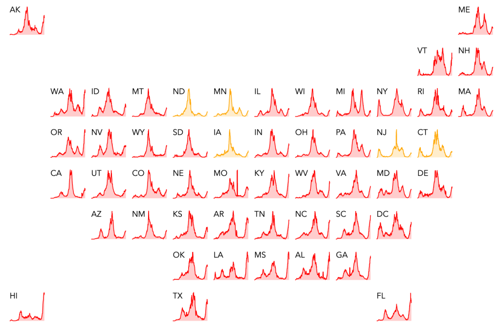
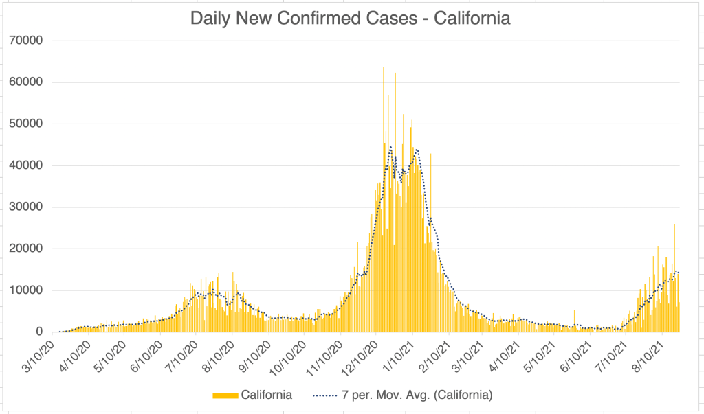
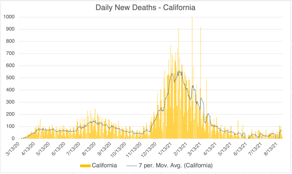
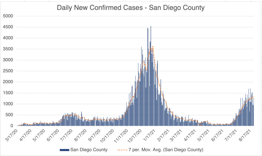
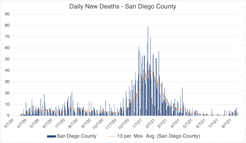
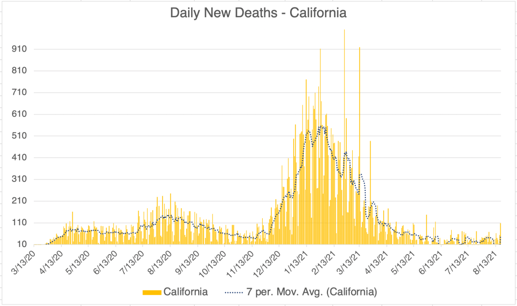
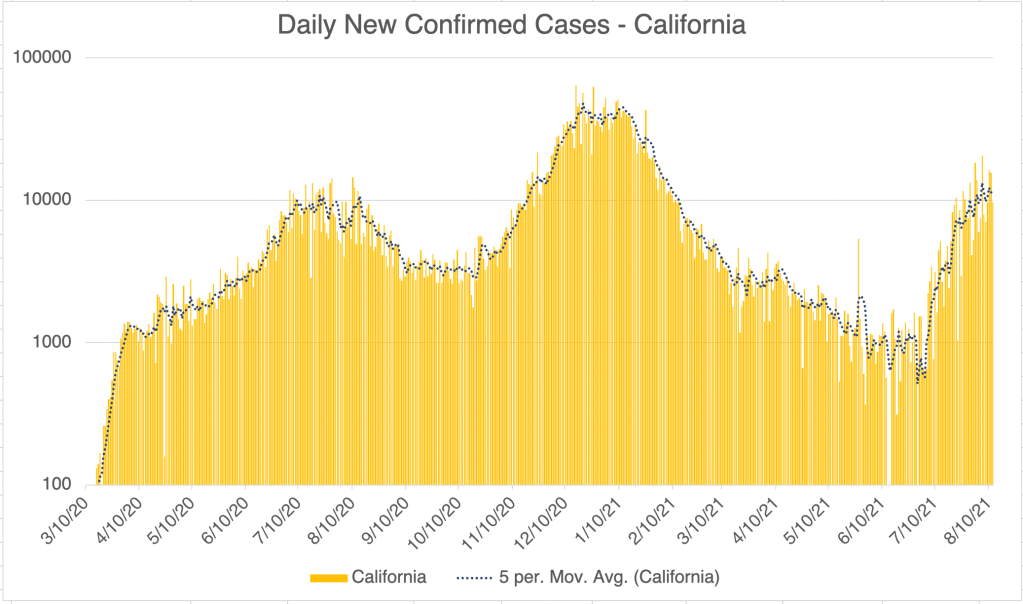
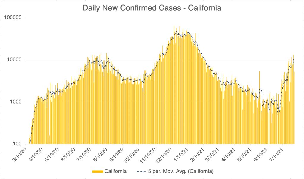
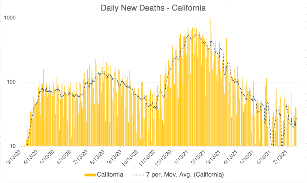
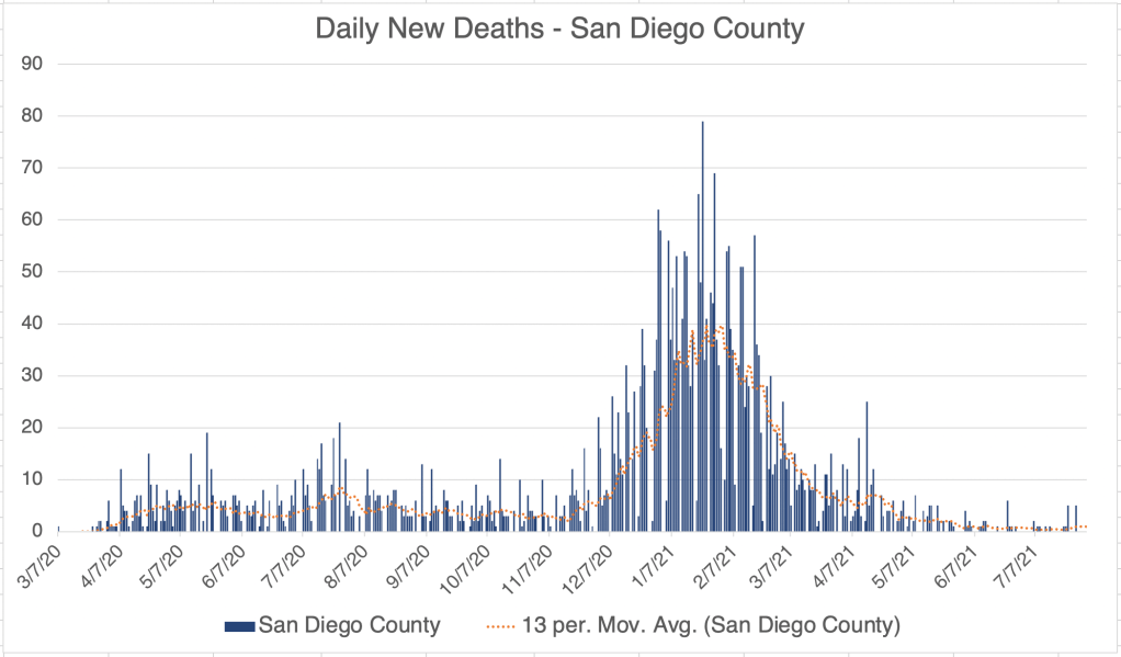
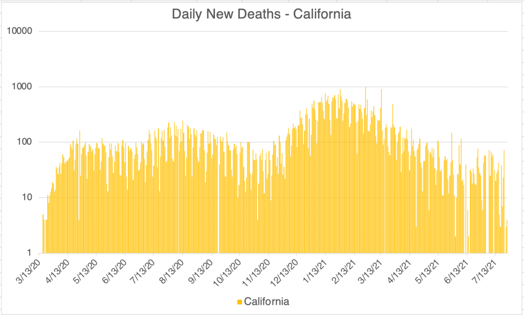
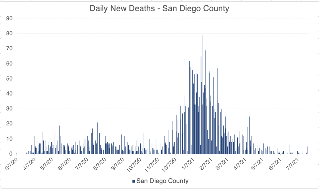
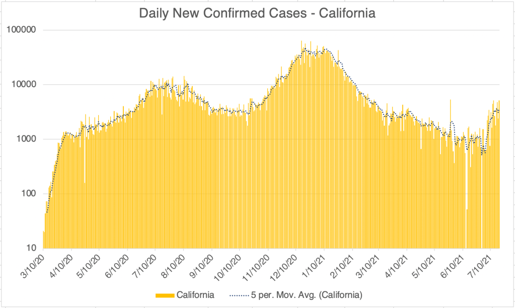
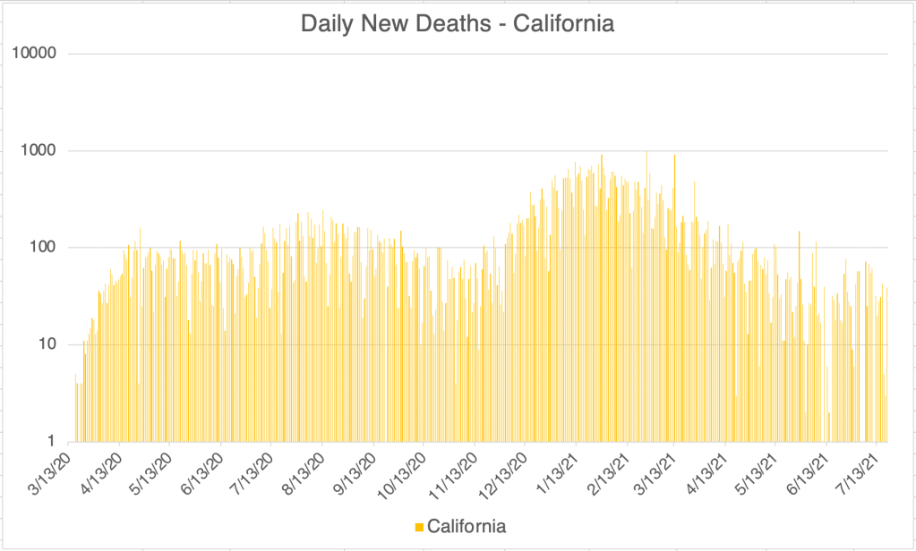
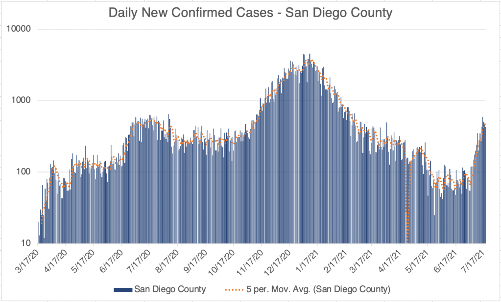
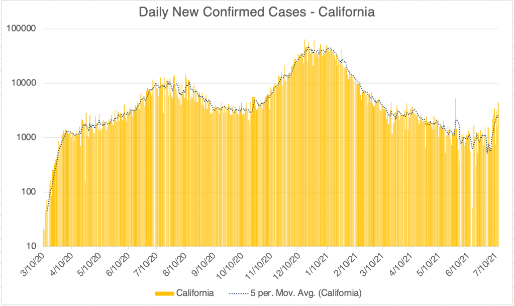
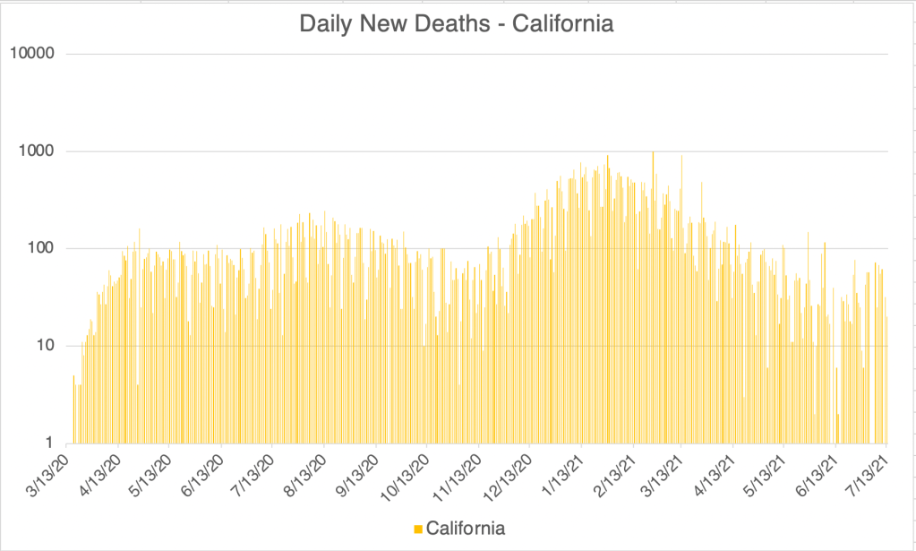
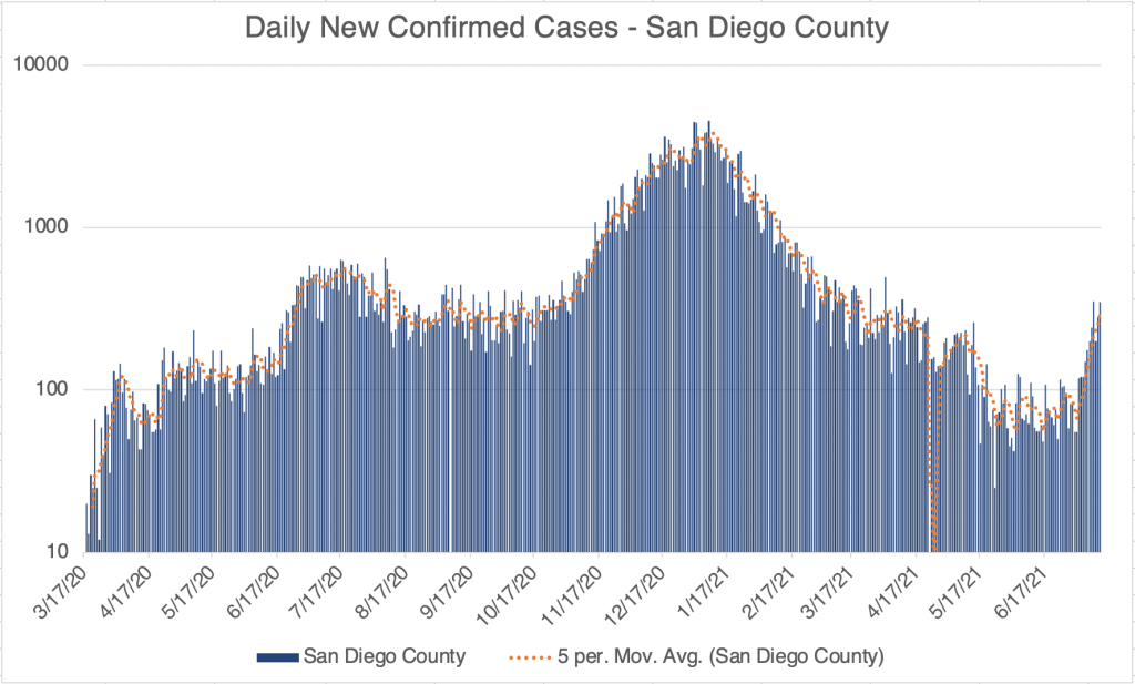
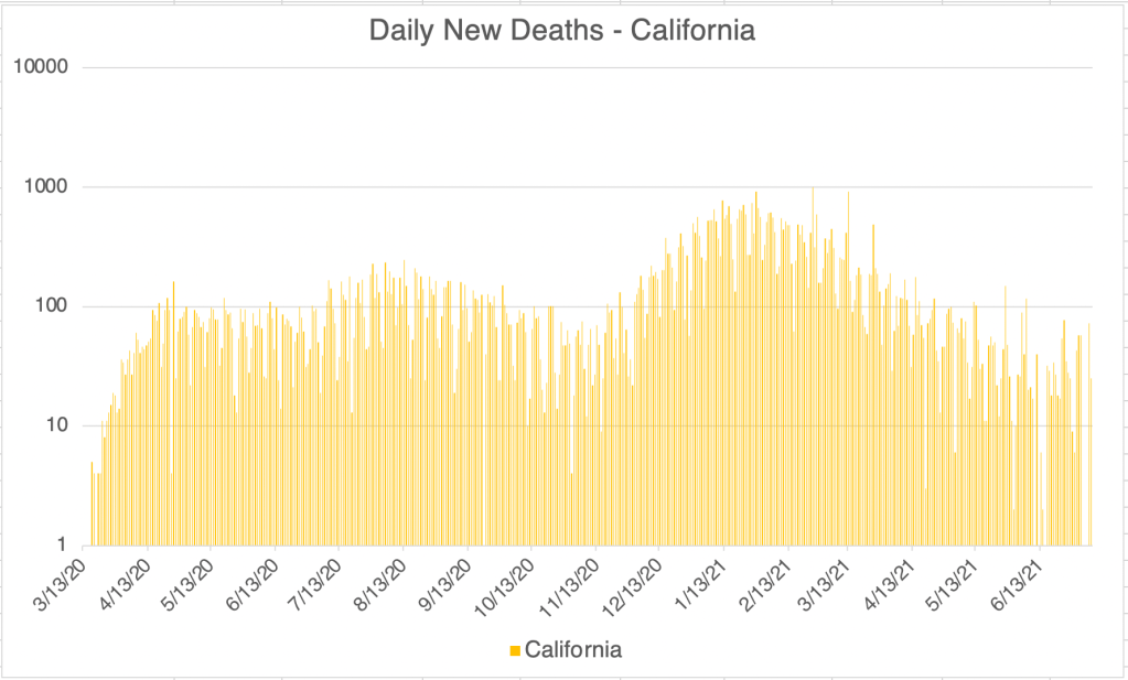
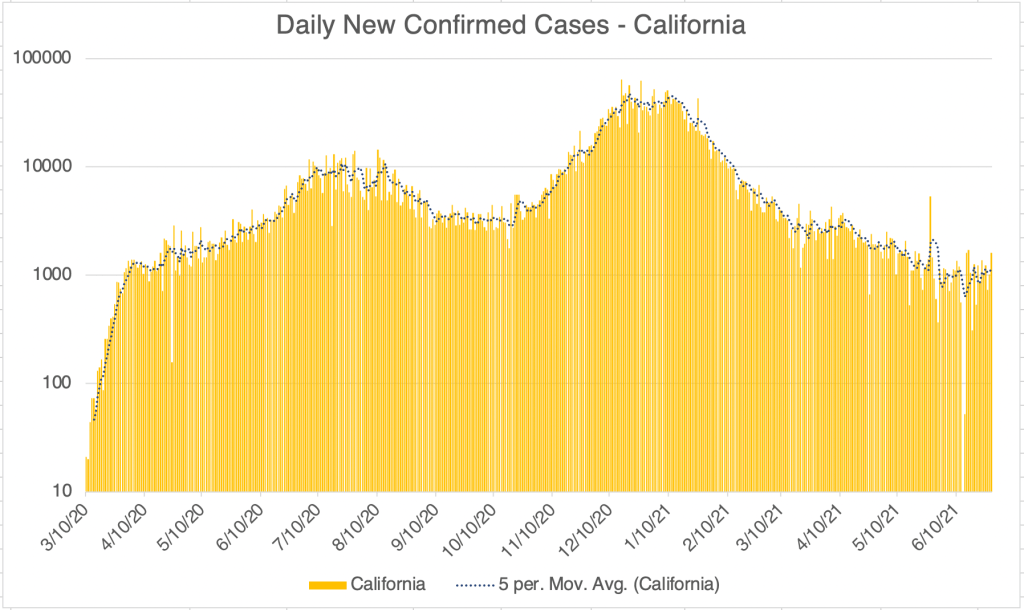
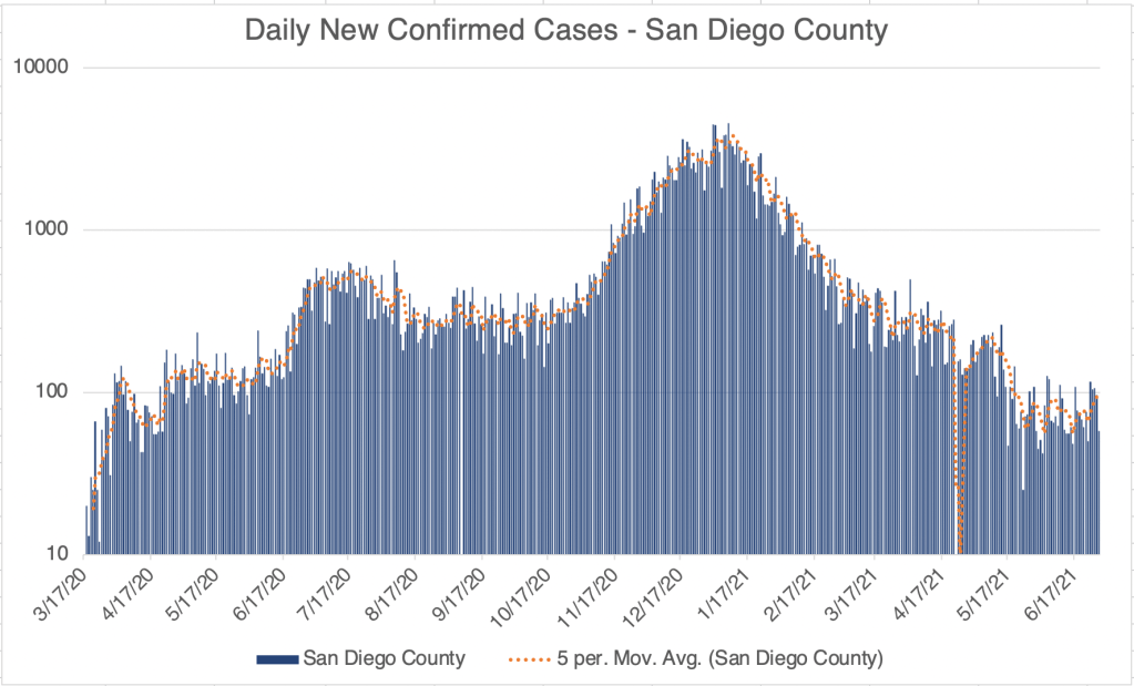
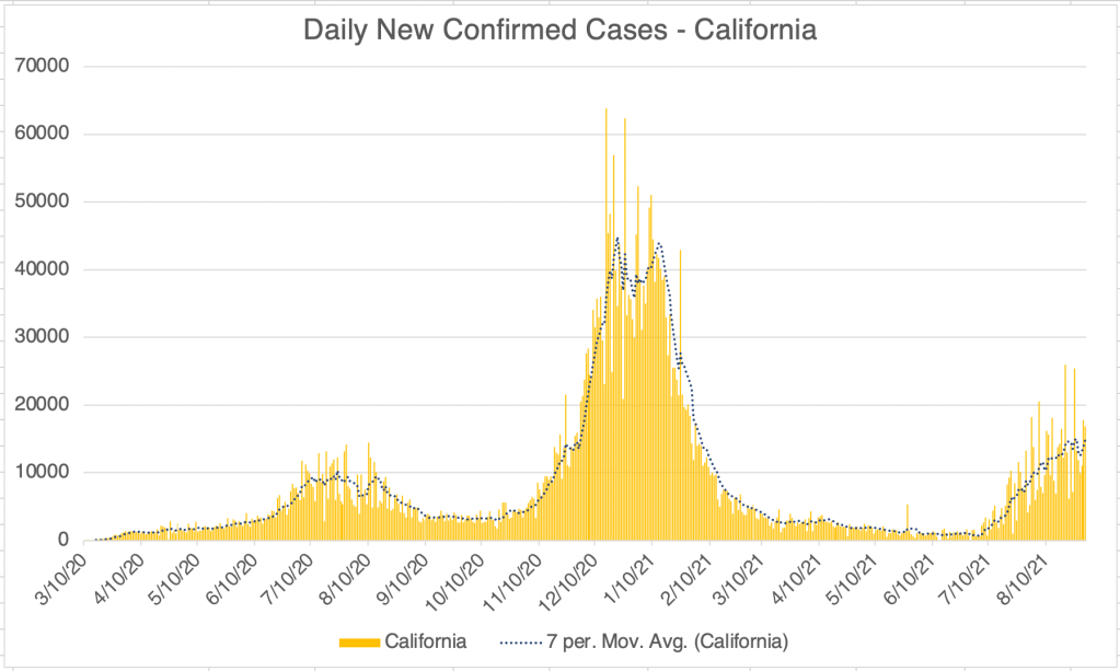
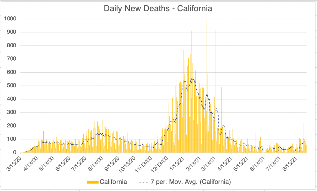
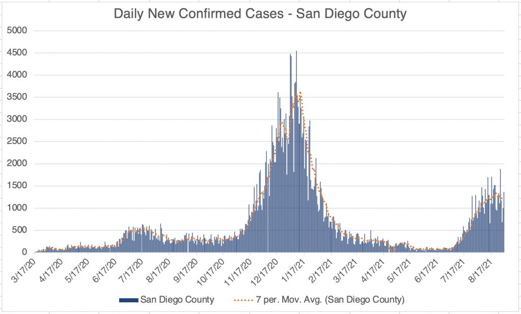
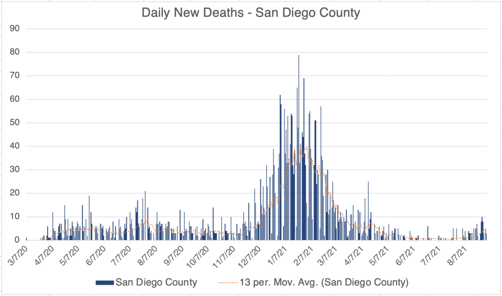
New cases continue to fall in California and San Diego. Tentatively, it even looks like deaths are falling as well.

Graph is by me, from data collected from Johns Hopkins University COVID site. Graph is presented in a linear format.
Graph is by me, from data collected from San Diego County Public Health. See also regularly updated slides from SD County.
Graph is by me, from data collected from Johns Hopkins University COVID site. Graph is presented in a linear format.

The Pfizer vaccine recently received FDA approval. The confusing part, is that legally speaking, the approved vaccine is not the same legal entity as the Emergency Authorized vaccine. The Pfizer vaccine we’re used to is called “Pfizer-BioNTech COVID‑19 Vaccine”. The FDA approved one is called “COMIRNATY (COVID-19 Vaccine, mRNA)”. I’m not a legal expert at all, but my understanding from watching some legal analysis is that the original vaccine is still only EUA authorized, and has some liability protection for Pfizer. However, Pfizer does not have liability protection for the COMIRNATY vaccine. According to the approval letter from the FDA, the formulations of the 2 vaccines are the “same formulation” and “can be used interchangeably”.

So why the name change? An analyst I watched said that Pfizer would like to continue to use the original vaccine under the new approval, but avoid liability. So those getting the vaccine now would still be getting the vaccine with liability protection for Pfizer. If you want to get a 3rd shot, you may want to wait until the legally approved COMIRNATY vaccine is available. Again, I am not a legal expert, so my analysis may be wrong on this.

If all this is true, you may regard this as a dirty trick by Pfizer. I try not to be cynical about things that I have only a vague understanding of, but if you thought that, I couldn’t disagree with you.

2nd shot improves protection against Delta, even for those with natural immunity. In a video by Dr. Roger Seheult, he argues that another shot greatly improves the immune response to the Delta variant. This follows both for those with only a single shot of the Pfizer vaccine, or with natural immunity. All this to say, if you’ve had COVID, 1 shot of a vaccine will help protect you from a breakthrough infection from the Delta Variant.

From Planas et al, 2021. Data suggests boosted binding of antibodies to Delta Variant after natural immunity (COVID infection) and 1 shot of the Astra Zeneca or Pfizer vaccine.
From Planas et al, 2021. Data suggests boosted binding of antibodies to Delta Variant after 2 shots of Pfizer vaccine.

Don’t fear, but be smart,
Erik

Case Update, August 25th, 2021

This is a brief case update. The US is still increasing in new cases, but the number of new cases is slowing. Several states appear to be past the peak new cases are now headed down, including Louisiana, Texas and Vermont. New COVID deaths in the US are on the rise, but are still far lower then during last wave. It will take several weeks to know how many new deaths we’ll see, since new deaths trail new cases by between 1 and 4 weeks.

Graph is by me, from data collected from Johns Hopkins University COVID site. Graph is presented in a linear format.
Endcoronavirus County Level Map, August 25th, 2021


Endcoronavirus State Level Map, August 25th, 2021

New cases in California and San Diego continue to go down for the second week. New deaths are starting to creep up for both regions, but remain relatively low.

Graph is by me, from data collected from Johns Hopkins University COVID site. Graph is presented in a linear format.
Graph is by me, from data collected from San Diego County Public Health. See also regularly updated slides from SD County.
Graph is by me, from data collected from Johns Hopkins University COVID site. Graph is presented in a linear format.

Don’t fear, but be smart,
Erik

Case Update, August 19th, 2021, Is COVID Endemic?, Mandatory Vaccination.

This is a case update. I’ll also briefly discuss the future of the pandemic.

Numbers continue to rise in the US, but are definitely slowing in their increase. New cases are most prominent in the West and Southeast. New deaths are rising, but much more slowly than for other waves.

Graph is by me, from data collected from Johns Hopkins University COVID site. Graph is presented in a linear format.
Endcoronavirus County Level Map, August 19th, 2021
Endcoronavirus State Level Map, August 19th, 2021

For California and San Diego, it looks like we have crested the wave and new cases are starting to head down. In both of these regions, new deaths are not really increasing at all. This supports the pattern that in vaccinated areas, large numbers of new cases due to the Delta Variant are not followed by large numbers new deaths. I mentioned a few weeks ago that deaths can trail new cases by as much as 4 weeks, but we are now 6 weeks into the Delta Wave in California and San Diego without seeing a significant rise in new deaths.

Graph is by me, from data collected from Johns Hopkins University COVID site. Graph is presented in a linear format.
Graph is by me, from data collected from San Diego County Public Health. See also regularly updated slides from SD County.

Internationally, new cases appear to perhaps have peaked world wide, but it will take some time to see if cases start to go down. As stated above, countries with vaccination programs are experiencing almost no new deaths due to Delta Variant. Numbers for the Netherlands are striking, and other countries like the UK, Sweden, Japan, and South Korea show a similar pattern.

Graph is by me, from data collected from Johns Hopkins University COVID site. Graph is presented in a linear format.
New daily confirmed cases in the Netherlands, from Worldometers.
New daily deaths in the Netherlands, from Worldometers.

Several sources I listen to are now saying that SARS-2 is now or will be endemic. For some background, an epidemic is an outbreak of a disease in a small area or region. Avian influenza and the first SARS outbreaks were epidemics, since they didn’t leave Asia. A Pandemic is an outbreak in a large area including several continents. A disease becomes endemic when it becomes a constant feature of life in an area. I would include malaria, seasonal flu, and HIV in the list of endemic diseases. Interestingly, Wikipedia still considers HIV to be a pandemic.

I have resisted calling COVID endemic. I don’t think it fits the criteria at this point. While there have been several new variants that have caused additional waves of cases, they are all at least partially impacted by the available vaccines, and presumably by natural immunity as well. While this is the case, I still think it is possible that we can eradicate the virus from the world at some point.When might SARS-2 become endemic? For me, that would happen if either new variants arose that were not mitigated by natural or vaccine driven immunity, or if immunity in vaccinated or naturally immune people ceased to be effective in preventing new infection. Both of these would allow SARS-2 to continue to circulate indefinitely.

Some have argued that vaccine mediated immunity is not as long lived as hoped. This may be why there have been many “breakthrough” cases in the last few weeks. However, Youtuber Dr. Zubin Damania suggests that while protected from new infection wanes over months, vaccine protection against severe disease is persistent, at least against the Delta Variant. This may explain our current pattern of low deaths despite high cases in vaccinated regions.

So is COVID endemic? I still say no, and hope it can be eradicated. However, some municipalities, including Norway and the state of Iowa, have declared that is endemic and will be a permanent feature of the world. If I decide that the data shows that SARS-2 is endemic, then that is the day that I will get vaccinated. ‘Cuz I do want to go back to normal life someday, but I don’t want to actually get COVID. Obviously, many vaccinated and unvaccinated folks have decided to go back to living normally, despite official calls to maintain vigilance.

Vaccination mandates: I have not been in favor of requiring vaccination in order to return to work, fly on commercial aircraft, or other activities. While I am all for precautions and continue to wear a KN95 indoors while in public, healthcare is a personal choice and should not be coerced. Some have even claimed that it is illegal to coerce a measure that does not have FDA clearance. While vaccination is a good choice for many, it does have liabilities that have made many resistant to vaccination. This should be honored.

I know several people in the healthcare industry who have not wanted to be vaccinated, and have quit or been fired from technical or nursing jobs. While an argument could be made that those working with patients should be vaccinated, it seems misguided to be letting go of nursing staff when there has been a long standing nursing shortage.

Don’t fear, but be smart,
Erik

Case Update: August 13th, 2021

This is a case update. For the US, cases continue to rise, although the rise in cases may be slowing just slightly. New cases are being driven by a few states with rocketing new case numbers, in states in the South, as well as Washington, Oregon, and Hawaii. Only Hawaii is experiencing a decline in cases after a sharp rise.

Graph is by me, from data collected from Johns Hopkins University COVID site. Graph is presented in a logarithmic format to emphasize small numbers. Note that each number on the left is 10x higher than the one below it.
Graph is by me, from data collected from Johns Hopkins University COVID site. Graph is presented in a linear format.
Endcoronavirus State Level Map, August 13th, 2021

For California and San Diego, new cases are still rising, but more slowly all the time. COVID related deaths are still only creeping up for the US, and still haven’t risen at all for California and San Diego, 6 weeks into the Delta variant peak. At least for now, it continues to appear that the Delta variant is less virulent, at least in the US and some other heavily vaccinated countries.

Graph is by me, from data collected from Johns Hopkins University COVID site. Graph is presented in a logarithmic format to emphasize small numbers. Note that each number on the left is 10x higher than the one below it.
Graph is by me, from data collected from San Diego County Public Health. See also regularly updated slides from SD County. Graph is presented in a logarithmic format to emphasize small numbers. Note that each number on the left is 10x higher than the one below it.
Graph is by me, from data collected from San Diego County Public Health. See also regularly updated slides from SD County.
Graph is by me, from data collected from Johns Hopkins University COVID site. Graph is presented in a linear format.

Incidentally, high infection rates in the South are likely caused by hotter weather causing folks to go inside for air conditioning. Just like last summer.

If the Delta wave isn’t over in the US by October, we are likely to see lots of cases in the North, just like last Fall.

Don’t fear, but be smart,
Erik

Case Update, August 2nd, 2021, Peak in New Deaths?, Breakthrough Cases.

This is a case update, and it will come with a big correction from last week.

New confirmed cases continue to rise due to the Delta variant in the US, California, and San Diego County, although at a noticeably slower rate.

I said last week that we may see the peak in US cases this week because Sunday’s number was the same as the previous week’s. This week’s numbers were erratic, but continues to show an upward trend, with yesterday’s new case number being higher than last week’s. So we are still on an upward trend, but it is slowing.

Graph is by me, from data collected from Johns Hopkins University COVID site. Graph is presented in a logarithmic format to emphasize small numbers. Note that each number on the left is 10x higher than the one below it.
Endcoronavirus County Level Map, August 1st, 2021
Proportion of current cases from various SARS-2 Variants. The Delta/India variant (B.1.617.2) is in orange. From CDC data.

For California and San Diego County, new case numbers are definitely flattening, and we could very well start seeing a downward trend this week.

Graph is by me, from data collected from Johns Hopkins University COVID site. Graph is presented in a logarithmic format to emphasize small numbers. Note that each number on the left is 10x higher than the one below it.
Graph is by me, from data collected from San Diego County Public Health. See also regularly updated slides from SD County. Graph is presented in a logarithmic format to emphasize small numbers. Note that each number on the left is 10x higher than the one below it.
Graph is by me, from data collected from San Diego County Public Health. See also regularly updated slides from SD County.

Correction on new deaths: Last week I said that new deaths were not rising at all as a response to the higher Delta peak case numbers. While this was true last week and is still true, I also have to say that I assumed that deaths generally followed cases by 2 weeks. After looking back at data from the US and other countries, deaths appear to trail new cases by anywhere from a few days to as many as 4 weeks. Since our current wave started at the beginning of July, it’s still too early to say if we will get a new peak in COVID deaths.

Several countries have indeed seen Delta peaks in cases without a peak in deaths so far. The UK and Portugal are both 6 weeks into their Delta variant peaks, without a substantial rise in deaths so far. My statements from last week may still end up being true. I will certainly keep you posted on this.

New cases and daily deaths in the UK. From Johns Hopkins University COVID site.
New cases and daily deaths in Portugal. From Johns Hopkins University COVID site.

How many breakthrough cases? There has been a lot of discussion around breakthrough cases, a new COVID case in a person who has been fully vaccinated. According to the CDC, there have been 6,587 hospitalizations or deaths in 163 million vaccinated Americans as of July 26. This is a proportionally small number, but is obviously not zero.

I could only find data until April 30th for any SARS-2 infection, 10,262 infections for 101 million vaccinated Americans from January 1st, to April 30th. Note that this is before the Delta wave started in the US (early July). There were 12,376,975 confirmed infections in the US during that time, so the proportion of infections in vaccinated individuals is 0.083% according to CDC numbers.

While the proportion of infections and deaths in vaccinated is very low, I hear persistent unconfirmed stories about vaccinated people being infected. Hopefully, given the politicized environment, we will someday get good data on this.

Don’t fear, but be smart,
Erik

Case Update, July 26th, 2021

This is a COVID case update. There were large increases in confirmed cases in the US, California, and San Diego County last week. Wave 5, the Delta Variant wave, can no longer be considered a blip to be sure. In all three regions, case numbers are significant, even matching last Summer’s wave. Most new cases are concentrated in the Great Lakes States, the South, and the West.

Graph is by me, from data collected from Johns Hopkins University COVID site. Graph is presented in a logarithmic format to emphasize small numbers. Note that each number on the left is 10x higher than the one below it.
Graph is by me, from data collected from Johns Hopkins University COVID site. Graph is presented in a linear format.
Graph is by me, from data collected from Johns Hopkins University COVID site. Graph is presented in a logarithmic format to emphasize small numbers. Note that each number on the left is 10x higher than the one below it.
Endcoronavirus County Level Map, July 24th, 2021
Graph is by me, from data collected from Johns Hopkins University COVID site. Graph is presented in a logarithmic format to emphasize small numbers. Note that each number on the left is 10x higher than the one below it.
Graph is by me, from data collected from San Diego County Public Health. See also regularly updated slides from SD County. Graph is presented in a logarithmic format to emphasize small numbers. Note that each number on the left is 10x higher than the one below it.
Graph is by me, from data collected from San Diego County Public Health. See also regularly updated slides from SD County.

For the US, I’ve noticed that the Friday numbers are always particularly high these days. This may be because labs are trying to report out all their cases before the weekend. Sunday continues to be the low reporting day. Last Friday’s number was very high for the US, 177k new cases. So we had a big upward trend for the week. However, Sunday’s number was about the same as last week.

I’m going make a very tentative point now that may very well be wrong. Since yesterday’s number was basically the same as last weeks, this MAY be an indicator that we’ve hit a peak for Wave 5. This next week will show if that’s true. In many nations, the Delta variant has created a sharp peak, with numbers quickly rising before the peak, and quickly falling after.

California’s numbers are very high was well, and San Diego County is the 9th highest county in the nation for new cases.

There is some good news. At least in the US and San Diego County, new deaths have not gone up with the number of new cases. In fact, in San Diego County at the time of this writing, new deaths are lower than they have ever been during the pandemic, with just 24 in June, and just 18 so far in July. California is experiencing a slight uptick in new deaths. This pattern appears to be true for many first world countries, including those in Western Europe, and Eastern Asia like Japan and South Korea.

World wide, cases continue to climb. In many countries including Indonesia, Russia, and India, new Delta Variant cases did result in a large number of new deaths. This suggests that vaccination in a country has resulted in better outcomes for infected people in that country.

Graph is by me, from data collected from Johns Hopkins University COVID site.
New daily confirmed cases and new deaths for Indonesia, Johns Hopkins University COVID site.

Don’t fear, but be smart,
Erik

Case Update: July 20th, 2021

This is a case update. We continue to see cases going up significantly in the US, California, and San Diego County. Frankly at this point, cases are going up further than I expected, although they still are not as high as our most recent small peak in April. These new cases are likely due to the more infectious Delta Variant. According to endcoronavirus, new cases are concentrated in the West, Midwest and South of the US.

Graph is by me, from data collected from Johns Hopkins University COVID site. Graph is presented in a logarithmic format to emphasize small numbers. Note that each number on the left is 10x higher than the one below it.
Graph is by me, from data collected from Johns Hopkins University COVID site. Graph is presented in a linear format and includes only the Fall/Winter 2020, Spring 21, and Delta Variant peaks.
Endcoronavirus County Level Map, July 20th, 2021
Graph is by me, from data collected from Johns Hopkins University COVID site. Graph is presented in a logarithmic format to emphasize small numbers. Note that each number on the left is 10x higher than the one below it.
Graph is by me, from data collected from San Diego County Public Health. See also regularly updated slides from SD County. Graph is presented in a logarithmic format to emphasize small numbers. Note that each number on the left is 10x higher than the one below it.
Graph is by me, from data collected from Johns Hopkins University COVID site.

In the past I’ve seen that Sunday numbers are most consistent week to week and usually are an indicator of what we will see in the following week. This past Sunday, case numbers were significantly higher in the US than the previous week, although I might be optimistic and say that we may already reached the new peak in California. San Diego did not report Sunday numbers last week, so I can’t say what the current trend is for San Diego.

Happily, we have not seen a corresponding increase in deaths. A slow yet consistent downward trend in deaths in the US has apparently not been effected at all by the Delta Variant, but did rise a little in California.

A new study preprint by Bernal et al suggests that the Pfizer vaccine is 88% effective against the Delta Variant as opposed to 93% for the Alpha/UK Variant. The vaccines provide good protection when compared to others, but are not completely protective.

Don’t fear, but be smart!
Erik

Case Update, July 14th, 2021

This is a case update. We’ve been seeing a definite trend upward in cases in the past week for the US, California, and San Diego County. It’s not a huge number of new cases, but there is definitely an upward trend.

Graph is by me, from data collected from Johns Hopkins University COVID site. Graph is presented in a logarithmic format to emphasize small numbers. Note that each number on the left is 10x higher than the one below it.
Graph is by me, from data collected from Johns Hopkins University COVID site. Graph is presented in a linear format and includes only the Fall/Winter 2020, Spring 21, and Delta Variant peaks.

In the graphs today, I’m showing a logarithmic graph for the US since the beginning of the pandemic, and a linear graph for cases since the start of the Fall peak last October. Logarithmic graphs are useful since they emphasize small numbers and are more useful when numbers become low, but they do make small numbers look deceptively high. So I’m showing both today so you can get a more full picture of the Delta Variant peak that we’re seeing right now. It’s significant, but not huge.

According to endcoronavirus, regions in the West and Midwest of the US are particularly impacted right now, with Arkansas, Louisiana, Nevada and Colorado perhaps being the most hard hit. Remember that in the endcoronavirus map, a red county means that cases are increasing, but total cases may still be low. For the Montanans reading this, new case numbers are still quite low in Montana, except for small rises in a few places, like Billings, Bozeman, and Missoula.

Endcoronavirus County Level Map, July 14th, 2021

Deaths are not increasing in the US yet, but are increasing in California.

Graph is by me, from data collected from Johns Hopkins University COVID site. Graph is presented in a logarithmic format to emphasize small numbers. Note that each number on the left is 10x higher than the one below it.

Worldwide, numbers are far below the most recent India Variant peak, but are increasing in some areas scattered across the globe, like Russia, Cuba, Senegal, and Burma. The Delta/India Variant peak is over for many countries including India.

Graph is by me, from data collected from Johns Hopkins University COVID site.

Don’t fear, but be smart,
Erik

Case Update: July 8th, 2021

This is a case update. Reporting has become erratic in the last few weeks. San Diego County in particular only reports new numbers on Wednesdays now, so we are no longer getting daily new numbers. Also, Johns Hopkins is no longer reporting Recovered Cases, so I can no longer give Active Cases. These disclaimers aside, there has been an increase in cases in the last few weeks. This is almost certainly because of the more infectious Delta/India variant.

Graph is by me, from data collected from Johns Hopkins University COVID site. Graph is presented in a logarithmic format to emphasize small numbers. Note that each number on the left is 10x higher than the one below it.
Endcoronavirus County Level Map, July 7th, 2021
Graph is by me, from data collected from Johns Hopkins University COVID site. Graph is presented in a logarithmic format to emphasize small numbers. Note that each number on the left is 10x higher than the one below it.
Graph is by me, from data collected from San Diego County Public Health. See also regularly updated slides from SD County. Graph is presented in a logarithmic format to emphasize small numbers. Note that each number on the left is 10x higher than the one below it. Numbers are now reported only weekly. While total numbers are accurate, daily numbers are extrapolated from weekly reported numbers.
San Diego County COVID-19 Variant Case Summary, July 8, 2021.

I predicted last week that we wouldn’t see a major new spike in cases, and that’s arguably still true, but we are seeing increases in numbers. New cases are currently almost double what they were at this time last week for the US, California, and San Diego County. We’ll have to see how this progresses. I continue to believe at this point that we won’t see a major new peak, but what “major” means is still subjective.

In San Diego County, 79% of eligible residents have received at least 1 dose of vaccine and 68% are fully vaccinated. This represents 105 and 90% respectively of the Counties goal of 75% of the population.

Worldwide, new cases are a little higher than a few weeks ago. Countries with current outbreaks are scattered across the globe, with examples being Russia, South Africa, Indonesia, Tunisia, Cuba, and Columbia.

Graph is by me, from data collected from Johns Hopkins University COVID site. Graph is presented in a logarithmic format to emphasize small numbers. Note that each number on the left is 10x higher than the one below it.

Don’t fear, but be smart,
Erik

Case Update, June 29th, 2021; Adjustment to comments on the Delta Variant.

Friends, this is a case update. I’m also going to update information on the India/Delta Variant.

New confirmed cases are starting to creep up in the US, California, and San Diego County. Most commentators are suggesting this is because of the India/Delta Variant which is now percolating into the United States.

Graph is by me, from data collected from Johns Hopkins University COVID site. Graph is presented in a logarithmic format to emphasize small numbers. Note that each number on the left is 10x higher than the one below it.
Graph is by me, from data collected from Johns Hopkins University COVID site.
Graph is by me, from data collected from Johns Hopkins University COVID site. Graph is presented in a logarithmic format to emphasize small numbers. Note that each number on the left is 10x higher than the one below it.
Graph is by me, from data collected from San Diego County Public Health. See also regularly updated slides from SD County. Graph is presented in a logarithmic format to emphasize small numbers. Note that each number on the left is 10x higher than the one below it.

San Diego County reports 16 confirmed cases of the India Variant in the County.

San Diego County COVID-19 Variant Case Summary, June 23rd, 2021.
Graph is by me, from data collected from Johns Hopkins University COVID site. Graph is presented in a logarithmic format to emphasize small numbers. Note that each number on the left is 10x higher than the one below it.

According to endcoronavirus, there are pockets of increasing cases in the US, particularly in East Texas. In most of these counties, new case numbers are just slightly higher than “baseline” numbers.

Endcoronavirus County Level Map, June 29, 2021

As I’ve stated before, the Delta Variant is significantly more infectious than the original Wuhan strain, as well as more infectious than the UK Variant. I said last week that it is not more pathogenic. I have to adjust that assessment. While it hasn’t so far produced more deaths than other versions, it does seem to produce more hospitalizations, so it does appear to be more pathogenic at least by that measure.

I’m going to way out on a limb and suggest that the Delta Variant will not cause large numbers of new cases in the US because of our natural immunity and our large number of vaccinations. That being said, there have been reports of fully vaccinated individuals contracting the Delta Variant. None of their symptoms were severe. I may of course end up being wrong about this and I will keep you posted on new confirmed case numbers.

Some municipalities are considering new lockdown measures. I have not supported “lockdowns” since last Spring, but as an unvaccinated person, I still wear a mask in indoor spaces in public.

Don’t fear, but be smart,
Erik

Note: I am no longer posting graphs of California and San Diego recovered cases, since those municipalities are no longer giving regular updates on those numbers.